As framers we are often challenged by projects needing specialized modifications or adjustments to somewhat normal procedures.Mounting a newspaper article with writing on both sides is a perfect example. Special attention needs to be paid to camouflaging or covering the writing which may "ghost" through from the opposite side.
Though ghosting generally refers to an unwanted image, as framing designers we may elect to use this ghosting concept as an integral part of an overall design. In this case the term "tinting" better explains the desired ghosting, especially when a colored substrate is selected as a mounting surface.
Substrates
Whether 4ply mat boards, black on black foam or 3/16" colored foam boards are selected, any time a colored substrate is used beneath a thin mounting, the color of the substrate will alter or tint the original mounting. When newspapers are mounted to a black substrate to erase the verso writings, they become slightly grayed. Japanese rice papers that are mounted to a black board readily showcase the silk threads which are an integral part of the paper design (photo 1). Consider the effect a color substrate could have beneath a paper artificial parchment certificate.
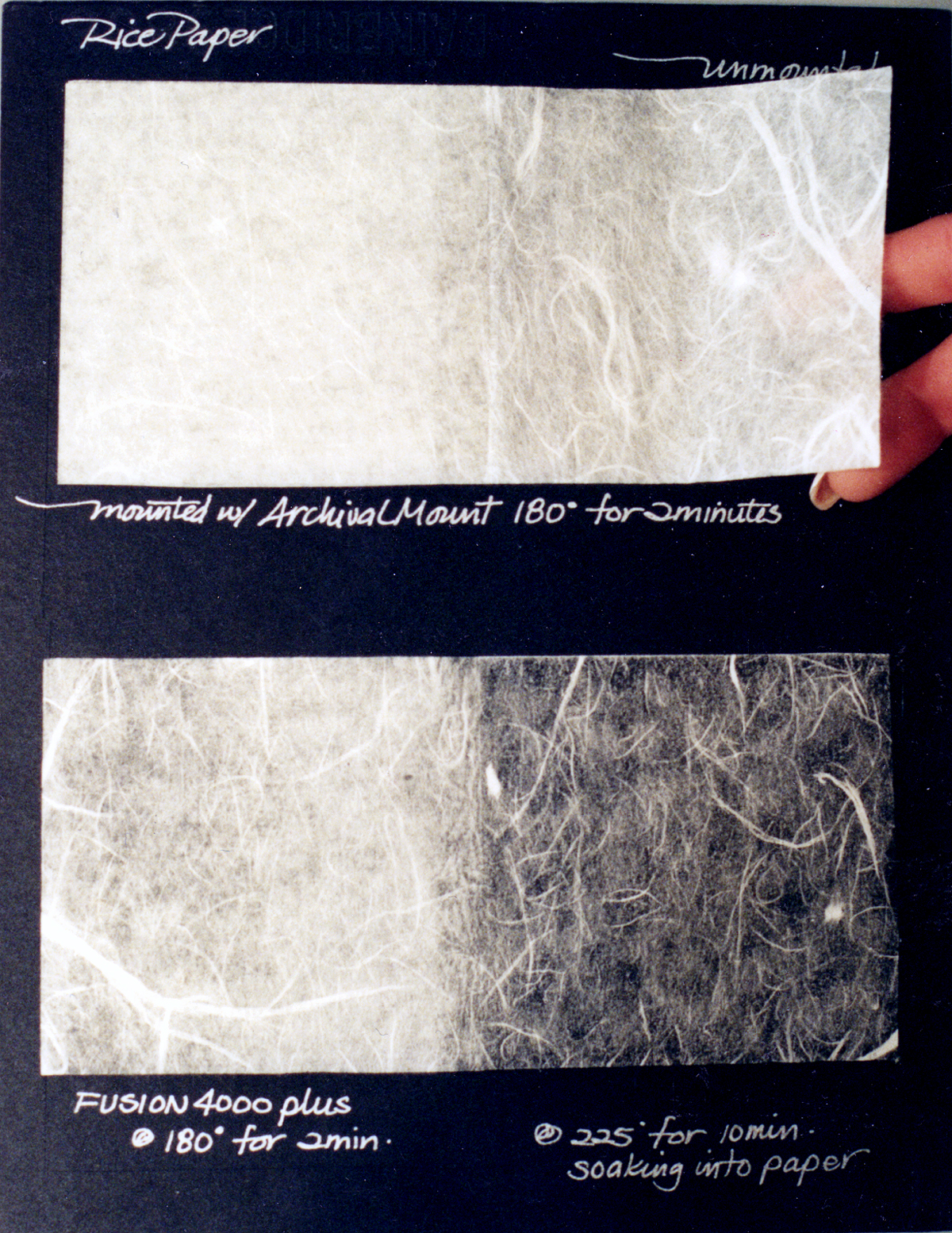 Photo 1
Rice paper over white tissue (top), and over film adhesive (bottom).
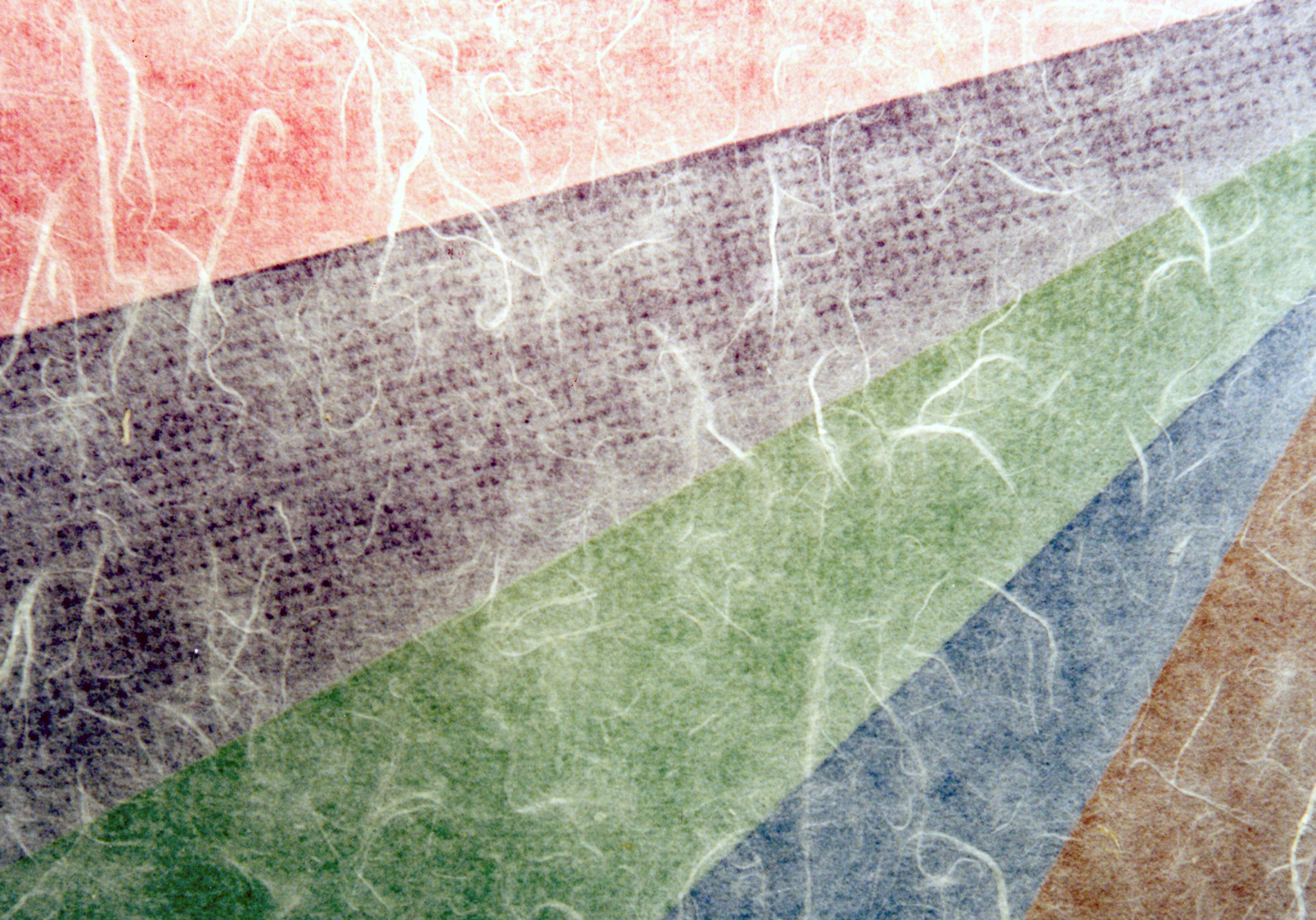 Photo 2
Color come through to tint rice paper.
Color Tinting
If the paper, certificate or fabric to be mounted is white, selecting a color other than black as a substrate, allows for tints to be utilized in the design. This opens up to matting enhancement which may better fit into the desired color scheme of a room at home or office. Color tinting is generally quite subtle, more of a gentle subliminal understatement.— The same thin Japanese silk threaded paper will gray when mounted to black, but will appear more pink, lavender, mint or sand when mounted onto a bold primary or secondary color substrate (photo 2).
The thickness of the certificate or paper to be mounted will indeed effect the degree to which the color tint is visible through it (photo 3). As mentioned above, the tinting is very subtle and really only hints at a pastel which must be enhanced by mat selection to help showcase and accent the faint pastel colors.
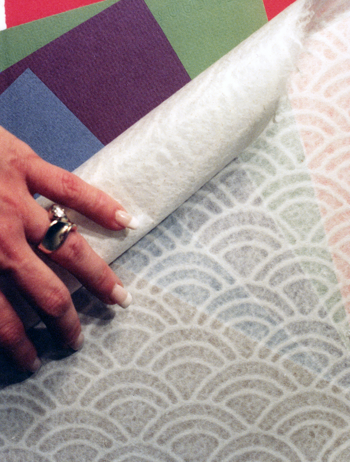 Photo 3
Thicker paper allows less color to show through.
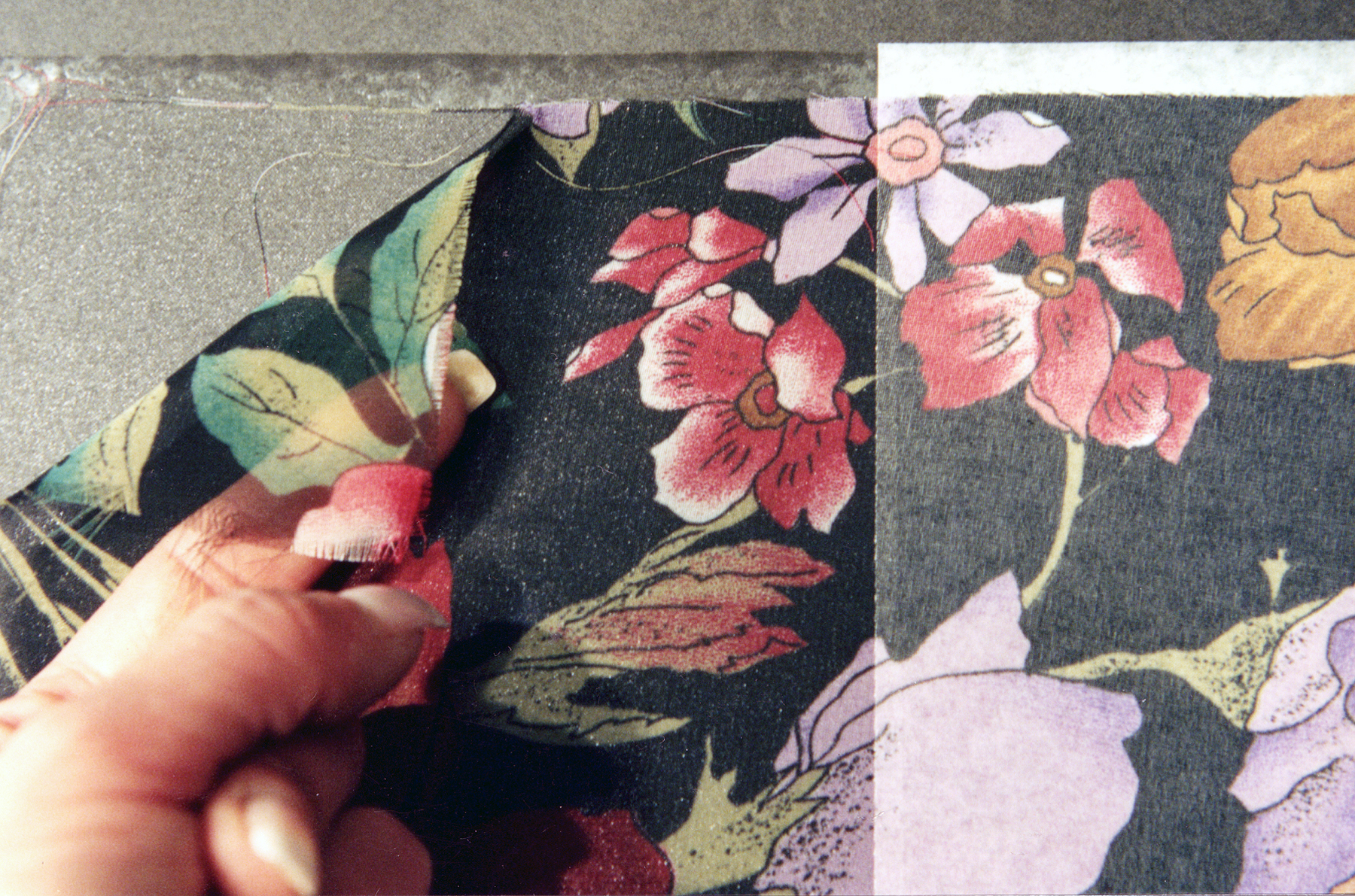 Photo 4
White tissue fades the colors.
Adhesive Clarity
In order to control the color tint as illustrated in the preceding photos, it is important to understand adhesives and their effect upon mountings. An adhesive that remains clear when mounted or dry is required during the color tinting design process. Most wet and spray glues dry clear and easily adapt to this mounting design. Unevenly spread wet or spray glues may bleed through in spots resulting in a sloppy presentation. Dry mounting is as ideal method for showcasing color tinted items, but any dry mount tissue will appear white when mounted.This works in opposition to the desired tinting by blocking the color substrate with the white tissue carrier of the adhesive (photos 1 and 4).
Dry mounting is the healthiest, most time efficient and long term mounting process, and the one that best adapts to color tinting. By selecting a 100% pure adhesive film (Fusion 4000, TM-3, Flobond...), the optimum amount of color is allowed to tint through the mounted paper.
An average mounting temperature of 185-190ºF for 3-5 minutes may vary with the press used, thickness and dimension of substrate.Time held within the press will also effect the end product, keep in mind these are design enhancements and not artwork. The longer a mounting is left in a press the more transparent a porous paper or fabric will become as it becomes more saturated with adhesive. Adhesive is drawn towards the heat source in a dry mount press so this also increases the absorption process as it is pulled by heat into the paper.
Because of their synthetic nature many non-natural fibers such as polyester and acetate will not absorb adhesive. Once mounted, even a properly well mounted fabric may be peeled from the adhesive/substrate without damage (photo 4). Notice in the sample photo the turned chiffon fabric remains soft and sheer. Mounts using films may appear shiny when viewed at an angle which may be mistaken for adhesive absorption. It is merely the shiny melted/mounted adhesive beneath the thin open weave of the sheer fabric that creates the appearance of adhesive saturation (photo 5).
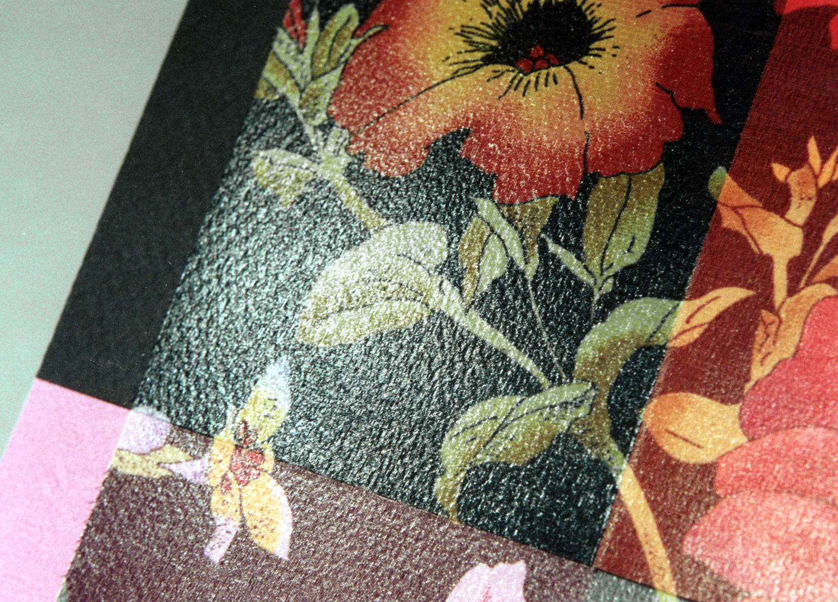 Photo 5
The shine is the melted adhesive showing between the wide threads.
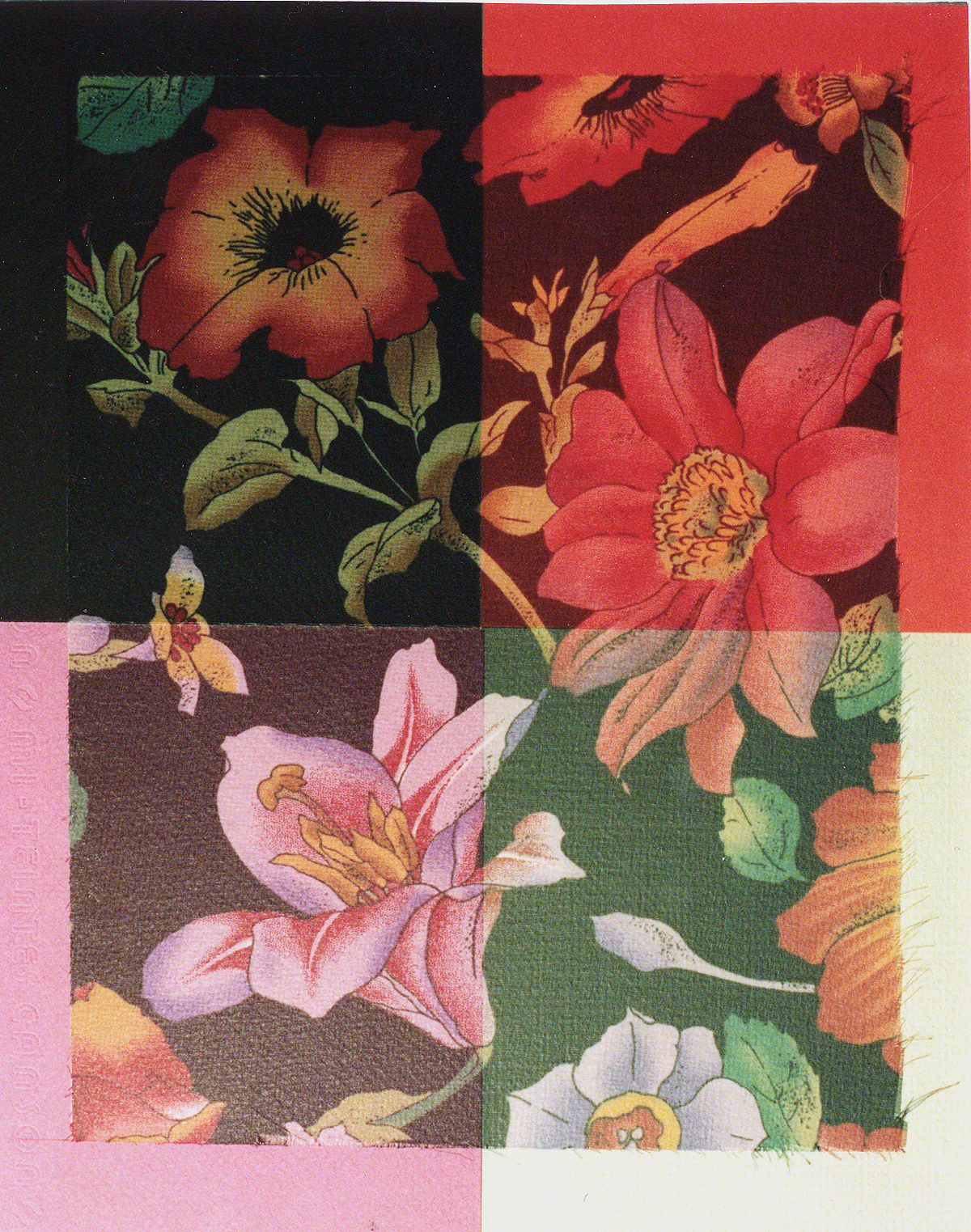 Photo 6
Layering over assorted color substrates alters the flower colors.
Color Potential
When dealing with thin, sheer and porous fabrics it is important to understand the impact of color tinting and its design potential. If a sheer fabric with a pattern is selected, the pattern may be drastically altered by the selected color substrate beneath it.
Photo 6 dramatically illustrates the drastic changes in the color appearance of the sheer black based fabric shown upper left.Clockwise the same fabric on Crescent P990 Oriental Red livens the orange flowers while browning out the black background...and totally killing the leaves. Lower right mounted on P1089 Sauterne pales the lavender and orange flowers and greens the background. Lower left Canson MiTientes #352 Orchid creates a more reddish black/purple background while enhancing the lavender flower.
As clearly shown in the sample photo, a sheer chiffon floral with a black background may be transformed into four different images with four distinctly different moods, color accents and probable applications.
Color Applications
Wrapped mats and shadow boxes lend themselves to color tinting of patterned fabrics to accent or alter a pattern color, while many certificates are ideal candidates for more basic or faint pastel color tinting. Tinting should always be used as a specialized technique in conjunction with any mounting which has print on both sides, and the substrate color should always match the dominant dark ink to prevent ghosting.
The idea is to understand the theory of a thin mounting over a color and to select the appropriate adhesive which best allows for the desired end product. Always consider the saturation issue of adhesives and whether wet, spray or dry, remember to use one that dries or mounts clear. Any tissue core dry mount adhesive will mount white and negate the option of color tinting.
Whether the design idea is to prevent ghosting, enhance a pastel tint or alter the color of a sheer printed fabric, the concept and understanding of color tinting should be a part of any framing designers list of skills and offerings. It showcases your talents, originality and will bring in additional design dollars...for being so very clever!
END
Copyright © 1994 Chris A Paschke
For more articles on mounting basics look under the mounting section in Articles by Subject.
Additional information on all types of mounting is found in:
The Mounting and Laminating Handbook, Second Edition, 2002,
The Mounting And Laminating Handbook, Third Edition, 2008 and
Creative Mounting, Wrapping, And Laminating, 2000 will teach you everything you need to know about getting the most from your dry mount equipment and materials as an innovative frame designer.
All books are available from Designs Ink Publishing through this website.
Chris A Paschke, CPF GCF
Designs Ink
Designs Ink Publishing
785 Tucker Road, Suite G-183
Tehachapi, CA 93561
P 661-821-2188
chris@designsinkart.com