 Photo 1
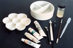
(L to R top) 6-well porcelain palette; 3-well porcelain water dish; gum arabic; (bottom) Tuner, Holbein, Grumbacher and Talens gouache; ruling pens dip pen; watercolor brush; and eyedropper
While many artists, designers and framers are already familiar with transparent watercolors, relatively few people know much of anything about "gouache" (gwash). Although actually an opaque watercolor, it is a very misunderstood medium often confused with inexpensive poster paints and casein. It has been accused of being difficult to work with, and is often thought to be color "fugitive", meaning it is not permanent or lightfast, which is generally untrue. Gouache is somewhat an untapped resource for framers excellent for use in ruling pens, panel designs, texturing mats, lettering and calligraphy on mats, bevel painting and more.
The word "gouache" is the French version of an Italian word "gouazzo" meaning dampness or puddle. Transparent watercolors may be described as pigmented, water-soluble paints which remain relatively transparent even after drying. Unlike transparent watercolors, gouache is an opaque watercolor with many of the same properties, plus a few advantages of its own. Although gum arabic is the traditional binder used in both watercolor and gouache, there is a greater amount of this binder used in the binder/pigment ratio in gouache than watercolor, that in relation to the addition of chalk in the compound attributes its greater opacity and color brightness. Small amounts of glycerin and preservative are added to tube gouache to retain moisture and prevent bacteria growth.
Colors and Permanence
Gouache is used primarily by commercial artists, designers and calligraphers because of its lightfastness, opacity and blendability. Since it comes in both half pans (or cakes) and tubes in regular artist pigments, colors may be tinted, shaded, and otherwise blended or intermixed as with any tube media. From a framers point of view consider the color palette you can maintain with only the basic primary (red, yellow, blue), secondary (orange, green, purple), black and white tubes.
There are a number of manufacturers who produce a quality line of Designer's gouache including Holbein, Winsor & Newton, Turner and Talens. In recent years there has been a trend by many manufacturers to expand their color lines with metallics, pearlescent and fluorescent colors in addition to the traditional palette. Often these colors are not considered lightfast and should be time tested for fading in a sunny window prior to considering use. Some brands have series ratings right on the label of the tube designating lightfastness or permanence. Winsor & Newton is a brand I use a great deal because of their quality, smoothness and availability, and I never use anything other than permanence rating AA or A.
Color Theories
Permanent White is the brightest, most opaque white and should be used when pure white is required. Zinc White is the cleanest, most lightfast white when mixed with color and should always be used for making tints. If attempting to mix a light pastel tint from a tube color, always add the color to the white to darken the tint. If you begin with the color you may end up with a pint of beautiful Dusty Rose before you reach the desired tint from that tube of Alizarin Crimson.
In opposition, black is not always black. Simply adding white to black does not necessarily produce neutral middle grey. By adding Zinc White to the rich velvet black color of Jet Black the result will be a tinted blue-black; to the medium grey black of Lamp Black the tint will be a "cool" grey-black; while the Ivory Black tint becomes a "warm" brown-black. So think before you mix. Unlike creating a tint when you add the color to the white, when adding black to a color for creating a shade always begin with the color and add a little black at a time to darken into the desired shade.
Tools and Materials
The materials and tools required for mixing are fairly minimal depending upon your desired use (photo 1). The relatively clear glycerin (mentioned previously) often found at the top of a newly opened tube should be squeezed out and discarded before dispensing pigment for use. If using gouache in panel designing it can be left relatively thick as it comes from the tube. By using a piece of scrap glass that has been taped on all sides as a palette you can blend colors on the glass, it doesn't absorb into the surface and it cleans up with water. Thick gouache may be applied to mats, fabrics and frames with brayers, stencil brushes, paper towels...use your imagination. Since gouache has more body than watercolor it can be built up and textured...however, too many layers too thick will cause cracking and peeling.
Photo 1
(L to R top) 6-well porcelain palette; 3-well porcelain water dish; gum arabic; (bottom) Tuner, Holbein, Grumbacher and Talens gouache; ruling pens dip pen; watercolor brush; and eyedropper
Although it is known for its opacity, you can also achieve a general transparency by thinning it to the desired consistency with distilled water. Distilled water is recommended so as not to introduce any additional elements into the mixture which could alter the permanency rating.
If you plan to use the gouache with a brush, dip pen or ruling pen, it needs to be thinned prior to use in order to flow smoothly, and Gum Arabic should be added as a binder. This will help the gouache adhere to the paper so if you need to erase pencil lines it will not smear or pale. Gouache thinned for lettering is approximately 1 part water to 1 part pigment. Maybe a little less water than pigment depending upon exact usage, then add approximately 1 drop of gum arabic per teaspoon of mixed color. Too much arabic will keep the gouache sticky to the touch, it stays very shiny and it will never really dry. It will take a little practice for perfect results each time, but it is really quite simple.
Color Matching
When mixing a color to match the ink in a photo or graphic, perhaps for a painted bevel, remember gouache always looks darker when wet. Take a scrap of the mat board you intend to use, apply a patch of color and let dry to ensure the color match. Mixed colors are difficult to match so always mix enough for the complete job (especially if blending a tint, shade or new color), yet don't get carried away with mixing, a little will go a long way. One teaspoon of mixed gouache will easily line a large French mat.
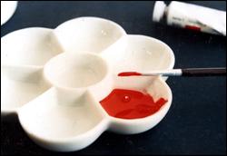 Photo 2
Squirt ½" of gouache into palette, add ½ tsp distilled water and blend to proper consistency. Thin if too thick.
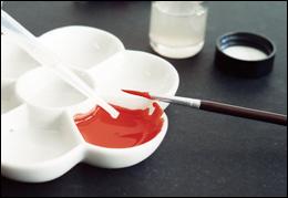 Photo 3
Add 1 – 2 drops of gum arabic as fixative.
Step by Step
Dispense about ½" of tube gouache into a mixing palette or dish, then begin thinning by adding approximately an equal volume of distilled water with an eyedropper (photos 2). Blend together to the desired consistency then add 1 drop of gum arabic (photos 3). Fill 3mm nib with gouache using a soft watercolor brush to keep the edges of the nib clean (photo 4) and test on mat board (photo 5).
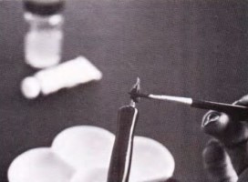 Photo 4
Fill nib with gouache using watercolor brush.
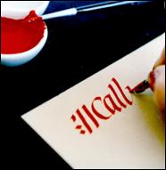 Photo 5
Test for flow and consistency. Thin if necessary.
Fill ruling pen by raking a brush filled with color across the pen edge from the side to prevent excess gouache from contaminating the tool (photo 6) then test on board or paper scrap for desired consistency and flow (photo 7). Also check it against cork backed steel metal ruler (photo 8). Let dry for final color match test.
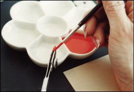 Photo 6
Test gouache consistency on museum board with 3mm nib.
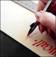 Photo 7
Test with ruling pen on board for flow.
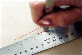 Photo 8
Also check it against cork backed steel metal ruler.
Gouache will keep for a long time if tightly capped, but if it should prematurely harden simply split the tube open and reconstitute by placing the dry pigment in a capped jar with a little distilled water overnight. Essentially little or no waste, primary color palette will allow total color mixing, variable texture, and lightfast too...what a find!
END
Copyright © 1992 Chris A Paschke
For more articles on mounting basics look under the mounting section in Articles by Subject.
Additional information on all types of mounting is found in:
The Mounting and Laminating Handbook, Second Edition, 2002,
The Mounting And Laminating Handbook, Third Edition, 2008 and
Creative Mounting, Wrapping, And Laminating, 2000 will teach you everything you need to know about getting the most from your dry mount equipment and materials as an innovative frame designer.
All books are available from Designs Ink Publishing through this website.
Chris A Paschke, CPF GCF
Designs Ink
Designs Ink Publishing
785 Tucker Road, Suite G-183
Tehachapi, CA 93561
P 661-821-2188
chris@designsinkart.com