 Photo 1
Hand carved decorative filigree and copperplate calligraphy both as use of shape.
For centuries, psychologists have been studying the human mind and its reaction to visual shape stimulus. Ink blot responses attempt to standardize human reaction, feeling, and emotion in connection with specific lines, colors and values that create non-objective shapes. These studies have determined that although it remains somewhat individualized, squares generally equate a feeling of perfection, stability, symmetry and self-reliance. Frames present a mood, depending upon their shape. Horizontal shapes within an artwork, such as a landscape, predominate within a horizontal frame unit, and vertical images grow upward if placed within a vertical frame format. So shape is a very influential element.
Natural and Geometric Shapes
Pure shape consists of four general categories, also known as characteristics: natural, geometric, abstract, and non-objective. Natural shapes make up all of our surroundings such as stones, leaves, puddles, and clouds...they are anything found in the natural environment. Plants, animals and humans are all natural, not manmade, non-created shapes.
Many natural shapes may also be characterized as geometric. One of the most common geometric natural shapes is that of the hexagon. It is part circle, part square and is naturally found in honeycombs, turtle shells, mineral deposits, snow crystals, and biological tissues. Geometric shapes are comprised of triangles, squares, circles, etc., and as mentioned above are closely related to Nature, architecture, or in this case picture framing. Rectangular, square, hexagon, round, oval, and multiple opening mats all constitute use of geometric shape as an element in mat design. Frames that are multi-sided, oval, rectangular, and offset also create geometric shapes, but with moulding.
Abstract and Non-Objective Shapes
Natural shapes reduced down to their essence become stylized or abstract. American Indians have always embraced religious, earth, and animal forms converted into distinctive abstractions and patterns, which often have very specific symbolic meanings. These shapes are used as designs on pottery, weavings and jewelry. They emulate natural forms yet evolve into abstracted patterns of their originals.
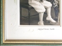
Non-objective shapes are those that don't originate from any recognizable shape or object. Though they may have been stimulated by an actual natural form such as the human body, with the resulting design no longer visually resembling the original, upon which it was based. This is most notable in many contemporary artists, some of the later paper projects by Matisse, or a hand carved mat filigree accent. (photo 1)
Photo 1
Hand carved decorative filigree and copperplate calligraphy both as use of shape.
Shape in Frame Design
Maintaining or reinforcing the shapes within art creates a harmony between the frame and its contents. It also emphasizes the mood of the original shapes of the artist's images, note the large, strong Japanese brush stroke is emphasized by the square frame hung at a diagonal. (photos 2 & 3) Therefore, selections of matboard openings and/or moulding perimeter shapes are extremely important. They may either reinforce the original feeling or throw the entire presentation into an unsettling visual arena.
 Photo 2
A square frame and mats set at the diagonal, echo the curved lettering of "Infinity" but also reinforces the bold sumi brush stroke carried out to the outer wrapped mat edges. Had the framer done this voluntarily it would have been copyright infringement, but this frame design was created by the artist/calligrapher. Use of five elements of line, color, texture, shape, and intensity are used.
 Photo 3
Detail/inset of art and calligraphy on mulberry paper, stacked mat of wrapped foamboard, 4ply rag, spacer, wrapped foam, 4ply rag with artist stokes tying the layers together into a unified frame design.
Emphasis
Compositional balance must be considered when arranging shapes within a confined unit, frame or shadow box. Dark, dense shapes appear heavier and attract greater attention, so shapes of intense color must be offset to adjust the visual balance within a frame. Use of the slanted corner double v-groove replicates the slant of the letter A in the art, tying in the mat to the image, while also creating a visual accent space lower right by its shape. (photo 4)
 Photo 4
This Karlgeorg Hoefer LE etching has a double v-groove with angled corner to replicate the slant of the A. The elements of line, color, shape, rhythm (repetition), and space are used in the design.
A single portrait dressed in dark clothing amidst a multiple opening mat of light colored portraits will be the first photo seen. This dark shape will dominate even if all the images are the same opening dimensions. The desired end product utilizes what is known as controlled tension to direct or balance the images. Visual interest and balance must be achieved or the design is doomed to failure. Good art will already contain this necessary element, but object boxes, multiple openings, and wall groupings must be controlled by the framing designer.
Controlled Tension and Dominance
The concept of controlled tension is to arrange shapes to guide the viewer's attention from one element or object in a frame to another. This may be controlled through controlled vision or shape dominance. This in turn stimulates use of other elements such as rhythm and movement. The determination of visual importance—controlled vision of an object, photo, or framed unit—may easily be manipulated by shape, either by the outer frame perimeter or the inner mat opening. A single oval opening amidst a sea of eleven rectangular openings in a multi-opening mat will attract shape dominance, or greater visual importance. Three oval openings with seven rectangular and two square openings will better balance the visual dominance depending upon the location of the shapes within the frame.
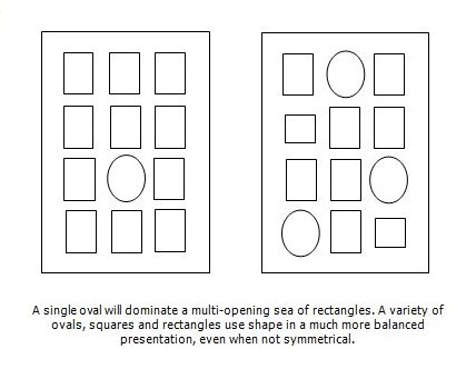 Diagram 1
The size, subject and surface decoration involving other elements also adds to shape dominance. An oval surrounding a portrait will often dominate an oval surrounding a garden snapshot. An oval opening would also have less visual strength, if there were ruling pen or tiered mat lines, surrounding several rectangles, even if it were the only oval in a twelve opening mat.
Since a shape consists of a border and visual control is the goal in framing, if you elect to showcase shape as an element through mat decoration or fancy CMC cuts, the execution must be clean and perfect. The parallel between the diagonal within the image and the v-groove qualifies shape as an element. The idea is to make a statement so shape becomes recognized as an elected element within the design and countable in your 'three to five' design principle limitation.
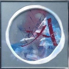 Photo 5
The calligraphy was created on blue Roma handmade paper, which was Surface Tiered atop a double 2-ply Strathmore rag—to create the desired 4-ply—and Under Tiered with blue gray paper at the bottom for the freeform cut top mat. The ³⁄₁₆" freeform, mulberry wrapped, liner mat is colored with pale pastel pigment which accents the shape of the top mat without replicating it. Countable fundamentals are color, texture, shape, rhythm, and emphasis.
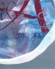 Photo 6
Detail/inset.
Copyright Limitations
And then there is copyright. I have written and lectured about copyright infringement for decades pointing out again and again in framing competition and use of techniques—like canvas transferring back in the day—that at times a technique—canvas transferring—may be done as a requested service for a client, but framers or galleries may not purchase prints with the plan to transfer and sell them as a new commercial product.
Descriptive Fair Use allows use of someone else's trademark or intellectual property without permission if you are using it for informational purposes. This applies to opinions, education, and possibly used a frame design. Descriptive fair use allows use of a trademarked name in a purely descriptive sense as when using a CMC to replicate familiar trademarks for a client. Nominative Fair Use allows use of a registered trademark specifically to reference the products under that brand.
Intellectual property is another thing—with copyright law protecting creativity, trademark law protecting branding, patent law for inventions, and Trade Secret law for confidential information.
CMC and Copyright
Use of shape is very popular with CMCs allowing for logos to be replicated perfectly. The thing about logos is that they are considered intellectual property. You can both copyright a logo and trademark it. Copyright prohibits all forms of unlicensed use that does not follow the rules of fair use. Trademark, looks at how it is used and if confusion—commercially—could result in the use. You need permission to use a logo unless it is for editorial or information purposes, such as when a logo is used in a written article or being used as part of a comparative product statement.
Fair use is controlled by four factors: was the use commercial vs. educational; actual reuse vs. creative interpretation; full vs. partial use; and did use impact sales in the market. Based on these factors, when using a logo in a frame design—though it may be commercial—it is for a singular consumption; is a dominantly creative interpretation; and yes, it is the full logo, but it has no impact on the market sales of said product. So it seems to be OK, but it is a bit of a gray area at best.
Crescent Design Ideas
Trademark infringement requires use of the trademark to sell goods and services. The ™ notation is used for unregistered or common law trademarks, and ® is appropriate for registered trademarks. The ® symbol puts others on notice that the trademark is registered and presumably owned by the user. A common defense to trademark infringement claims is that the trademark is not used for a commercial purpose, or not used in connection with the sale of goods or services. The key consideration is whether you are attempting to commercially profit off of the association or potential confusion with another trademark. You might also want to consider getting a license to use a trademark rather than simply using names, pictures, or logos that might be protected under trademark or copyright laws.
If any company logo or image from within the art has been replicated in a framing design during the creation of a PPFA OPEN competition piece it could be scored lower for not noting the official confirmation of one-time permission to use that logo. So the question arises if use of a Hot Wheels or Barbie logo may be used legally in a frame design...which brings me the 2022 Crescent Blog "Framing Your Special Toys." Crescent has given me permission to use their images in this copyright discussion for educational purposes. And yes, it was legal.
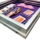 Photo 7
The Barbie® logo was cut on a Valiani Nexus CMC—as was the Hot Wheels® below—and is matted with 5648 Peony, 9500 White Glove and 5648 again. A triple stacked Nurre Caxton frame was needed for the depth required for the doll. Elements used are line, color, texture, shape, and intensity. Shown courtesy of Crescent Cardboard.
My brother collected Hot Wheels® cars when he was little, which we sold at Hobby Hut, but that's my memory. (photo 8) Copyright and intellectual property respect is serious business, whether a logo or part of an artist's work being continued onto a mat as surface design. Unauthorized use is unethical and may be illegal.
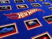 Photo 8
This presentation features the centralized logo and multiple windows for each featured car. Triple matted with Crescent Select suede Sunrise 5509, Red Sky 5510, and Tile Blue 5638. Use of line, color, texture, shape, and intensity create a unified well balanced design. Shown courtesy of Crescent Cardboard.
END
Copyright © 2024 Chris A Paschke
References
Crescent—https://www.crescentcardboard.com/article/framing-your-special-toys/
Fair Use—https://www.rocketlawyer.com/business-and-contracts/intellectual-property/trademarks/legal-guide/what-happens-if-i-use-a-trademark-without-permission
Logos—https://legalbeagle.com/13308784-how-to-find-out-if-a-logo-is-copyrighted.html
Permission—https://www.upcounsel.com/permission-to-use-logo
Tiered Mats—Creative Mounting, Wrapping And Laminating, Chris Paschke, 2000.
For more articles on mounting basics look under the mounting section in Articles by Subject.
Additional information on all types of mounting is found in:
The Mounting and Laminating Handbook, Second Edition, 2002,
The Mounting And Laminating Handbook, Third Edition, 2008 and
Creative Mounting, Wrapping, And Laminating, 2000 will teach you everything you need to know about getting the most from your dry mount equipment and materials as an innovative frame designer.
All books are available from Designs Ink Publishing through this website.
Chris A Paschke, CPF GCF
Designs Ink
Designs Ink Publishing
785 Tucker Road, Suite G-183
Tehachapi, CA 93561
P 661-821-2188
chris@designsinkart.com