 Photo 1
The exaggerated width of the mat throws the proportion off balance being nearly the same as the window opening.
Proportion defines as the relationship, dimension or magnitude which determines how much space an item occupies and how large or small it is in relation to its surrounding area, and is what makes our world recognizable. It is the amount of visible sky vs. land or ocean vs. desert. A mountainside may be charred by fire but we still recognize the mountain because of its proximity to surrounding landmarks.
An artist must fit all of the pieces together so a design feels comfortable. In turn, all the pieces of a frame design must be unified for it to be successful. Since there are no real rules for presenting framed art with the correct mat widths or proportions, the use of framing principles—elements and factors—require personal and subjective judgment on the part of the frame designer, with proportion being one of them. Some framers have a natural eye for identifying a design that fits, and this may be why some designs appear more successful than others.
The easiest tool for controlling use of proportion is to vary the widths used, remembering that repetition of widths is a killer. When mouldings widened to 3" or more, mats had to widen proportionately grow just to maintain a balanced presence, and to establish a better relationship between frame, mat and inner artwork. The exaggerated mat width in photo 1—a sample used in design classes—throws the proportion off-balance being nearly the same width as the window opening, and not good.
Photo 1
The exaggerated width of the mat throws the proportion off balance being nearly the same as the window opening.
Proportion, Ratio and Scale
Proportion deals with the ratios of one part to another, such as width and height. (Diagram 1) Art is often created by ratio, with a 1:1 ratio is always being a square, regardless of size. A 24x36" painting has a 2:3 ratio allowing artists to create pieces smaller (6x9", 10x15"…) to be captured for larger reproductions. Elongated images with 1:3 or 1:4 ratios fall into a category with Asian scrolls and exaggerated narrow art. Proportion is a matter of size relationships within a given project, while scale refers to the actual size of an object in relation to the other objects in the same project. Both scale and proportion are design elements that have to do with size.
 Diagram 1
- Ratio is the mathmatical comparison of height to width, regardless of vertical or horizontal use.
It is important to understand scale in relation to proportion. Large patterns will appear much larger when contained within a smaller, confined space such as a shadow box. And in turn, small patterns may be overwhelmed by the use of large negatives spaces. A large flower design—or bold pattern—will overpower a small 5x7" mat, but might work well on the corner of a 20x30" mat because the scale is better suited and won't through the proportions off. (Diagram 2)
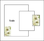 Diagram 2
Scale refers to the actual size of an object in relation to the other objects in the frame.
Surface Mat Decoration
Incorrect proportion becomes most noticeable with surface decoration. Sample photo 2 created by Ray Dwyer, CPF showcases a triple mat—top decorated mat is floated on the colored middle mat creating the illusion of a quadruple mat without the added thickness—with debossed lines, and painted surface panel with gold ruling pen lines. The problem is not the execution, but the spaces between and surrounding the elements ending with the painted surface design outer edge being far too close to the center of the mat between the image and frame, making it appear crowded. Buy simply adding an additional ½" - 1" of the mat—with no decoration—there would have been a wider boarder between decoration and frame to allow the eye a place to rest.
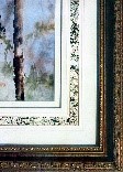 Photo 2
Surface decoration cannot be an afterthought. This design should have had a wider border to better allow a transitional calm space between decoration and frame. Courtesy of Ray Dwyer, CPF.
The triple decorated mat in photo 3 has just as much going on as the above design, but the additional surface width from the debossed lines and surface panel, plus the inner ¾" paper of the original art, outside the etching plate mark, allows all proportions to feel in balance. The wider border between the surface decoration and the gold frame allows a resting transition, and even though there are debossed lines, textural panel painting, spacer, and under-tiered pin-striped middle mat, the only countable principles are the elements of line, color, texture, and intensity.
 Photo 3
The wider border between the surface decoration and the gold frame allows a resting transition for the design which includes the elements of line, color, texture, and intensity even though there are debossed lines, panel painting, spacer, and under tiered pin striped mats.
Border Widths
The concept of weighting the bottom of a mat originated during the period of time when art was hung very high on 12'-15' walls with frame blocking the part of the visual sightline of the mat. Widening the bottom border compensated for the sightline problem when seated. Until recently, 20th century designs often showcased 2½" to 4" double mats with ¼" weighted bottoms and ¼" inner liner. It's been decades since a wider bottom border has been the norm and it has become more of a design statement.
More contemporary guidelines for mat proportions are open to discussion and design, but routinely the top mat is widest of the mats used, and often suggests it should be reflective of the dominant color in the art. The wider the frame, fillet, wrapped bevel, surface decoration, or liner mat, the wider that top mat should be. The key here is that image size of the art should not necessarily predetermine mat borders by using mathematical standards or formulas. This has been exemplified time and time again by wonderfully exaggerated mat borders to help showcase tiny images, or multiples of small images/wide borders to fill a wider expanse on a wall.
Asian Proportions
The elongated or exaggerated vertical use of varied boarder widths reflects the influence of traditional Asian scrolls and is often referred to as Asian proportions. (Diagram 3) These proportions are selected in Western framing to reinforce a long thin appearance or more vertical dimensions of an image. If a long rectangle is framed using same border measurements, the elongation of the image is lessened. By utilizing Asian proportions of wider top and bottom dimensions with narrower sides, the elongation is better maintained.
 Diagram 3
Asian proportions use narrower sides and wider top/bottom to maintain the original art ratios.
Contemporary use of Asian proportions in western framing is embraced by the widening of the top and bottom borders, but that is not always required with the top mat. The floated mask art in diagram 3 uses a base Asian proportion in a modified way. The original art is floated on Harvest Brown rag with a visible 1¼" matching top mat with a spacer for intensity and depth. The side spaces between art and mat are only ½" with the top and bottom space extended for elongation to 1½".
And then there are times we may be forced to create elongated proportions simply because the original etching or engraving was left on full sized printing paper. "Cigarman" is triple rag matted with Ecru—to match the original art paper—and Warm White as a contrast. The liner mat has even ¼" visible border; middle mat shows 1" all around and is under-tiered with a single hairline of Black Shadow paper and 8-ply rag spacer beneath. The top mat has Asian proportions with narrower sides and weighted 1⅞" top and bottom. (Photo 4)
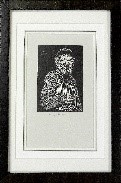 Photo 4
"Cigarman" etching on untrimmed paper dictates (demands) elongated dimensions.
Space and Proportion
A float space is the gap between the inner edge of a float frame and the rigid canvas, cradle, or panel artwork. The float depth—or recess—is the distance from the top of the frame to the art. Traditional placement of a canvas in a floater is ¹⁄₁₆" to ⅛" beneath the face of the frame with a ⅛" float space between the art and the side of the frame. The frame is for structural support and a more completed look.
When framing encaustic art, the float and depth spaces are less restricted with spaces easily being ½", ⅜" or more depending upon the overall size of the art. A large cradled panel might need a visual space up to ¾" to best balance the float frame space in relation to the art, especially if there is a deckle edge. (Photo 5) In these cases the float depth may be impacted by additional space too. Because of the textural aspects of heavy impasto paint and encaustic techniques a ⅛" float depth will never protect the art surface from floor contact if laid face down.
 Photo 5
Float spaces for encaustic art are often ¼", ½" or more depending on the size of the art panel.
A recent client wanted her commissioned 40x30" original oil painting on 1½" bars float framed with Andover Black, but she opted to have it set to the back of the 2⁵⁄₁₆" inner depth—nearly 1" from the frame face—with a float space of at least ⅜". The face of the floater is only ¾" wide so the placement of the stretched canvas allowed there to be much more inner black to show surrounding the canvas which worked exceptionally well with the black leather jacket she is wearing in the painting. Also the red hairline at the edges of the moulding draw the eye into the chestnut coloring of her horse and saddle. (Photo 6-8) In this case the float frame made a much greater statement over just a support for the canvas, it became a fully enhancing part of the framing.
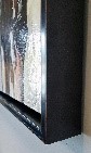 Photo 6
Andover Black floater has a 2¹³⁄₁₆" exterior depth with 2⁵⁄₁₆" inner depth.
 Photo 7
The 1½" depth canvas was set back against the bottom with 1" from the frame face to the painting and with a float space of ⅜" around.
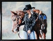 Photo 8
Andover Black float frame mounted to the back of the frame allowing 1" float depth with ⅜" float space all sides. "Rambo" shown courtesy of Karen Bowe, Tehachapi CA.
Final Frame
In review, never design the mat to echo the same width of the moulding, or an inner fillet to mirror the liner mat width beneath it. Whenever panel designing, regardless of dry pigments, ruling pen lines, v-grooves or glass etching, always consider variations in widths. And since there are no hard, fast rules there is much greater freedom to best enhance the art. Since over the decades our materials have improved to better house the art, our concepts may now also offer cutting edge designs, while still paying attention to design principles.
END
Copyright © 2023 Chris A Paschke
For more articles on mounting basics look under the mounting section in Articles by Subject.
Additional information on all types of mounting is found in:
The Mounting and Laminating Handbook, Second Edition, 2002,
The Mounting And Laminating Handbook, Third Edition, 2008 and
Creative Mounting, Wrapping, And Laminating, 2000 will teach you everything you need to know about getting the most from your dry mount equipment and materials as an innovative frame designer.
All books are available from Designs Ink Publishing through this website.
Chris A Paschke, CPF GCF
Designs Ink
Designs Ink Publishing
785 Tucker Road, Suite G-183
Tehachapi, CA 93561
P 661-821-2188
chris@designsinkart.com