 Photo 1
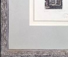
A triple rag mat only shows multiple lines and two colors in this basic clean design. Line is not established by a contrasting bevel but rather by the middle liner mat strip.
Frame design is something all custom framers should understand and being technically proficient is very important, because without good design the finished product can be visually weak. In the introduction of this two-part review—September 2022 issue—the design principles were laid out as elements and factors, as well as establishing the givens. Now for the details.
Six Elements
Line begins as a point which extends into a line, and is identified by assorted techniques including the cut of a rectangular bevel, stacked mat windows, mat decoration, accent strip, French lines, and debossed indentations. The most basic line is created with a simple same color double mat. Multiple connected lines give shape, while the surrounding area is space.
Color elicits the most expressive of the elements by stimulating an emotional response. It is the visual reaction to reflected light wavelengths selected to accent or harmonize with artwork to create an overall mood through the use of assorted matboard, moulding, and fabric. Photo 1 (line, color)
Photo 1
A triple rag mat only shows multiple lines and two colors in this basic clean design. Line is not established by a contrasting bevel but rather by the middle liner mat strip.
Texture defines as the surface character of materials determined by their actual physical structure. Everything surrounding us has an internal, structural texture (grain within a wood moulding holding it together); an external, tactile texture; and a visual texture which may be manually applied to the surface (printed fabrics or marbled papers). Texture and pattern are intricately intertwined, and people often react to textures in psychological ways. This psychological reaction allows us to mentally feel without ever actually touching an item. This establishes the difference between tactile and visual textures.
Shape defines and gives form. The shape itself is a positive area, while the surrounding is the negative area, referred to as positive and negative space. Shapes are areas which stand out from the space surrounding them because of a defined boundary, or because of a difference of line, color, or texture. There are four general characteristics to shape: natural, geometric, abstract, and non-objective. Photo 2 (line, color, texture, shape)
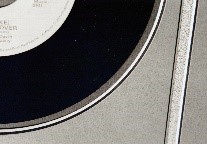 Photo 2
(Line, Color, Texture, Shape) Texture is established once two different surfaces are included. This sample shows both Flannel and Millstone mats as two textures, two colors and curved lines as shapes.
Natural shapes make up all of our surroundings such as stones, leaves, puddles, clouds—anything found in the natural environment. Geometric shapes are comprised of triangles, squares, circles, and are closely related to Nature, architecture, and picture framing. Rectangular, square, hexagon, round, oval, and multiple opening mats all constitute use of geometric shape as an element in mat design. Abstracted shapes are natural shapes reduced down to emulate natural forms yet evolve into patterns of their originals. Nonobjective shapes are those that don't originate from any recognizable shape or object, often stimulated by natural forms such as the human body. This is most notable in many contemporary artists such as Kandinsky and Matisse.
Intensity and value are most often used in relation to discussions of color, but framing pushes it to into the use of highlights and shadows created within a frame. Webster's dictionary defines intensity as "the relationship of one part or detail in a picture to another with respect to lightness and darkness." Framers create intensity through creative applications by use of fillets, lifters, spacers and creative applications such as glass etching, deep bevels, and stacked mouldings. Photo 3 (intensity)
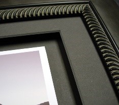 Photo 3
(Intensity) Though having a dramatic design by use of reverse bevel floated image mount, and spacers lifting the single mat, since mat and backing are same color, the only element used is intensity. The carved frame could easily be counted as a textural pattern or rhythm if replicating a similar pattern in the art.
Space is the distance around or between items used to unify or highlight an image. While space defines as a measurable distance between pre-established points, two-dimensional space only involves length and breadth; three-dimensional space adds depth; and four-dimensional space adds time or motion. Visual design is actively concerned with three specific types of space: pictorial, illusionistic and actual.
Pictorial space relates to a flat two-dimensional surface, as in a cutout paper silhouette, existing across a plane rather than in it. Illusionistic space is imagined multiple planes established through techniques of overlapping, layering, size, and perspective, dealing with three-dimensional images in relatively two-dimensional presentations. Actual space relates specifically to three-dimensional items where space is real and tangible. It concerns itself with artworks and memorabilia such as pottery, jewelry, sculpture, keepsakes, and special objects. Photo 4 (line, color, space)
 Photo 4
(Line, Color, Space) A triple rag mat shows line and color, same texture but the Mylar encapsulated papercut is floated between mats using space as an element.
Four Factors
Balance is necessary for survival creating much of the rhythm experienced in human life, as inhaling is balanced by exhaling, and activity is balanced by sleep. Structural balance is identified by the actual equilibrium of an object based upon the physical nature of items in space arranged with respect to a central point or axis. A building without structural equilibrium or balance would be unable to support its own weight. Visual balance is the aesthetic quality of balance or illusion of equilibrium. If visual balance is missing, the viewer will feel uneasy. There are three basic types of visual balance: symmetrical, asymmetrical and radial.
The visual weight of symmetrical balance is perfectly even on each side of an imaginary center line. Wedding invitations and announcements are often good examples of this. Asymmetrical balance creates tension by arranging elements that visually balance the design on either side of a central line. Radial balance radiates from one centralized focal point, like a nautilus shell or wagon wheel.
Symmetrical balance is when identical forms equidistant from the center equalize each other, as a mirror image. Symmetry is the most basic, and easiest, form of visual balance to understand. There is an imaginary axis or line through the center of an image which divides it either horizontally or vertically into two identical halves. Identical repetition of this type is also known as pure, formal, passive, or bilateral symmetry, though in art it may appear static, lifeless and too monotonous for prolonged audience attention. Photo 5 (Balance)
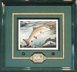 Photo 5
(Line, Color, Intensity, Balance) Though the LE fish is indeed symmetrically framed with flies and fish stamp divided essentially down the center, the arch of the fish in the art is more a sample of asymmetry. Generally, art will rarely be symmetrically balanced both halves.
Asymmetrical balance is also known as informal, active, or occult balance. It is attained when visual units on either side of a vertical or horizontal axis are not identical, but are placed in positions within the frame so as to create a felt equilibrium. All of the elements may be used to achieve asymmetrical balance in a frame design; texture may balance shape, color may balance size, and proportion may balance color and line. When applying asymmetry position is critical in successful use of balance. Two shapes of equal stature placed too near an outer border may create too much tension and the design may appear heavy or out of balance.
Radial balance—radial symmetry—occurs when the weight is distributed around a central point, as two or more forces identical in strength and character circulate around it. Simple everyday examples would be the spokes of a wheel, a dandelion, or daisy. Thus, the center becomes the focal point and often there is a feel of circular movement. Framing a record, a doily (as seen in Part 1, PFM, September 2022), or any round art using only round and square shapes replicating the original and best maintains radial balance. Though it might feel a little uninspired.
Proportion is the relationship between parts. It relates to the size and scale within a frame and deals with the ratios of one part to another such as border widths, mat and frame widths. Controlling the widths of frame, fillet, mats, mat reveals, and space surrounding art are all proportion. Varying widths maintains interest, while same widths can negatively distract. Scale strongly relates to proportion and is usually most noticed when misused. Photo 6 (Proportion)
 Photo 6
(Proportion) When proportion is used badly, the weight of the frame, width of the mat and decoration can overwhelm the art. This a great example of over-designing using line, color, texture, intensity, shape (calligraphy and dry pigment decorative mat design), and proportion. Sometimes less is more.
Emphasis is the physical positioning of elements for visual concentration or focal point within the frame to indicate what is meant to be dominant, thus controlling viewer's eye movement. Emphasis may be achieved by color intensity, darkening or lightening contrast, line convergence, or simple repetition. Reactions such as peacefulness, agitation, playfulness, and confusion, may all be stimulated by visual arrangements within a frame, just make certain that is your intention.
Rhythm—also identified as repetition—is the use of marks, colors, lines, shapes, and patterns as an association to something from within the art reintroduced through similar details in fillets, moulding pattern, mat carving, and other surface decoration. Rhythm is a very strong element because of its living connections to heartbeats, breathing, and seasons. Photo 7 (Rhythm)
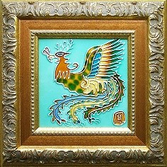 Photo 7
(Rhythm) Though the phoenix tile and renaissance inspired frame feel a little out of period the rust caramel color, gold and carving simulating the feathers all tie together in this odd collaboration. Since there is no mat, and the frame itself makes a statement, only rhythm is a countable principle.
Unity
If all selected elements and factors have been well organized and work together, then unity will be achieved by the harmony with the art giving the design has a sense of completion. There are four basic ways to achieve unity. Establishing the correct style/period of the art should never be an afterthought. Proximity is next, all things should relate to each other. Establishing visual unity by manipulating space, proportion and emphasis creates a visual flow as they are placed within the design is necessary. Repetition (textures, patterns, shapes), also known as rhythm is a huge factor that should be implemented. A similarity in size (multiple openings cut the same dimensions), shape or color will definitely help tie things together and emphasis, balance and rhythm all work together to unify a good frame design.
Final Harmony
The elements of any design are the tools of the designer, and the factors are how the designer uses these elements. Just as it is true that shape and space flow in and out of each other; that texture can be the result of highlights and shadows of line and color; all the principles must work together for a unified end product. If any are isolated then one may dominate the other and the design could be lost. Remember that if you don’t need to use a design element, don’t use it, everything should be used for a reason and limit your principles from three to five. And if there is more than one use of the same element, then it counts.
Additional Reading
“The Design Process”, Parts I-XII, PFM, 1994.
“The Essence of Design”, Parts I-XII, PFM, Feb 2000-2001.
“Design Elements: Color and Theory”, PFM, January 2018.
“Design Elements: The New Neutrals”, PFM, June 2018.
“Design Elements: Pop of Color”, PFM, August 2018.
“Design Elements: Texture, Color, Technique”, PFM, November 2018.
“Design Elements: Factors Explained”, PFM, September 2020.
“Design Elements: Rhythm”, PFM December 2020.
“Design 101”, PFM, January 2020.
Bibliography
Bevlin, Marjorie Elliott. DESIGN THROUGH DISCOVERY. New York: Holt Rinehart Winston, 1984.
Binyon, Lauren. THE FLIGHT OF THE DRAGON. London: Brown Knight & Truscott Group, 1972.
Collier, Graham. FORM, SPACE AND VISION.
Faulkner, Ray, et al. ART TODAY. New York: Holt Rinehart Winston, Inc., 5th Ed., 1969.
Graves, Maitland. ART OF COLOR DESIGN. 1951.
Itten, Johannes. THE ELEMENTS OF COLOR. New York: Reinhold, 1970.
Leland, Nita. THE CREATIVE ARTIST. Cincinnati: North Light Books, 1990.
Mayer, Ralph. A DICTIONARY OF TERMS AND TECHNIQUES. New York: Thomas Y. Crowell Co., 1969.
Ocvirk, Otto G., et al. ART FUNDAMENTALS THEORY AND PRACTICE, Sec Ed. Dubuque, Iowa: Wm. C. Brown Co., 1969.
Prohaska, Roy. BASIC COURSE IN DESIGN. 1980.
Siebert, Lori, et al. MAKING A GOOD LAYOUT. Cincinnati: North Light Books, 1992.
Wills, F.H.. FUNDAMENTALS OF LAYOUT. New York: Dover Publishing, 1965.
Wong, Wucius. PRINCIPLES OF COLOR DESIGN. New York: Van Nostrand Reinhold, 1987.
Wong, Wucius. PRINCIPLES OF TWO-DIMENSIONAL DESIGN. New York: Van Nostrand Reinhold, 1972.
END
Copyright © 2022 Chris A Paschke
For more articles on mounting basics look under the mounting section in Articles by Subject.
Additional information on all types of mounting is found in:
The Mounting and Laminating Handbook, Second Edition, 2002,
The Mounting And Laminating Handbook, Third Edition, 2008 and
Creative Mounting, Wrapping, And Laminating, 2000 will teach you everything you need to know about getting the most from your dry mount equipment and materials as an innovative frame designer.
All books are available from Designs Ink Publishing through this website.
Chris A Paschke, CPF GCF
Designs Ink
Designs Ink Publishing
785 Tucker Road, Suite G-183
Tehachapi, CA 93561
P 661-821-2188
chris@designsinkart.com