 Photo 1
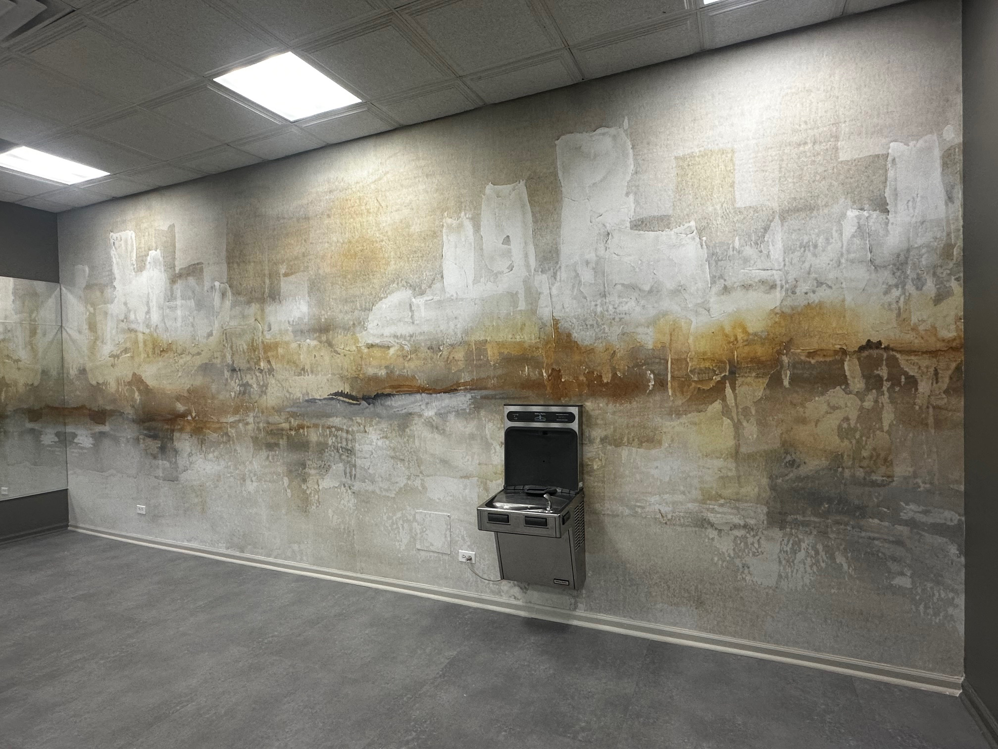
Original art by Chris Paschke "City Essence I", with Wild Apple, printed as vinyl wallpaper by Studio EL for a designer's client for a workout room in Chicago IL.
There will be a continued trending in 2026 for recycled natural materials that are cozy, earthy and warm, with global inspiration. Biophilic seems here to stay with plants and potted herbs, stone countertops, wooden beams, raw linen fabrics, woven baskets, and clay pottery. Textures remain dominant with bouclé, linen, velvet, suede, cane and jute all essential. All these trends are also maintaining the heavily textured art as seen in 2025. Focus is on selecting art that is personal, intentional, meaningful, and connected to your life, rather than more for design trends. Interiors are promoting rich reds, soft greens, and warm earthy neutrals. Gray colors are no more, and rust seems to be taking center stage with accents and small furniture suggesting a focus on comfort and nature with stone--like travertine--on counters, coasters and end tables.
"Think high ceilings, large scale pattern wallpaper and floral art, arched mirrors, and classic molding. Modern Rustic continues to dominate in kitchens, living rooms, and hospitality spaces across North America and Europe, featuring imagery of misty forest landscapes, raw ceramics with dried grasses, and abstract compositions inspired by rock, sand, and bark," says Anita Peterson at Wild Apple. Thanks to wide format printing, artist created wallpaper is very trendy, as seen by this vinyl wallpaper printed by Studio EL (original art by Chris Paschke, Wild Apple) for a Chicago interior designer for displayed in a workout room. (Photo 1)
Photo 1
Original art by Chris Paschke "City Essence I", with Wild Apple, printed as vinyl wallpaper by Studio EL for a designer's client for a workout room in Chicago IL.
WGSN/Coloro & Pantone
WGSN and Coloro--a global color palette that offers physical and digital solutions ensuring color accuracy for the art, fashion, and design industries--selects colors for worldwide forecasts. (Photo 2) Transformative Teal, a fusion of blue and aqua green that represents redirection, regeneration, and resilience amidst environmental challenges, is WGSN's Color of the Year for 2026-27. It is cooling, calming, and restorative creating harmony and balance. Other colors on their palette include Wax Paper, a creamy off-white color, near-neutral with a soothing, serene character, almost glowing from within. Fresh Purple is a culturally emotive color linking royalty, love, mystery and spirituality for home and interiors, used on resin, matte and shiny materials. Cocoa Powder is a red-toned brown evoking nostalgia. It accents the continued importance of brown having a natural quality that relates to natural materials like cacao, mushrooms, and earth. Green Glow is a yellow green that radiates and illuminates, like neon and infrared lights, creating a mix of emotions, from uneasiness to enthusiasm. Wild Apple is already showcasing Transformative Teal in numerous new pieces. (Photo 3)
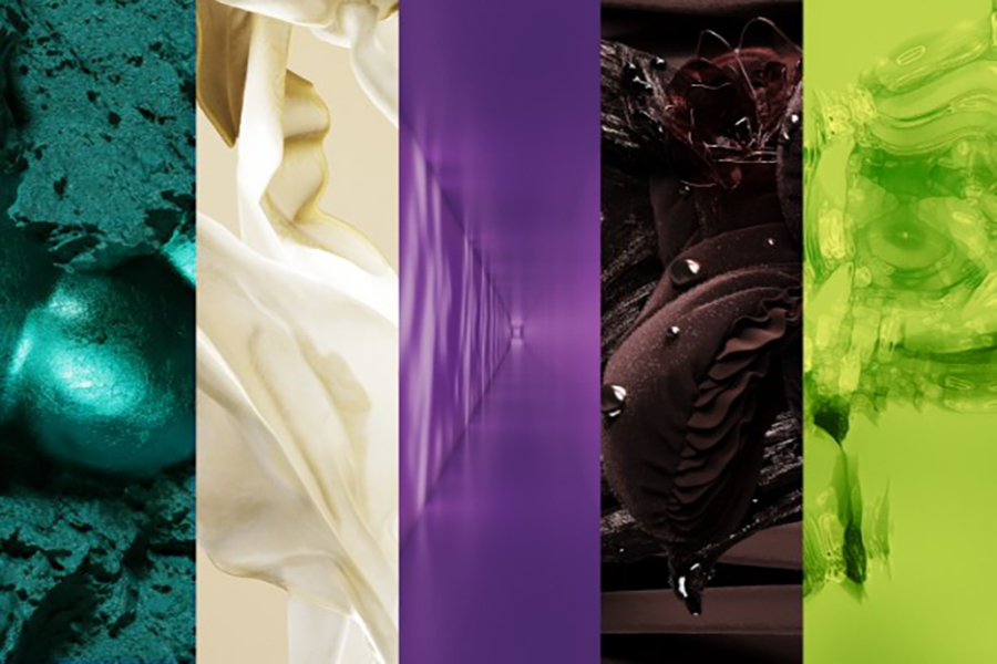 Photo 2
WGSN/Coloro COTY palette 2026.
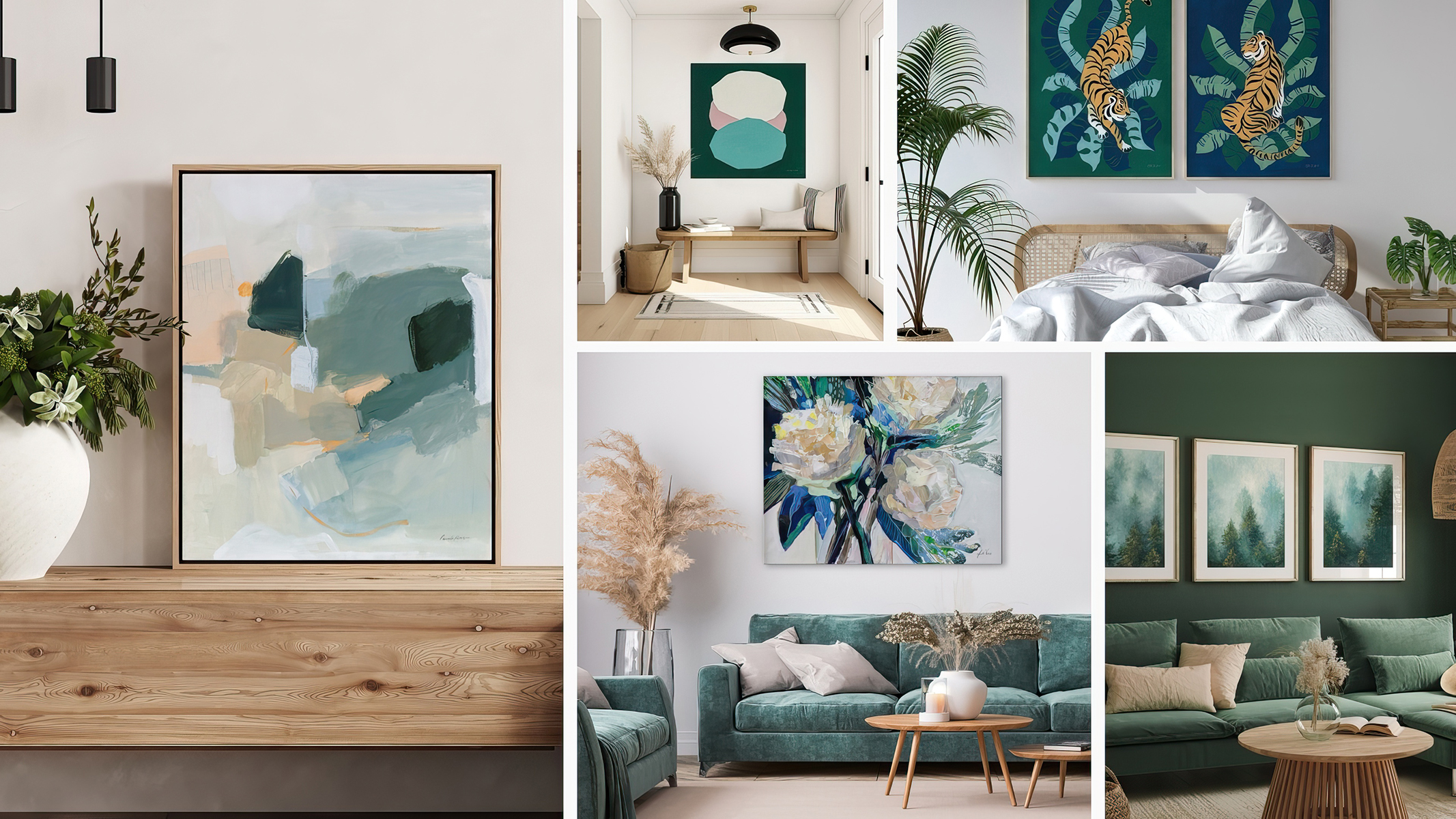 Photo 3
Wild Apple features WGSN's Transformative Teal, in assorted new art.
Domestically and globally, designers look to Pantone for their annual trend palettes. Pantone does not officially launch their color of the year until December, but currently their Welcome Home palette features warm inviting colors from crème to rust with an earthy warm violet and warm taupe. (Photo 4)
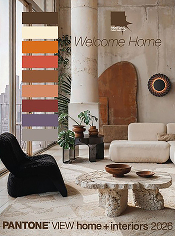 Photo 4
Pantone® VIEW Home + Interior 2026 palette, prior to their official COTY announcement.
Paint Colors of the Year
As already mentioned, earth tones will dominate continuing the shift away from monochromatic grays, with colors from olive and smokey greens, muted ochres, and berry tones; colors that feel solid, nuanced, and timeless. Warm browns are more complex versions this year that add depth and sophistication, along with warmer rich raspberry, deep plum, and soft cranberry making bold statements while still combining well with natural materials, including wicker, rattan, warm woods, and stone. (Photo 5)
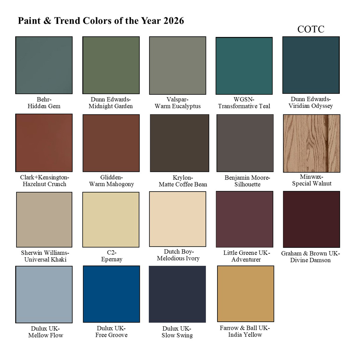 Photo 5
Paint manufacturer Colors of the Year, see chart for names.
Greens remain our connection to nature with Behr's Hidden Gem a dark, rich, smoky jade being bold & colorful, a perfect wall color. Valspar Warm Eucalyptus is a muted, slightly cooler, earthy gray-green neutral color, that is inviting, calming, and grounding. Dunn-Edwards Midnight Garden a sweet, earthy green perfect for cabinetry and walls, accents and exterior. Surprise…Dunn-Edwards also launched a color of the century (COTC) this year Viridian Odyssey a deep, sophisticated shade of blue-green balancing between cool serenity and natural warmth.
Dutch Boy Melodious Ivory is a warm cream base perfect to layer with bold accent colors, reflecting a modern farmhouse look. C2 Epernay is more of an ochre with a sophisticated butter yellow which has European influences. Browns continue to highlight the palette with Glidden's Warm Mahogony being almost a brown burnt red, feeling nostalgic and retro while still modern, working well as a main color, trim, or accent. Krylon a division of Sherwin-Williams claims Matte Coffee Bean promotes relaxation and wellness with its warm, deep calming tones designed for accents and contrast in décor.
With wood remaining a huge interior design element, Minwax Special Walnut is a classic, dimensional tone that feels both familiar and fresh, as a statement color for cabinet or accent piece. Sherwin-Williams/HGTV Universal Khaki is a timeless neutral shade that brings elegance to any space, being bold enough on its own, and subtle enough to complement to those richer tones. Benjamin Moore Silhouette is a rich espresso of mocha with refined notes of charcoal as a modern version of a classic neutral. Clark+Kensington Hazelnut Crunch is a rich, warm brown inspired by biophilic design, minimalism, and nature.
UK companies are shifting to earthy, rich colors and earth tones with Graham & Brown Divine Damson is an intense deep plum with dark cherry tones as a statement color, adding richness to home offices and hallways. Little Greene Adventurer is a regal plum aubergine leaning towards burgundy and deeper jewel tones for bedrooms, dining rooms and bathrooms. Farrow & Ball India Yellow is an intense, deep mustard yellow which creates a cozy space when contrasted with a dark brown tones and accents, with Dulux offering a palette of three blues: a deep blue-black Slow Swing, a vibrant midrange blue Free Groove, and airy blue Mellow Flow.
Color & Style Impacting Art
Design trends are similar but with new twists with Tactile Textures, Biophilic Naturalism, and Minimalism. Tactile textures include 3D art, sculptures, layered materials, and collections that emphasize tactile qualities. Biophilic design focuses on creating living spaces from the natural world, bringing the outside in, and enhancing human well-being and connection with nature by incorporating natural elements, patterns, and systems into their environments.
"Art will feature oversized floral arrangements, bold botanical prints, and flowers displayed in every kind of vessel. This trend celebrates abundance, artistry, and the timeless power of flowers to transform a space," says Moira Hershey, Art Director Wild Apple. Abstract art offers texture, neutrality, and modernity for hospitality, restaurants, and wellness spaces requiring art that isn't too personal or theme-specific. Whether for a neutral space or working with a bold palette, abstracts bring movement, mood, and polish without competing with other elements, also making great oversized canvases, mural walls, and statement pieces or series. (Photo 6)
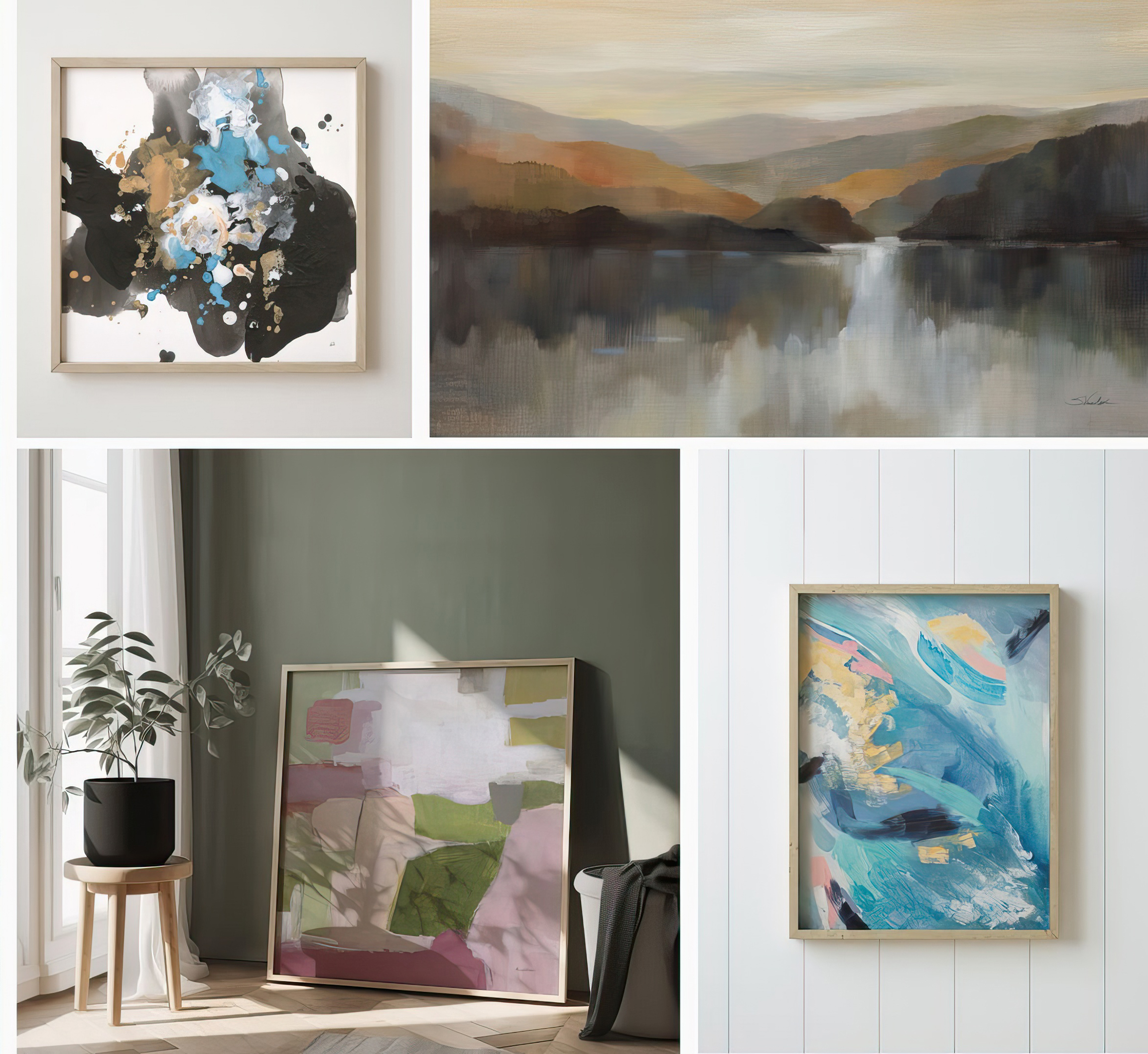 Photo 6
Abstract and landscape are being showcased with earthy and bright accent colors for 2026.
Expressive scribbles, brushstrokes, splatters and handmade mixed-media textures are totally trending. Palettes are getting bolder. Think coral, teal, cobalt, pink, mauve and golden ochre (as well as other magnificent shades). Tone-on-tone neutrals of warm taupe, faded clay, and neutral palettes are minimal but rich. (Photo 7)
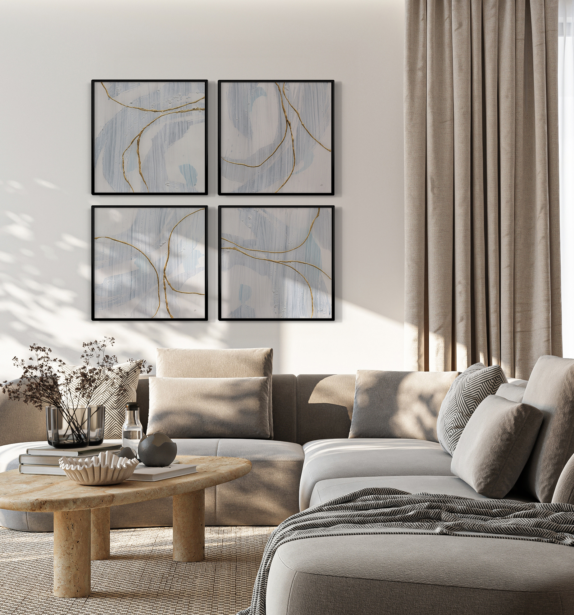 Photo 7
(Possible Cover) "Gold Branches I-IV" by Chris Paschke/Wild Apple as a 4-up in a contemporary living room. Photo courtesy of Wild Apple.
Abstraction always allows for many color palettes to meld into a variety of décors, as with of moody dark tones. (Photo 8) "From bold bursts of color to rich, grounding hues, our collections celebrate the full spectrum of emotion and self-expression. Whether through the playful energy of Eclectic Joy or the timeless elegance of Moody Darks, each piece invites you to experience art beyond the visual. These predictions are based on what’s currently trending for the upcoming year, which can change quickly. Colors that continue to dominate interiors are the neutrals--browns, beige, warm tans and crème," says Larry Winn, CEO and Creative Director, Grand Image. (Photo 9)
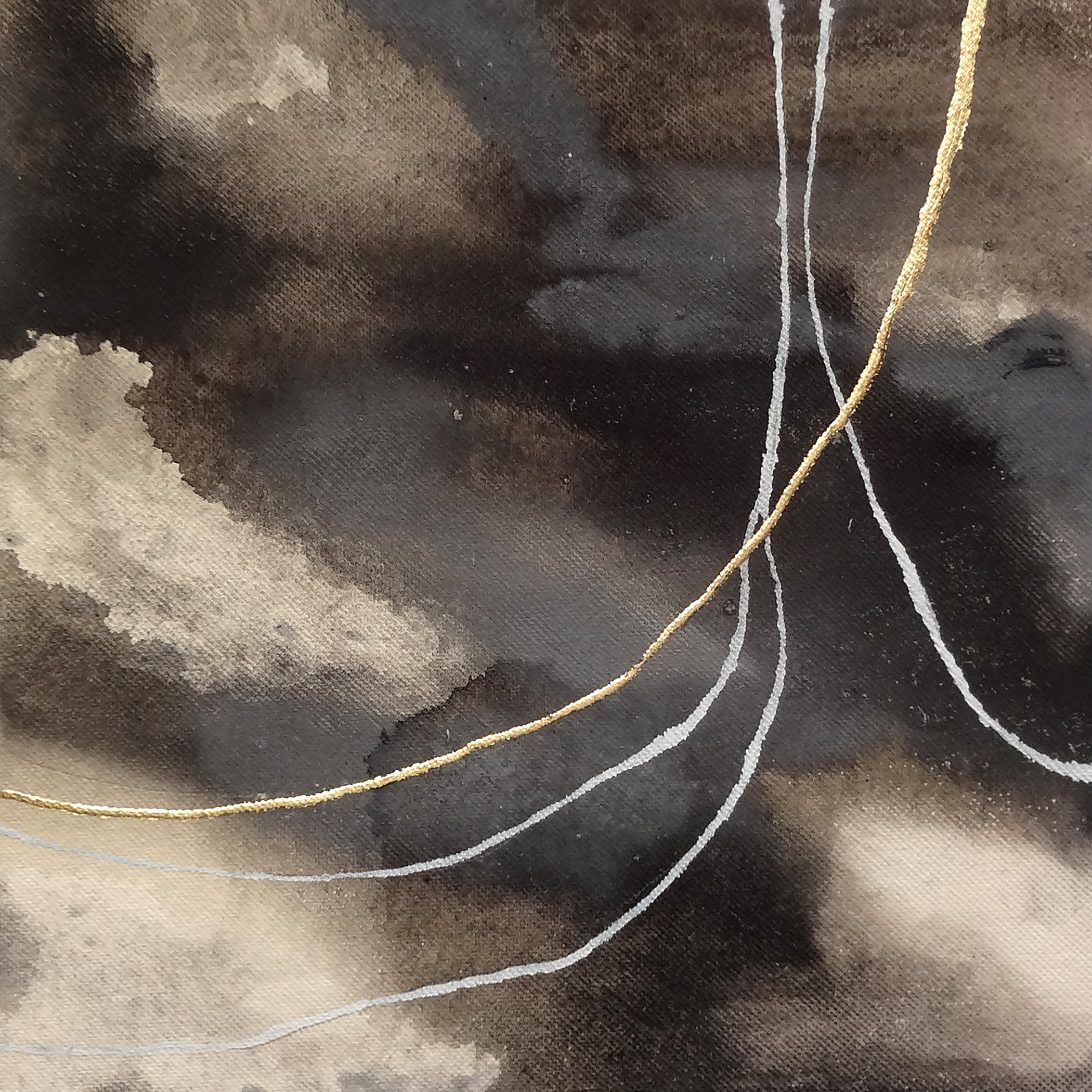 Photo 8
"Water Canvas" is one of a series of 8 on canvas by Chris Paschke, courtesy of Wild Apple.
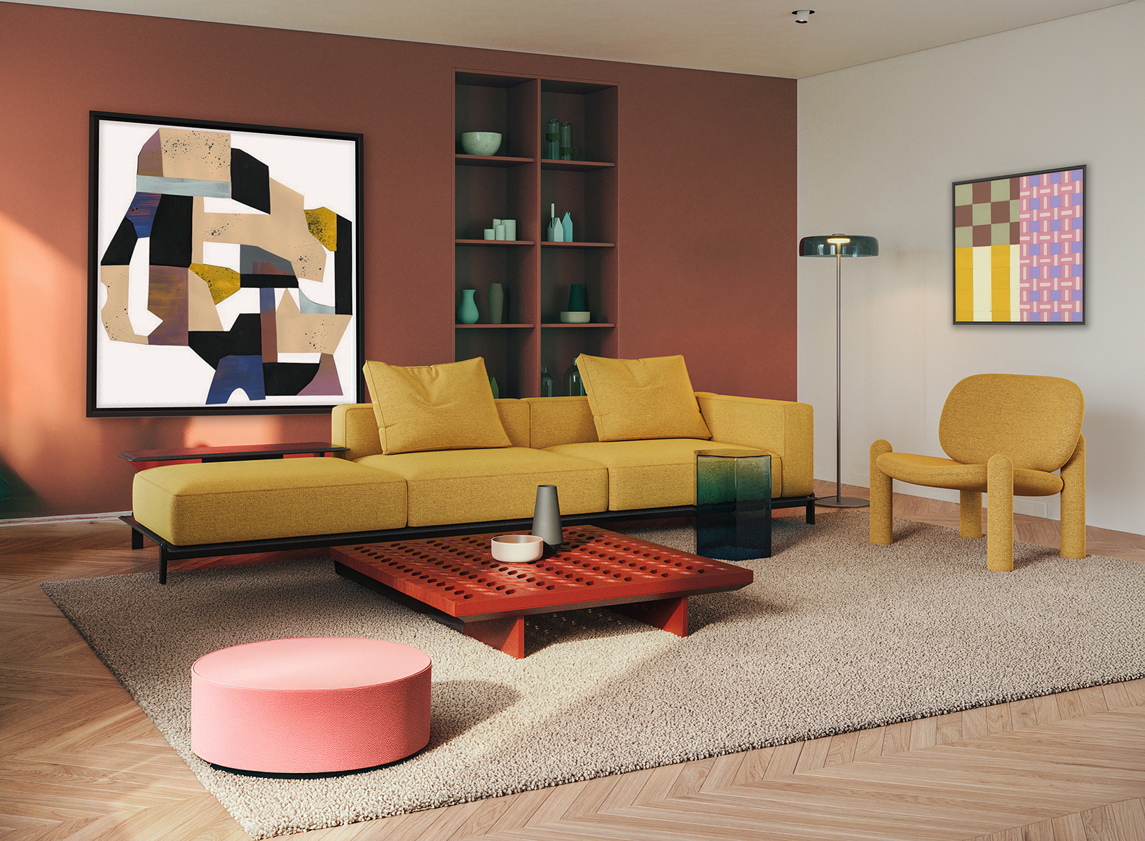 Photo 9
"Eclectic Joy" is a trending showcasing neutrals of brown, beige, tans and crème. Photo courtesy of Grand Image.
Color and Art Impacting Framing
Though wood tones and textures are surging ahead in popularity with décor trends, colored mouldings are once again popular for the new year. “In home furnishings, we continue to see a focus on individual, eclectic styles with lots of artisanal influences. Shapes and materials that have a hand-made feel without being rustic, and styles that embrace subtle, yet distinctive, decorative detailing serve as inspiration for our development of new moulding designs,” says Sue Losco, Director of Product Management, Crescent Brands.
Gold and silver remain popular as warm metallics continue to pair well with both neutral and bold color schemes.
Omega Moulding has launched their Adorno and Corona lines, the later with hints of earthy colors. Framerica is showing woodgrain in their Restoration Oak collection. Studio Moulding features traditional grain textures in their Grove and Harmony collections, and their Cascade II has finishes with a hint of metallic, while still a wood moulding. The Universal Arquati Arte collection features woodgrain, metallics and colors. Superior Moulding has their Bauhaus and Meadow collections featuring colors with sleek lines and texture. International Moulding shows their Orchard series in wood and Foundry metals with great woodgrain appearances. Nielsen's Timberline also has a grained natural for current trends.
Final Words
As an artist and framer, every year brings new inspiration and design possibilities. The continuation of warm, earthy colors of browns, greens and accompanying textures feels really good, soft, and comforting. Welcome to the New Year.
END
Copyright © 2026 Chris Paschke, CPF GCF
For more articles on mounting basics look under the mounting section in Articles by Subject.
Additional information on all types of mounting is found in:
The Mounting and Laminating Handbook, Second Edition, 2002,
The Mounting And Laminating Handbook, Third Edition, 2008 and
Creative Mounting, Wrapping, And Laminating, 2000 will teach you everything you need to know about getting the most from your dry mount equipment and materials as an innovative frame designer.
All books are available from Designs Ink Publishing through this website.
Chris A Paschke, CPF GCF
Designs Ink
Designs Ink Publishing
840 Tucker Road, Suite H-190
Tehachapi, CA 93561
P 661-821-2188
chris@designsinkart.com