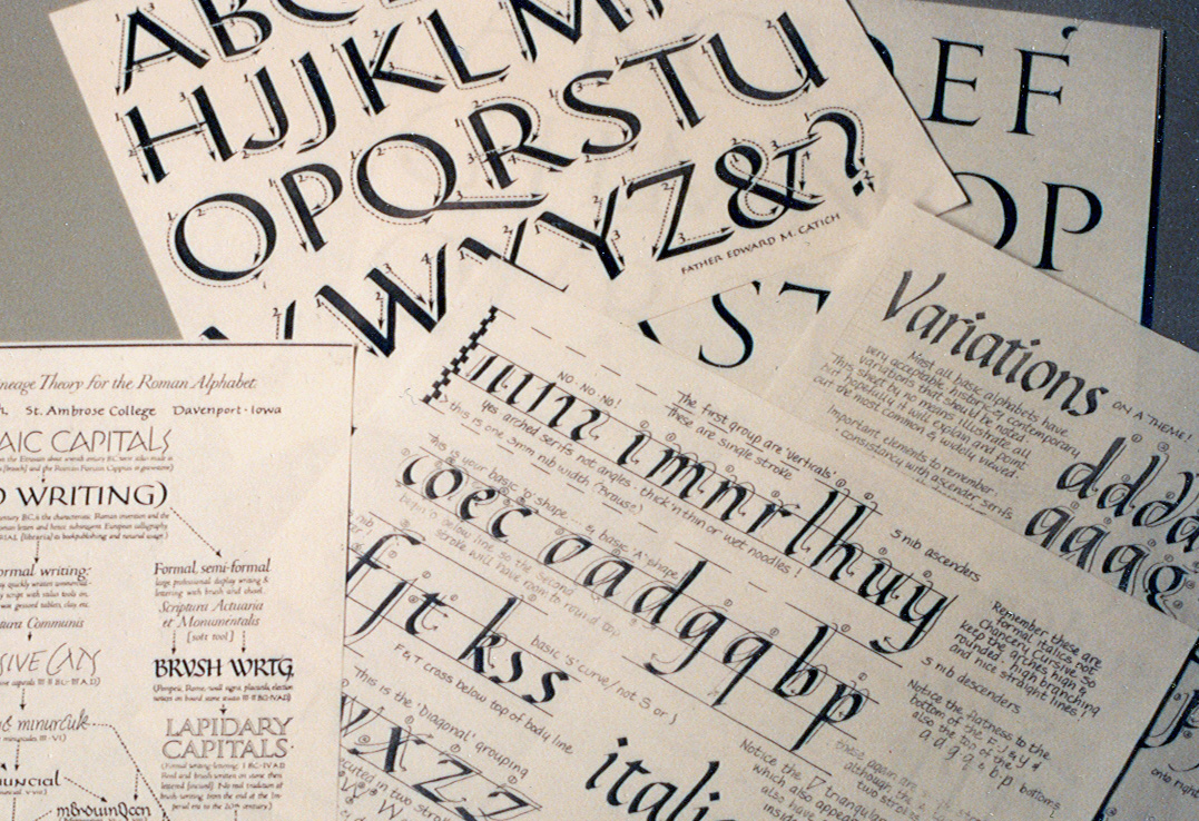
 Photo 1
Typical work sheets for class practice.
The phrase "creative designing and decorative matting" covers a plethora of variations and stimulates many exciting visual images.From the traditional beginnings of French matting using soft, translucent watercolors to machine produced marbled papers for boldly colored contemporary accent strips to rub on transfers, the concept of adding decorative surface designs to mats seems like an almost natural option for many skilled, creative framers and craft persons.
With the reemergence and public fervor for calligraphy the "art of beautiful writing" over the past fifteen years, framers have a familiar source of additional revenue and decorative mat enhancement at, quite literally, their very fingertips. The development and promotion of calligraphy within a framing operation can not only offer customers additional specialized services such as filling in blank certificates, but can also help establish the operation as one offering additional matting design opportunities above and beyond the normal scope of the double mat. This offering in itself can ultimately assist in the development of your respected reputation for filling a creative niche within the community and give you an edge on your competition.
Quality
Whether the calligraphic skills used to enhance the framed artwork are created on the premises or subcontracted to an outside calligrapher, the lettering quality must be of a professional caliber. Having been a calligraphic lettering and design teacher since 1980, I've often seen enthusiastic calligraphy students take one short, six week introductory course and feeling quite over confident either venture into the world hanging their shingle as a commercial calligrapher or as a calligraphy instructor. Granted there are many levels of skill from craft hobbyist to professional calligrapher and although an untrained eye may never tell the difference between them, make certain your offerings are always first class. A little knowledge can be extremely dangerous, and sometimes costly. It only takes one customer who does know the difference to spread discontent in your neighborhood.
The concept here is to initiate a new service and design alternative to enhance and customize the artwork for the client and create additional revenue possibilities for the framer too. If your calligraphy skills simply require a little fine tuning, dig out your tools and begin practicing again. Unless the level of proficiency of your selected calligrapher includes a large scope of historically accurate alphabets, I would suggest limiting the offered repertoire to one or two popular lettering styles...most likely a basic "formal italic" (not the more casual "cursive italic") and the standard Roman (photo 1). From years of commercial experience as a calligraphic designer I can safely say that the "formal italic" style has a cleaner, professional look than "cursive italic" and that the italic hand or variation of it has been selected by clients of mine about 80% of the time.
Photo 1
Typical work sheets for class practice.
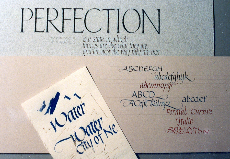 Photo 2
Test strips for size, style and color.
Contemporary variations of both italic and Roman will allow literally dozens of interpretive looks as your skills improve (photo 2). As "formal" italic implies, never lose sight of the clean professional look of crisp straight lines, deliberate curves, repetitive shapes and always remember...that one well placed, expertly executed "flourish" is far more effective than an entourage of floppy wet noodles. Every stroke or flourish must appear deliberate and intentional, even a mistake like a title slightly left of center can look dynamite if it appears to be intentional by adding an unplanned straightline flourish to the right (photo 3).
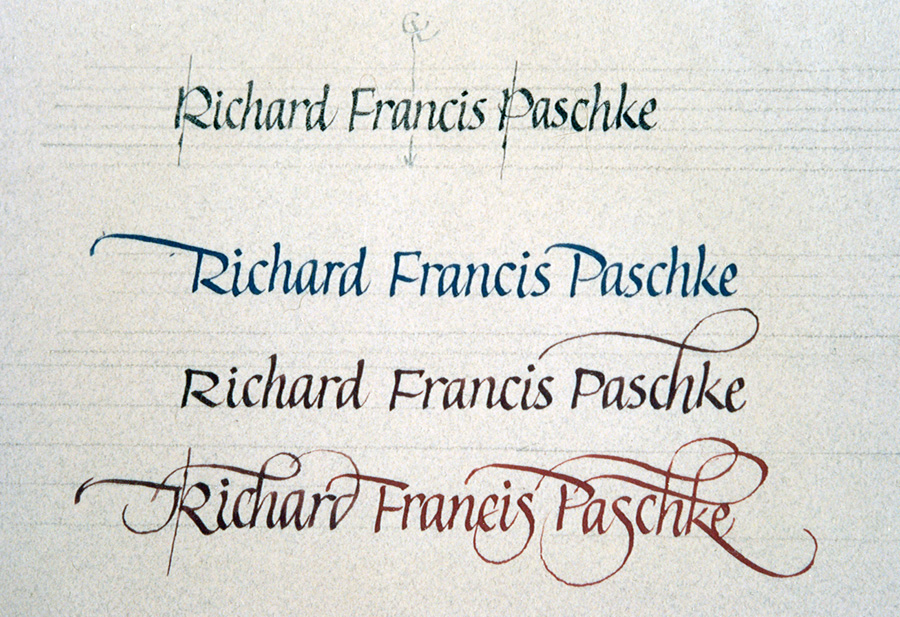 Photo 3
Italic variations
Practice Makes Perfect
Contrary to popular belief, you cannot learn lettering skills through osmosis by sleeping near your pen, you must practice a great deal to develop the fluidity and intuitive understanding of any alphabet and always totally master one form prior to attacking a new one. Each historic form has specific elements of structure including letter height, slant, pen angle, body shape and spacing unique to itself and they must be identified and understood in order to create the visual movement and life required in successful lettering. You should be at a point where the individual letter construction is purely instinctive and you need not follow a master sheet or guide book to remember how the letter should look. In order to avoid potential mistakes you must be able to concentrate on the spelling of the words not the structure of the letters themselves.
Though I will point out a few of the specifics to be better able to identify lettering styles and quality I am not attempting to teach calligraphy here but rather what to do with it instead. There are a great deal of fine calligraphy instructors around the country and generally by contacting your local "calligraphy guild" you can either locate classes or a qualified calligrapher to do the commission lettering for you.
Materials
Tools are varied depending upon individual jobs and their specific requirements, but the initial investment is rather small. You are only as good as your tools so work with dip pens not fountain pens and keep your nibs (pen points) clean (photo 4). Other supplies and materials used for calligraphy in relation to picture framing should maintain the same quality of lightfastness and permanence already demanded for fine art calligraphy in general. Calligraphy for reproduction is entirely another issue and long term permanence there is not required. If working with a professional calligrapher or lettering artist make certain they are using reliable fine art pigments such as gouache ("Gouache", PFM March 1992), sumi stick or tested commercially lightfast inks. Most fountain pen inks are fairly light fugitive (will fade) as well as quite translucent (can be seen through), which may not reflect or produce the desired color tint as opposed to the controllable opacity of gouache (photo 5). Also remember that gouache may be mixed to create essentially any color and consistency to match the framing requirements. Pigment may therefore be mixed for both ruling pen lines and lettering for the same mat.
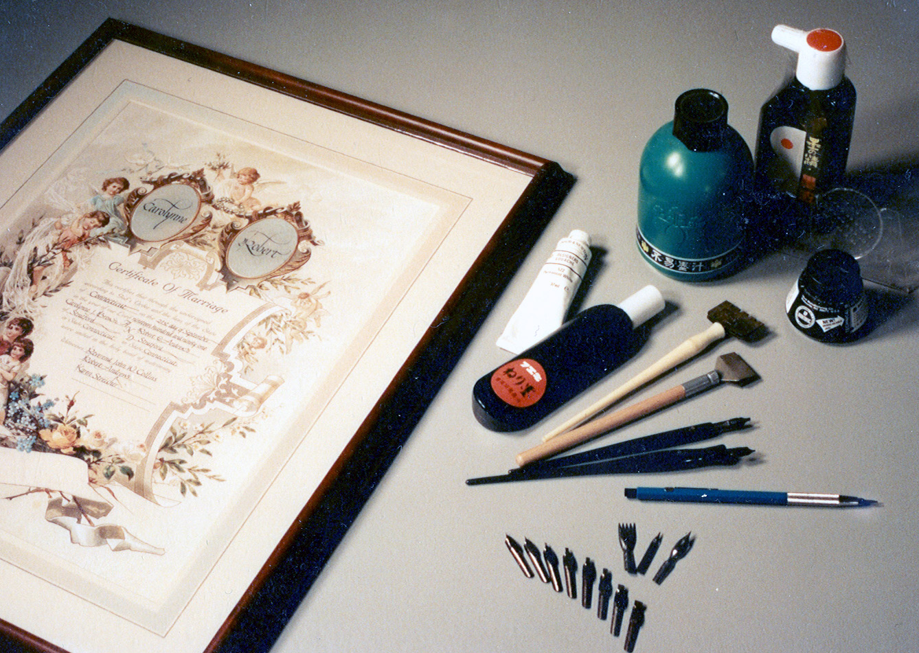 Photo 4
Inks, Ames Lettering Guide, Ink Concentrate, assorted steel nibs and wide pens.
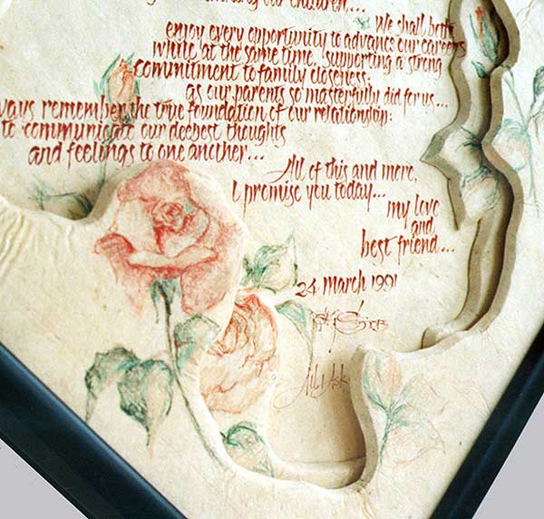 Photo 5
Detail shot of an anniversary commission piece including free form wrapped foam, gouache and Prismacolor pencils. Framed with Larson-Juhl black/red Hokito moulding.
Pricing
I'm not going to set hard and fast rules but I will give a few guidelines. It will matter whether you are able to execute the lettering yourself or if you need to subcontract a professional calligrapher. Calligraphers are often artists looking for ways to work out trade arrangements with local professional framers too so don't hesitate to negotiate. Charging either by estimated shop time, say ½ to 1 hour for the job or by the letter are both ways of coming up with a price. I personally always work by the hour, with a $10 minimum for a single word or name and always charge an additional $5 per color for any color mixing. The actual cost of the materials is almost nothing so it becomes almost a flat rate service charge. Plus, the color charge is for every color used, even if all you do is add a dab of white to tint out the originally mixed brown to a tan for a second word or date...if it dries to detectably a different color...it is a different color and another $5 must be charged for each new color.
As in the theory of beginning with a triple mat suggestion in order to achieve at least the double mat job, such is the case with calligraphic colors. Never suggest black when it's so very easy to sell a Havanna Lake for the family surname with a tinted Dusty Rose (Havanna Lake straight from the tube mixed with a dollop of Zinc White) for the dates. The calligraphic additions may take only ten minutes to write, will cost pennies and you can charge at least $20.00 ($10 base + $5 Havanna + $5 Dusty Rose) for the accents to the base mat price.
Never suggest black when it's so very easy to sell a Havanna Lake for the family surname with a tinted Dusty Rose (Havanna Lake straight from the tube mixed with a dollop of Zinc White) for the dates. The calligraphic additions may take only ten minutes to write, will cost pennies and you can charge at least $20.00 for the accents ($10.base + $5.Havanna + $5. Dusty Rose), to the base mat price.
Although this is a service for your clients it's first of all meant to be a profit maker for you. Samples are a must! Framed photos on your walls, albums of previous jobs, and most of all simply remember to suggest it! If you don't try to sell it, it probably never will sell.
In "Calligraphy For Framers" PART TWO: CREATIVE APPLICATIONS I will illustrate an evolutionary development of straight calligraphy using wet pigments into interpretive cutout and hand carved variations using the "art of beautiful writing" as a starting point.
END
Copyright © 1993 Chris A Paschke
For more articles on mounting basics look under the mounting section in Articles by Subject.
Additional information on all types of mounting is found in:
The Mounting and Laminating Handbook, Second Edition, 2002,
The Mounting And Laminating Handbook, Third Edition, 2008 and
Creative Mounting, Wrapping, And Laminating, 2000 will teach you everything you need to know about getting the most from your dry mount equipment and materials as an innovative frame designer.
All books are available from Designs Ink Publishing through this website.
Chris A Paschke, CPF GCF
Designs Ink
Designs Ink Publishing
785 Tucker Road, Suite G-183
Tehachapi, CA 93561
P 661-821-2188
chris@designsinkart.com