 Photo 1
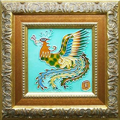
The LJ moulding with this enameled tile is reminiscent of the chinoiserie era during 18th century. The ochre ties the tile to the frame and the carved gold has the feel of the enamel details.
I once heard a home interiors radio ad that stated, "Select one of our tile designs for your new interior so that any other artwork in the room will never be noticed." As an artist and custom framer, that comment really saddened me, and for decades we have been taught to design framing to best enhance the art while allowing the art to remain the focal point.
Rhythm is the underlying principle of the universe, like a heartbeat, breathing, or the cycle of the days into seasons. It surrounds us in most everything we do, hear and see. Reintroducing similar patterns, colors, textures and shapes within different areas of a frame creates a unified feeling through rhythm, also called repetition. Rhythm is the direct result of repetition, while repetition is a method used to emphasize visual units in a marked pattern. Use of repetition does not always mean exact duplication, but rather a close similarity. Slight variations will add interest to a pattern which could quite easily become visually boring.
Color is an easy tie to create rhythm when framing. The highly decorated moulding from Larson Juhl seems an unlikely choice for the Chinese tile in photo 1, but both the colors and pattern reflect the feeling of the enameled phoenix. It's reflective of the chinoiserie era, the imitation of Chinese motifs and techniques in Western art, furniture, and architecture, during 18th century. The ochre ties the tile to the frame and the carved gold has the feel of the enamel feather details.
Photo 1
The LJ moulding with this enameled tile is reminiscent of the chinoiserie era during 18th century. The ochre ties the tile to the frame and the carved gold has the feel of the enamel details.
Types of Rhythm
There are three basic natural types of rhythm. Repetition is found in a heartbeat, alternation as the ebb and flow of the tides, and progression is visual transition as the growth of a tree trunk into branches. If portions of the whole are visually reproduced in a rhythmic manner the design will often appear well thought out rather than accidental.
The metric, mathematical beat of repetition uses the same visual element a number of times within the same composition. The use of the same moulding pattern in various weights, widths and colors as a stacked moulding creates progressive repetition between the outer moulding and inner fillet. (photo 2)
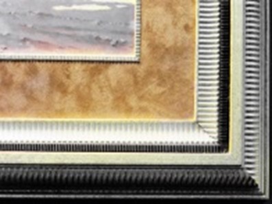 Photo 2
The use of the same moulding pattern in various weights, widths and colors as a stacked moulding creates progressive repetition between the outer moulding and inner fillet.
The use of spatial repetition can create an alternating rhythm by a recognizable repetition as one with a visual accent instead of beated similarity. An example of literal alternating rhythm was created between the petal flower and the double line design in the moulding replicated from the artwork. (photo 3) Take care with literal repetition such as this for in some cases it might be considered copyright infringement rather than harmless design enhancement.
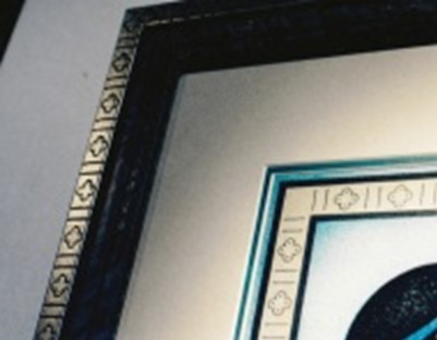 Photo 3
Alternating rhythm was created between the four petal flower and the double line design in the moulding replicated from the artwork. Frame design courtesy of Arquati Moulding.
A sequential change during repetition—as with the size variation between tree trunk into branches—establishes progressive rhythm. Sizes can grow, shapes can evolve from round to octagonal, and colors can gradually fade from gray to green all framing illustrate uses of a progressive repetition. (photo 4)
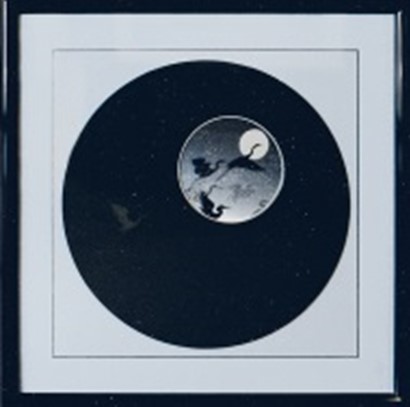 Photo 4
Rhythmic progression is seen here as the moon in the artwork is echoed by increasingly larger circles within the design. Although the v-grooved square creates contrast, as well as a transition from circle to square, it reflects the tension between the moon and mat and visual concentration remains on the image. Photo courtesy of Ray Dwyer.
Rhythmic progression is seen as the moon in the artwork is echoed by increasingly larger circles within the design. The v-grooved square creates contrast as well as a transition from circle to square, while visual concentration remains on the image. The graduated circles visually draw the eye down into the smallest inner circle, the moon, within the print.
Simple Rhythm
Dynamic use of rhythm and repetition are frequently found in successful framing designs. Each portion of the design must hold its proper portion of visual dominance or attention, known as emphasis, and to get a viewer's attention a featured portion needs to be in contrast with its surrounding area. But take care, too much repetition may also become visually fatiguing and chaotic.
Rhythm may be simple or complex in nature. Both are strong design statements using repetition with a great deal of visual focus while only being an example of simple rhythm. Simple rhythm involves the repetition of only one portion of a motif from within the artwork for continuity and emphasis. That does not mean it cannot remain a dominant visual element. A perfect example of simple rhythm is the reintroduction of the pattern from within the art into the frame design is with this 21" x 18" photo of Bigby Bridge framed with LJ 400370 Brimfield Café Mocha. The scooped pattern of the moulding emulates the arched structure of the actual bridge wonderfully tying it together. (photo 5)
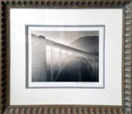 Photo 5
Bixby Bridge framed with LJ 400370 Brimfield Café Mocha. The scooped pattern of the moulding emulates the arched structure of the actual bridge wonderfully tying it together.
Complex Rhythm
Composite complex rhythm uses two or more recurring measures which exist simultaneously as a complex variation with a particular accent. This is the most common type of rhythm found in framing design as seen in photo 6 with more complex imaging of the texture, color and arched motif of the columns, replicated in the elaborately created mat. This design by Arquati Moulding successfully uses color, texture, intensity and rhythm in a dynamic presentation. It accomplishes a dominance of one basic visual idea, by creating a feeling of an overall harmonious relationship.
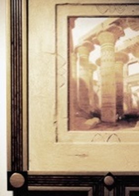 Photo 6
This is an excellent example of composite rhythm which replicates the colors, texture, and shapes from within the art onto the mat boards. Framed artwork courtesy of Arquati Moulding.
The stacked frame in Gondola (photo 7) uses the high gloss Larson-Juhl 125980 Biltmore Billiard black lacquer fillet under the frame lip of a LJ 406CS aged silver leaf scoop moulding to add a tactile texture that emulates the feel of the bow of a 20" x 17" gondola signed photograph. Though not an exact replica of a pattern in the photo, it uses the essence of the boat design for the reintroduction of rhythm without being a literal copy.
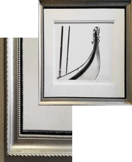 Photo 7 & detail
Larson Juhl 125980 Biltmore Black fillet stacked with LJ 406CS aged silver moulding beautifully picks up the black edging of the gondola in the exterior frame
Manufacturers and Rhythm
Use of texture is another visual form of introducing rhythm into a design. Suede boards are a subtle and profitable way to introduce repetitive textures into the framing. Once reserved for polished, high-end art and framing, suede has a mottled, soft tactile and visual appearance that works well with earthy photos and landscapes. (photo 8) It easily draws the eye into the foggy brushy landscape helping connect the framing to the image.
"If a customer doesn’t know you have fabrics as an option then you have already made the decision for them to use traditional mats. Why not start by getting away from plain surface paper mats and try using fabric-covered mats to instantly increase your frame’s appeal? Fabric mats are anything but ordinary. When used correctly, the subtle textures and warmth they add instantly elevate a custom frame from ordinary up to, and including, spectacular! Fabric mats now come in every color imaginable, and run the gambit of rustic to contemporary," says Alan Yaffe, Peterboro Matboard. He continues, "For this reason Peterboro recently released one of the largest single launches of fabrics in the history of our industry."
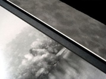 Photo 8
The tactile and visual textures of suede boards allows them to work well with high end sophisticated period looks as well as mottled landscape photography.
Copyright vs. Trademark
Copyright is a form of intellectual property law that protects original artwork. When visual art is created—paintings, drawings, photographs, sculptures—copyright begins immediately upon completion of the art. The only person allowed to copy or modify that art is the artist, and ownership of the copyright stays with the artist even after selling it to a collector. The new owner does not have rights to make prints or sell copies unless express permission in writing has been obtained.
Copyright in picture framing can be a bit of a gray area. Use of visual and recognizable elements of art without artist or publisher permission could be considered infringement. The copyright holder is typically the art's creator, publisher, school, company, or business to whom copyright has been legally assigned. That doesn't mean you are totally excluded from using the image or desired element, but rather permission must be obtained prior to including it in the design.
A logo or trademark is any photograph, word, or symbol used to identify a brand, service, or product. Permission must be obtained to use a logo unless it is for editorial or information purposes. Trademarks differ from copyright in that merely printing someone's logo doesn't automatically mean an infringement has occurred, and most logos are not protected by copyright law. Use of repetition and rhythm in design through literal copying and recreating a logo, symbol or tracing can easily cross into copyright infringement even if only used to tie a design together. Finding a familiar rhythm from within is always a better design replication than use of a traced pattern.
Final Beat
Exact replication does not tie a design together and could be illegal. Use of the essence and repetition of a detail from within the art can visually connect the art and framing without being literal. If the desired shape, pattern or texture were introduced into another frame would it visually be linked to that specific art and if not it is simply the repetition of a pattern. But if it stands alone as an identifiable entity--a logo, marketing symbol, or trademarked item, it could be copyright infringement.
Within art, rhythm cannot be added to an artistic or visual composition, it must be implicit in the process of creation and in the experience of the artist during that process, meaning, it cannot be added after the fact...like a dab of blue paint. In framing, rhythm should become a principle that naturally finds its way into successful designs. It aids in establishing balance, emphasis and the unity any design should be striving for.
END
Copyright © 2019 Chris A Paschke
Resources—Items
http://larsonjuhl.com—Brimfield, Biltmore
http://peterboromatboards.com—Fabric Matboards
http://universalarquati.com—Mouldings
For more articles on mounting basics look under the mounting section in Articles by Subject.
Additional information on all types of mounting is found in:
The Mounting and Laminating Handbook, Second Edition, 2002,
The Mounting And Laminating Handbook, Third Edition, 2008 and
Creative Mounting, Wrapping, And Laminating, 2000 will teach you everything you need to know about getting the most from your dry mount equipment and materials as an innovative frame designer.
All books are available from Designs Ink Publishing through this website.
Chris A Paschke, CPF GCF
Designs Ink
Designs Ink Publishing
785 Tucker Road, Suite G-183
Tehachapi, CA 93561
P 661-821-2188
chris@designsinkart.com