 Photo 1
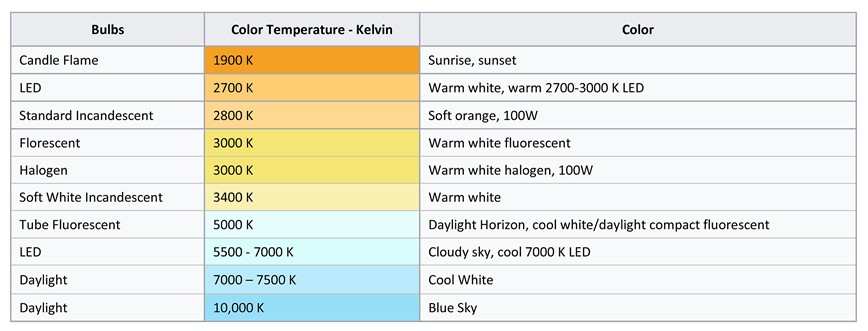
Lower Kelvin numbers mean the light appears more yellow; higher Kelvin numbers mean the light is whiter or bluer.
Placing a pop of color in an otherwise neutral room of gray, white or brown has been an interior design trend for over a decade, and it continues to be strong. It can be in a vase, the flowers in a vase, an accent throw pillow, or the frame on the wall, but it's that pop of color that can unify the room by creating a focal point and giving the eye a place to rest in a sea of neutrals. A pop of color in framing is generally the reintroduction of a color from within the art as an accent or color tying the image to the framing, and in-turn the room it may be displayed in.
But…in order to see color, there must be light. White light is the mixture of many wavelengths, which refract through a prism into separated bands or spectral hues of color. We see a red apple because all spectrum colors are absorbed while red is reflected back for our eye to see. Red light intensifies the reflected red color while a green light on that red apple will reflect black having no red in it to reflect back the actual color. Understanding color theory of light helps with the understanding what light sources should be used to control color temperature.
Color and Light
The lighting source is a dominant element in the selection of color in framing and display. In a perfect world the lighting used at the design table should be the light that will showcase the displayed art once framed. All light has a color: sunlight, incandescent, fluorescent, daylight fluorescent, halogen, LED, which all impact colors once framing. Basic incandescent light—a traditional light bulb—is a warm red-yellow light. Florescent lights were traditionally cool blue, but are also available as color-balanced, daylight and warmer colors. Halogen lights are a white light favored for track lighting, desk and floor lamps. (photo 1)
Photo 1
Lower Kelvin numbers mean the light appears more yellow; higher Kelvin numbers mean the light is whiter or bluer.
LED (Light Emitting Diode) is an electronic semiconductor that emits light. They are smaller in size, energy efficient, last longer, contain no harmful toxins and are brighter then the standard incandescent or halogen light, but selecting the right color LED temperature can be challenging. Color Rendering Index (CRI) is a quantitative measure of the ability of a light source to reveal the colors of various objects faithfully in comparison with an ideal or natural light source on a scale from 0-100. Light sources with a high CRI are most desirable for museums, for color art restoration, and picture framing. The average LED typically scores from 75-85.
Kelvin
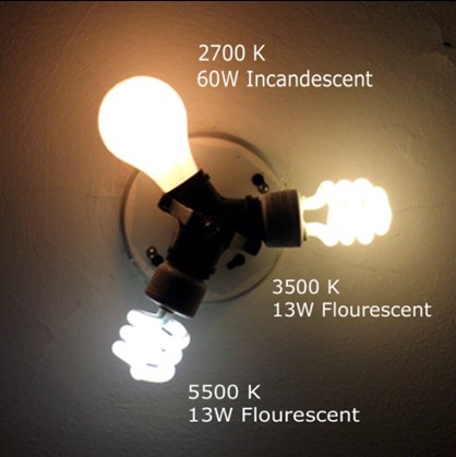
Color temperature is a characteristic of visible light that has important applications in area lighting, photography, interior design and framing. Color temperature is expressed in Kelvin (K) as a unit of measure for absolute temperature. Color temperatures over 5000K are cool colors emitting a bluish white, while lower color temperatures 2700–3000K are warm colors emitting a yellowish white through orange-red. (photo 2) Current LED color temperatures range from 2,500 to 6,500K.
Corinne Ferrara, Director of Marketing, Framerica Corp. shares exciting news about their Kelvin program. "Our newest initiative deals with interior lighting, which is oftentimes specified in great detail within hospitality and healthcare. Framerica’s "Kelvin™" program aims to help designers anticipate the ideal lighting for our products and how others goods might shift or react to the lighting temperature within the environment. The light temperature impacts both the look and mood of an environment. Framerica is the first moulding supplier to offer this information and we have made it available for our entire product line."
The difference between warm and cool colors was first observed in landscape light as warm colors associated with daylight or sunset, and cool colors associated with a gray or overcast day. Warm colors are often said to be hues from red through yellow while cool colors are often blue green through blue violet. Warm colors seem to advance while cool colors tend to recede; and in interior design warm colors may stimulate the viewer, while cool colors calm and relax. For lighting commercial building interiors, it is often important to take into account the color temperature of illumination. A warmer light is often used in public areas to promote relaxation, while a cooler light is used to enhance concentration, as in schools and offices.
Using Color
With the colors of the year running the gamut from Ultra Violet to Caliente to Oceanside it is no surprise that manufacturers have followed suit with colorful new mouldings to go with new trendy interiors. Kevin Mitchell, Specialty Matboard supports this idea saying, "We do see pops of color in the wholesale sector; custom framing, sports memorabilia and children art, all lends itself to bold colors. Although neutrals are prevalent in the market, there is still a need for striking color which may provide the perfect accent for the items framed."
Bella Moulding introduced two colorful lines Bambu and Raku for winter 2017. Bambu is a ¾" hardwood cap profile in nine soft, trendy colors. While Raku is a modern collection in assorted profiles ¾" to 2½" wide in six colors with a rich, textural, hand finished appearance. Presto Moulding and Frame also announced their Sprinkles collection of ¾" whimsical Pantone colors with grain character earlier this year. (photo 3) Omega Moulding features two colorful collections: their ½" x ½" Prism in eight colors; and Pop! with three profiles including floater, ¾" and 1¼" scoop in five colors and black.
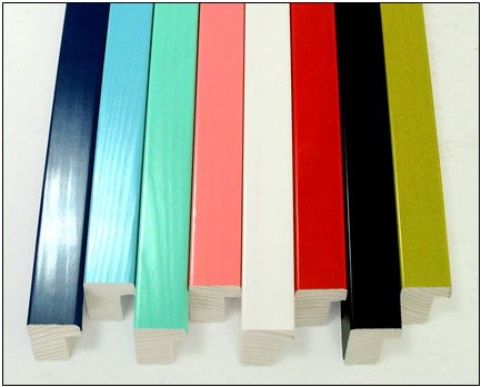 Photo 3
Presto Moulding and Frame announced their Sprinkles collection of whimsical Pantone colors with grain character.
Applying the Pop
The introduction of a pop of color may also be created through application and technique other than manufacturer products. Whether ruling pen lines, French mat panel, deep wrap bevel, decorative textural matboard, color solid core board or other surface decoration, the accent of color can pull a design together. The easiest way to reintroduce a pop of color in a frame design is by replicating the color from within the art, by tying the framing package to the art as long as the elements are respectful and never overpowering.
A Burgess Roye limited edition has ruling pen lines used by the artist within the image. To best replicate the hairline without overwhelming it is by using a technique of tiered matting called under tiering. Two sheets of Wild Poppy Mi-Teintes lightfast pastel paper are dry mounted with pure film adhesive behind the uncut window mat blank. When the bevel is cut there is a hairline reveal at the bottom of the bevel matching the color and weight of the line surrounding the Indian portrait. One sheet was too fine, three sheets were too heavy, and a ⅛" reveal bottom mat would have been overwhelming. (photo 4)
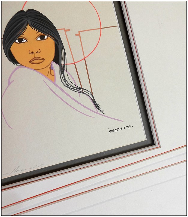 Photo 4
Under tiering adds sheets of lightfast Canson Mi-Teintes paper to the back of the mat for added hairlines in the bevel. More paper layers the heavier the line. Sample shows 1, 2, 3 sheet versions as testers.
Bevel banding and surface tiered mats also create hairlines and bands of color within the bevel when the window is cut. An antique family photo needed the texture from within to be replicated in the matboard for warmth and that was achieved by surface mounting a sheet of Canson Mi-Teintes Moonstone, a flannel textured sand color paper to a black ragmat. (photo 5) The bevel banding with pin-striping was achieved by mounting two solid core 4-ply rag boards—black and sand—layered with one sheet cream and three sheets gray between them to create the pin-stripes in the bevel. The surface sheet of Moonstone was added to the package and the whole unit was mounted at once in a 200°F press.
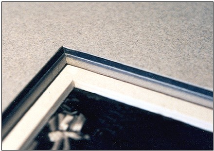 Photo 5
Bevel banding and surface tiered mats create hairlines and bands of color within the bevel when the window is cut.
Torn paper accents are a great way to introduce color as an unexpected touch of drama, whimsy, or as a visual accent. Cream Strathmore Pastel Paper is torn into strips to create a deckled accent strip which is attached to the back of the top window mat after cutting, an 8-ply rag spacer is added and ½" bottom mat reveal works well to enhance the original block print Totem Bear on sheer textural rice paper. (photo 6) A true pop of color, the frame design in PFM November 2017, "Mola: a Reverse Appliqué" features the red lip Larson-Juhl Confetti frame and a hand-painted bevel, both echoing the red lines and pattern of the original art. (photo 7)
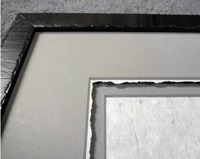 Photo 6
Torn paper added as a decorative trim beneath the bottom edge of the window bevel attracts attention and unites elements from within the art.
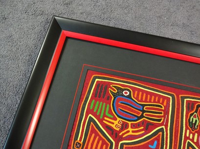 Photo 7
Featured in "Mola" the red lip Larson-Juhl Confetti frame is echoed by a painted bevel both uniting the red lines of the mola
Metallics are also colors and replicating the gold, silver or copper of today's trending art in the framing can be very impressive. The key here is to always make certain to stay within the same color family. The pale cool gold leaf (blue base gold) in the original art has been repeated by the Studio Mounding Aegis frame selection, which is of the same color family. (photo 8) Rather than using black which might have been too heavy, an ochre Strathmore 1-ply rag board is placed behind a freeform shaped, wax soaked, encaustic original in a sink mount. Use of the gold backing integrated the color of the beeswax medium and allowed for a #24-423 Nielsen Brushed Satin Antique Gold frame to unify the design. (photo 9)
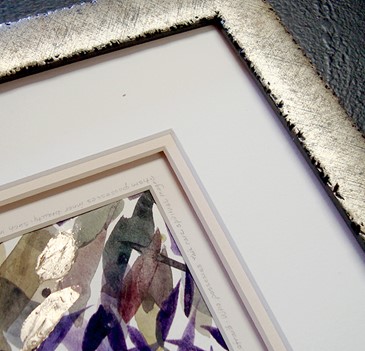 Photo 8
Replicating a metallic in the art in the frame or mat package ties the design while creating that added pop.
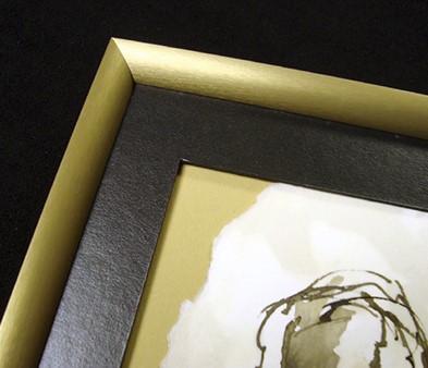 Photo 9
The ochre 1-ply rag mat behind the freeform encaustic soaked art integrated the color of the beeswax medium and allowed for a gold frame to unify the design. Nielsen #24-423 moulding.
Another use of a contrasting accent is the Kinder 1-ply, pale green, metallic strip behind a wide v-groove panel mat opening. (photo 10) Lifting the top mat with a spacer adds drama, texture, intensity, and color while creating a transitional resting place between the inner art and the outer frame. This is particularly valuable as a design tool when the art has textures or colors that cannot be matched by commercial mats, frames or other materials. This accent strip—as with deep wrapped bevels—may be made from fine art and decorative papers that are lightfast and lightweight enough for manipulation.
 Photo 10
Adding a contrasting accent strip behind a wide v-groove panel mat opening and then lifting the top mat with a spacer adds drama, texture and color in this sample.
Final Thought
Using color for impact, impression and as a tool for unification is all part of great frame design, but if you can't see the color, it can't pop. In the 21st century of advancement and technology nothing stays the same and since lighting continues to be the most variable factor in framing and color selection we must pay close attention. Any time a design is created under a different light source than it will be displayed under the colors will change and a good design may become a disappointment. The design may not be the framer's fault, but not discussing their lighting source probably would be.
Watch for the new WCAF 2019 Design Elements: Pop of Color, the class is the natural progression of learning more about color and design following in the footsteps of DE: Understanding Color and DE: Shades of Gray.
END
Copyright © 2018 Chris A Paschke
Resources—Items
http://bellamoulding.com—Bambu, Raku
http://framerica.com—Kelvin™ program
http://larsonjuhl.com—Confetti
http://omegamoulding.com—Prism, Pop!
http://prestoframe.comSprinkles
http://studiomoulding.comAegis-Pewter
http://nielsenbainbridge.com—Metal frames, Profile 24
Bibliography
LED Corporations. "What Is Kelvin And CCT", 2013.
George, Chris. Mastering Digital Flash Photography: The Complete Reference Guide. Sterling Publishing Company, 2008.
Petluri, Raghuram and Roger Sexton. "LED Usage in Museums and Art Galleries", 2010
Wikipedia, "Color Temperature", https://en.wikipedia.org/wiki/Color_temperature
Wikipedia, "Color Theory", https://en.wikipedia.org/wiki/Color_theory
Yerocus. Wikipedia. https://commons.wikimedia.org/wiki/File:Incand-3500-5500-color-temp-comparison.png. Public domain.
For more articles on mounting basics look under the mounting section in Articles by Subject.
Additional information on all types of mounting is found in:
The Mounting and Laminating Handbook, Second Edition, 2002,
The Mounting And Laminating Handbook, Third Edition, 2008 and
Creative Mounting, Wrapping, And Laminating, 2000 will teach you everything you need to know about getting the most from your dry mount equipment and materials as an innovative frame designer.
All books are available from Designs Ink Publishing through this website.
Chris A Paschke, CPF GCF
Designs Ink
Designs Ink Publishing
785 Tucker Road, Suite G-183
Tehachapi, CA 93561
P 661-821-2188
chris@designsinkart.com