 Photo 1: Symmetrical Balance
An example of approximate symmetry the art and framing give the illusion of a somewhat mirrored image by varying the two sides to maintain viewer attention. Framing courtesy of Ray Dwyer.
In PFM "Design Elements: Design 101" the framing elements were discussed as line, color, texture, shape, intensity, space, and framing factors as balance, proportion, emphasis, and rhythm. Together they make up the principles—or fundamentals—of frame design. The structural elements are used to control, organize and integrate a design, but since factors are often referred to as the organizational principles they need further discussion.
Factors are the binding qualities or the mortar that hold building block elements together. They are guidelines developed to assist in creating more harmonized designs and are the physical organizers that can make or break a design even when the perfect colors and textures have been selected. If the balance or proportion of the presentation is off, or there is an element that throws the eye out of the frame without pulling it back in, the design will never hold together.
Balance
Balance is necessary for survival in life with inhaling balanced by exhaling, and activity balanced by sleep. Structural balance is identified by the actual equilibrium of an object, and equilibrium establishes coherence. It is sometimes defined as the mathematical relationship of parts to one another within the whole. A building without structural equilibrium—balance—may not be able to support its own weight. As equality in weight or attraction to other visual elements, balance is possibly the strongest unifying principle.
Visual balance is the illusion of equilibrium, the aesthetic quality of balance. It is not a matter of whether it will fall over as much as whether it gives the impression of being well proportioned, aesthetically pleasing, and able to stand alone. If visual balance is missing, we feel uncomfortable. Any composition where all prominent shapes and masses are on one side might appear lopsided unless the opposing side has adequate visual interest to compensate. Other elements such as space, line or color may be used to counter-balance this visual weight using a large area of strong negative space. Like a building, a frame design lacking visual balance would likely fall apart.
Symmetry, Asymmetry, Radial
The feeling of equality as weight, attention or attraction to other parts within the frame, and is identified as symmetry, asymmetry, and radial balance. The visual weight of symmetrical balance is perfectly even on each side of an imaginary center line of an image. Since art is rarely a mirror image, most art falls under the cloak of approximate symmetry. (photo 1) By slightly varying the two sides of the axis to hold viewer attention the sides are similar enough to stimulate the feeling of exactness, while remaining sufficiently varied to prevent visual monotony. (diagram 1).
Photo 1: Symmetrical Balance
An example of approximate symmetry the art and framing give the illusion of a somewhat mirrored image by varying the two sides to maintain viewer attention. Framing courtesy of Ray Dwyer.
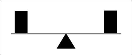 Diagram 1: Symmetrical
Symmetrical balance is perfectly even on each side of an imaginary center point.
Asymmetrical balance is created by arranging elements that visually balance either side of a central line. Any time weight is changed on one side, an adjustment must be made to compensate on the other, just as a heavier child must sit closer to the pivot of a seesaw to compensate for a lighter child on the opposite end (diagram 2). The art and framing in photo 2 are asymmetrical, but the visual balance is off. A slightly wider mat border to the left of the duck stamps would have given more space and better balanced the design.
 Photo 2: Asymmetrical Balance
The art and framing are asymmetrical but the balance is off on the left. A wider mat boarder to the left of the duck stamps would have given more space and better balanced design. Courtesy of Ray Dwyer.
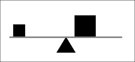 Diagram 2: Asymmetrical
Asymmetry balances by compensation on either side of the center point, just as a heavier child must sit closer to the pivot of a seesaw to balance a lighter child on the opposite end.
Radial balance creates forces identical in strength and character from one centralized focal point, like a wagon wheel (diagram 3). This often creates a visual circular movement adding another dimension to somewhat static symmetry. Photo 3 shows a deeply padded, dimensional, fabric lined, shadowbox for an antique circular hand crochet doily, as a perfect example.
 Photo 3: Radial Balance
Radial balance creates forces identical in strength and character from one centralized focal point, like a nautilus shell or wagon wheel. This deeply padded 3D fabric lined shadowbox reinforces the circular hand crochet doily.
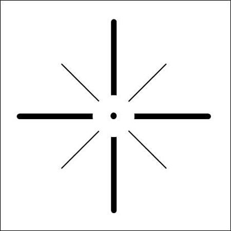 Diagram 3: Radial
Radial balance surrounding one centralized focal point, like a nautilus shell or wagon wheel creating a circular movement.
Proportion
Proportion is the relationship between parts determining how much space an item occupies and how large or small it is in relation to its surrounding area. There are no rules for correct mat widths or framing proportions but it remains the mortar holding elements together. The easiest way to control proportion is to vary the widths of materials and decoration. Never design the mat to echo the same width of the moulding, or an inner fillet to mirror the liner mat width beneath it. Whenever surface panel designing, be it dry pigments, ruling pen lines, v-grooves or glass etching, always varying widths, and don't crowd.
In photo 4 Peggy Lou, the inner liner mat and top mat together are definitely wider than the 2" moulding, but the surface decoration on the top mat creates the illusion of the mat actually being the same width as the frame, making the design feel out of proportion and the frame too wide for the small photo. Right colors, wrong proportions.
 Photo 4: Bad Proportion
The surface decoration on the top mat creates the illusion of the top mat actually being the same width as the frame, making the design feel out of proportion.
Art establishes a scale from which all framing proportions should originate and by varying widths of frame, fillet, mats, mat reveals, and space a frame design remains visually interesting. In framing it is important to understand scale in relation to proportion. Large floral patterns will appear larger when contained within a smaller, confined space. The pattern and scale of patterned fabrics won't change in a confined space, but the proportions of the pattern to the space will appear different.
Border Variations
The concept of weighting the bottom of a mat originated during a period when art was hung from long wires from the top of 14'-20' walls which tipped them forward. Widening the bottom border visually compensated for the sightline problem blocking some of the mat bottom, creating the illusion of same border width. Unusual contemporary widths demand proportion to be a counted principle.
Designs like the signed Cibachrome of Gwen Walker-Strahan required a wider liner mat to allow for the title and signature to be visible. The original mat is a 4¼" cream 4-ply rag mat with a v-groove ½" from the window. A ³⁄₁₆" spacer was added between the original and the new double mat of 2¾" Strathmore pink 4-ply rag and 2½" custom 8-ply under tiered, cream, rag top mat with multiple layers of brown and neutral cream mounted to the back showing up at the bottom of the bevel. (photo 5) The brown under tiering was added to help pull the eye into the photo of the Grand Canyon walls which have brown, pink and coral striation layers.
 Photo 5: Proportion Solution
This Cibachrome of Gwen Walker-Strahan required a wider liner mat to allow for the signature. The liner featured a v-groove already, so the double mat addition was a an under tier top with Strathmore pink 4-ply rag.
Asian Proportions
The elongated and contrasting use of border widths reflects the influence of traditional Asian scrolls as is often referred to as Asian proportions. These are most often selected in Western framing to reinforce and maintain a long thin appearance once framed. If a long rectangle is framed using the same border widths on all four sides it will reduce the visual impact of a narrow long image making it appear more rectangular. (diagram 4) Image left illustrates same border widths on all sides that detracts from the art elongation while use of Asian proportions (right) with narrower sides, wider top and bottom enhance the natural 1:3 ratio of the art.
 Diagram 4: Proportion
Image left illustrates same border widths all sides that detract from the art elongation. Asian proportions (right) of narrower sides, wider top and bottom enhance the natural 1:3 ratio of the art.
Emphasis
The physical positioning of elements for visual concentration—focal point—within the frame is the factor of emphasis. Emphasis may be achieved through color intensity, darkening or lightening contrast, line convergence, or simple repetition—also called rhythm. Without an obvious visual point of focus, the human eye will naturally settle just slightly above left of center to begin to observe the image (diagram 5). This location is generally where the most important figure, any critical action or the most vibrant color in a painting will appear...but any marked contrast creates emphasis.
 Diagram 5: Emphasis
The natural focal point on any undecorated surface is left and just high of center.
All designs will showcase some type of emphasis no matter how subdued. Any mark on a solid surface becomes a focal point, even a dirt mark on a mat or smudge on glazing. When more than one single spot is showcased there becomes a hierarchy of focus, where one should dominate. Remember there is no singular solution to a framing project; it is merely one solution to the design problem.
Emphasis in design is achieved most by use of the base elements line, color, texture, shape and the factor proportion. It utilizes physical positioning to control visual concentration within the space of a frame. As framers we are enlisted to create an environment for a piece of artwork, as designers we work towards visually enhancing and showcasing it in a unified manner, never detracting from or overpowering the art by drawing the eye away from it.
Eye Movement
What people think they are looking at and what they actually see are often two different things. Scientific studies have tracked eye movement and found that although we may believe we choose what we want to look at, the human eye really follows an unconscious flow taking in color, shape and details about viewed objects and their surroundings.
What we actually see is a rough overview of an image, or framed art, with one or two areas in very clear detail. We actively search out interesting visual features that have a meaning for us in a piece of artwork. As our eye fixates on tiny specific areas our peripheral vision is what fills in the rest of the rough image, and what in turn determines where our eye will be drawn next. This is also why individual visual flow within a framed piece will vary from viewer to viewer.
Final Factor
Artists and frame designers are forced to balance their designs horizontally, vertically, radially, diagonally...in all directions and positions simultaneously in order to achieve harmony or unity. It's rare an artist or framer consciously applies design principles as they work, since true design talent comes from one's unconscious mind, and a unified use of the elements and factors emerge as the design progresses.
END
Copyright © 2020 Chris A Paschke
For more articles on mounting basics look under the mounting section in Articles by Subject.
Additional information on all types of mounting is found in:
The Mounting and Laminating Handbook, Second Edition, 2002,
The Mounting And Laminating Handbook, Third Edition, 2008 and
Creative Mounting, Wrapping, And Laminating, 2000 will teach you everything you need to know about getting the most from your dry mount equipment and materials as an innovative frame designer.
All books are available from Designs Ink Publishing through this website.
Chris A Paschke, CPF GCF
Designs Ink
Designs Ink Publishing
785 Tucker Road, Suite G-183
Tehachapi, CA 93561
P 661-821-2188
chris@designsinkart.com