Color elicits the greatest emotional and expressive response of all the design elements. It directly and immediately stimulates an emotional reaction, and the viewer never needs to rationalize that response. Pleasing color rhythms and harmonies satisfy our aesthetic desires, for we individually are naturally drawn to certain color combinations while rejecting others.
Color—whether primary, secondary or neutral—contributes to setting the mood of a frame design and helps integrate the framing with the art, making color and color theory a big part of design and art presentation. The right color should enrich the image and attract the viewer’s eye, while the wrong color can detract from the quality of the art, shrink the image, and lose viewer attention.
Color Theories
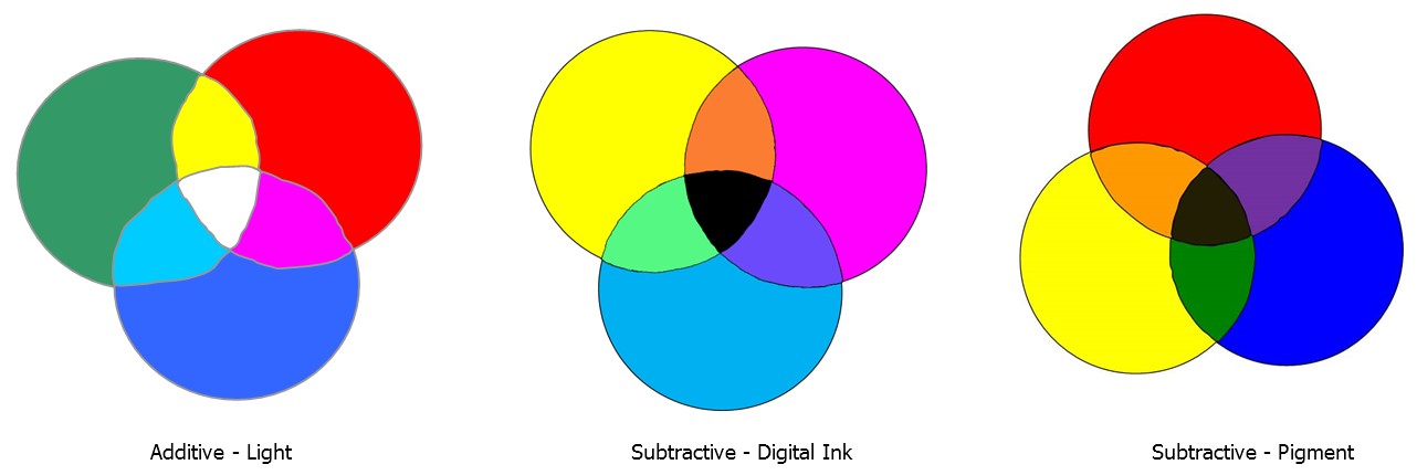
There are assorted theories surrounding the principles of color in relation to light, printing and pigment mixing. Historically there are two basic models, additive color theory—for light—and subtractive color theory—for print and pigment. There are three color primaries in each theory, but they are different. In light they are red, green, blue (RGB); in digital printing they are cyan, magenta, yellow (CMY); and in pigment they are red, yellow, blue (RYB). Primary colors cannot be made any other way, they are the starting point, and in all cases these are colors from which all other colors within the spectrums derive.
Additive color results from light emitted from a color source. The absorption of all wavelengths of light and the reflection of a particular wavelength is what allows us to see a color. In order to see a red apple all other wavelengths of light are absorbed into the apple, reflecting only the red waves, allowing us to see it as red. The three primaries are red, green, blue which when overlapped as three spotlights create secondary colors of yellow, cyan, magenta. The combination of all three when overlapped result in white space or white light, meaning the absorption of all colors with no waves bouncing off for us to see, so white light is the presence of all light wavelengths.
Subtractive color is the result of light reflected from a surface as pigment mixing and printing (digital imaging). Digital primary colors are cyan, magenta, yellow and when primaries are overlapped they subtract more wavelengths which are absorbed so we cannot see those colors. Pigment primaries are red, yellow, blue that when mixed together create black, muddy gray or brown. Unlike light waves, no amount of color mixing will ever produce white.
Color Wheel
There are a number of color theories that produce working models or wheels with 18th century work by Herbert Ives who established the wheel used by most artists, and is the one referenced in the framing industry. Wheels are valuable tools for helping understand colors and their placement in relation to each other by illustrating the spectral color hues and the resulting color from their color mixtures (diagram).
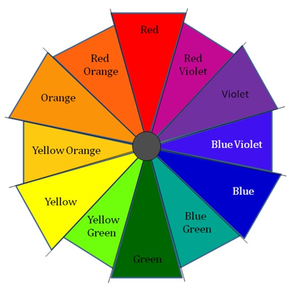
Primary colors—red, yellow, blue—are hues that cannot be created by mixing any other hues together, but from which all spectrum hues originate; secondary colors—orange, green, violet—are created by the mixing of two primaries; and tertiary colors are the blending of one primary and one secondary such as red and violet produce red-violet. Complementary colors are those opposite each other on the wheel: red/green, yellow/purple, blue/violet.
Color Properties
Every color has three basic color properties: hue, value and chroma. Hue refers to the position of a color in the spectrum as an intense pure color that has not been dulled or diluted. A red hue means pure red with no white, black or other color added. The hue of a color will change only when mixed with another pure color, for it remains a spectrum color such as red + yellow = orange.
Value is the lightness or darkness of a color in relation to a scale ranging from white to black, best understood by study of the gray scale (diagram). The gray scale shows variations in value from white to black with circles in the centers of squares as all middle gray value which appear to change against lighter or darker backgrounds. The value of a pure color is varied only when another spectrum color is mixed with a neutral, such as white to create a tint, or black to create a shade.
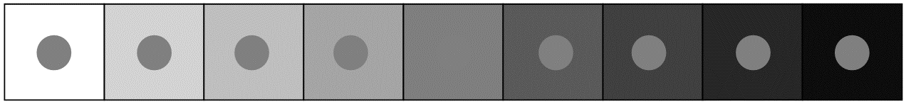 The gray scale shows variations in value from white to black with middle gray circles in the center showing value changes against light to darker backgrounds.
Chroma—also called saturation, intensity—is the degree of brightness or purity of a color. You cannot change the value of a color by tinting or shading it without changing the chroma also.
Color in the Industry
So how does understanding color theory impact framers and frame design. Manufacturers spend a great deal of time keeping up with color trends in home décor, fashion and art during product development and many will be releasing new lines at WCAF 2018. Larson-Juhl has just released their Carbon, Eiffel and Finn lines and Bainbridge has their Sherwin Williams Color Trends 2018 comparison chart which pairs up trending paint colors with current matboards in their line for the New Year.
Framerica is always launching cutting-edge lines based on color as Corinne Ferrara, Director of Marketing, Framerica Corp told me, "Color is integral in developing our products…and we realize that it’s possible to have a beautiful grain, pattern or texture with a perfect sheen and still not have a winning product if the color isn’t right." She continues, "Moulding design typically focuses on color tones that compliment or enhance. We try to focus on the delicate balance between that enhancement and the need for a moulding design to have some importance on its own – frequently through color."
Matboard also plays a big part in framing and new releases are also the result of trending colors. "What I’m seeing right now is that gray is still holding strong, although it’s warming up a bit from the cool grays prevalent in the past few years. Some interesting accent colors are emerging, such as deep, dusky violets, inky denim blues and pink…including pastel peachy-pinks, mauve…brighter cerise tones. Greens are strong, too, including saturated woodsy greens to yellow-infused greens," says Connie M. Cook, Senior Product Manager, Crescent Valiani.
Emotion and Placement
In "The Psychology of Color", Home Accents Today, September 2017, Michael Hurley discusses color in relation to emotion. "The pseudoscience of chromotherapy…can be traced back to the early Chinese and Egyptians, who believed it promoted healing." Today spas use soothing cool colors to promote feelings of calmness and tranquility; restaurants often select warm colors to energize and promote appetite.
Dark colors and shades make a room look smaller, and art appears smaller with dark mats. Interior design uses soft, light colors for furniture fabrics and carpets to enlarge the feeling of a small room, and the same is true for framing art. In diagram not only does the outer white square on the right appears larger, the white inner square on the left also does, but they are exactly the same size. Warm colors move forward while cool colors visually recede to the background, meaning a narrow red liner will become visually dominant as it moves towards the viewer while a cooler mauve or blue liner will recede into the picture.
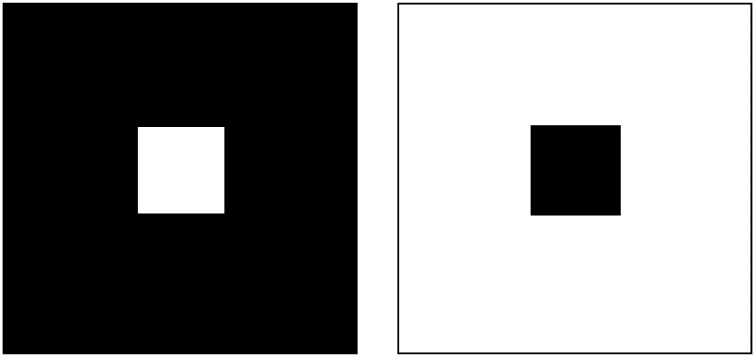 Not only does the outer white square on the right appear larger, the white inner square on the left also does, but they are exactly the same size.
Color in Frame Design
Color has a number of fairly specific purposes in design. Obviously, emotions may be stimulated by the use of color, and warmth or coolness may be created, but there is more. Never use color for its own sake, or to match the sofa, but always as a tool for creating a feeling and integrating with the art. Color may be used to develop a connection between the frame and art through visual recognition, such as a color in the art that is enriched by a moulding or mat color.
Selecting colors of the same base family (RYB) helps create a unified design such as a yellow based gold notary seal on a certificate, matted with a yellow gold liner mat, and yellow gold highlighted moulding. Don't mix red or green based gold with yellow based gold unless there is more of that color in the art. Yes, metallics are every bit as color based as the color wheel hues.
When discussing how manufactures keep up with trends Kevin Mitchell, Specialty Matboard explained, "A trend we have noticed…is metallic finishes. We’ve added a line of designer matboards that incorporate metallic and glitter to compliment metallic moulding finishes."
In Summary
Scientists tell us about the make-up of color composition, psychologists explain how the human eye perceives a given color and how it affects us physically and emotionally, but it's up to the frame designer to assimilate all of this information and design the most effective solution possible for every client. We are custom framers after all and should be color specialists too.
For more in-depth discussion on color theory and color in framing attend Design Elements: Understanding Color, or for a broader understanding of neutrals and how to effectively use them in framing Design Elements: Shades of Gray at WCAF Expo 2018. And watch for the second in this series "The New Neutrals" PFM April 2018.
END
Copyright © 2017 Chris A Paschke
Resources—Items
http://bainbridge.com—SW-NB Trends 2018, New Release Specifiers
http://crescent.com—Crescent Trends Brochures & Specifiers
http://framerica.com—New Release Specifiers
http://specialtymatboard.com—New Release Corners and Products
Bibliography
Bevlin, Marjorie Elliott. Design Through Discovery. New York: Holt Rinehart Winston, 1984.
De Grandis, Luigina. Theory and Use of Color. New York: Harry N. Abrams Publishers, 1986.
Graves, Maitland. Art of Color Design. 1951.
Itten, Johannes. The Elements of Color. New York: Reinhold, 1970.
Mayer, Ralph. A Dictionary of Terms and Techniques. New York: Thomas Y. Crowell Co., 1969.
Paschke, Chris A. CPF, GCF. Library, https://www.designsinkart.com/library.shtml
Puhalla, Dennis M. Ph.D, Design ELEMENTS: Form & Space. Beverly MA: Rockport Publishers, 2011.
Wong, Wucius. Principles of Color Design. New York: Van Nostrand Reinhold, 1987.
For more articles on mounting basics look under the mounting section in Articles by Subject.
Additional information on all types of mounting is found in:
The Mounting and Laminating Handbook, Second Edition, 2002,
The Mounting And Laminating Handbook, Third Edition, 2008 and
Creative Mounting, Wrapping, And Laminating, 2000 will teach you everything you need to know about getting the most from your dry mount equipment and materials as an innovative frame designer.
All books are available from Designs Ink Publishing through this website.
Chris A Paschke, CPF GCF
Designs Ink
Designs Ink Publishing
785 Tucker Road, Suite G-183
Tehachapi, CA 93561
P 661-821-2188
chris@designsinkart.com