 Photo 1
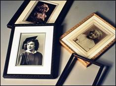
Common subject—family, no matching frames.
Family heirlooms and keepsakes are often framed over the years creating wonderful collages of periods, colors, textures and styles...a lifetime in pictures (photo 1). Sometimes the photos are brought in many at one time and the end product once hung must appear to have spanned the generations.
Photo 1
Common subject—family, no matching frames.
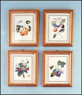 Photo 2
Consistent even spacing presents a unified traditional grouping.
Numerous articles have been written about individual frame design approaches for multiple unit groupings making them appear eclectic and evolutionary. Designing to a given room, period and color scheme can be a luxury. And sometimes even the best designed series of framed pieces—designed specifically for a grouping—can still fall apart if the space, proportion, balance, and focal point are lacking for the necessary unity to make the group work!
Yes, room colors, period or style, size of wall space are all integral in the completed presentation...but sometimes uncontrollable by the framer. What about the actual wall placement of previously completed pieces? In honor of this month's photo issue I'm going to address what goes into the design of "hanging" a wall grouping. It's not only the individual framed pieces, or even how they relate to each other I'm talking about, but the actual placement of them on the wall.
It All Begins at Work
Groupings can be featured as conversation pieces, "Wasn't she adorable as a baby?", or create a more historical period flavor for a room, as in a set of four botanicals. As retailers we know how important it is to have samples on our walls. Samples stimulate sales through viewer emotion and often create ideas for what might be achieved similarly at home. Therefore a well hung photo or artwork wall grouping is a terrific way to stimulate customer interest in clustering their own artwork. In opposition, poorly or haphazardly hung groupings may never appear as more than pieces temporarily hung until sold...as at an art fair. This will never stimulate additional grouped sales.
Space
During my June 1994 "PRINCIPLES OF DESIGN, Part Seven: SPACE" I lightly discussed the concept of space and wall groupings. Remember that "space is the distance around or between items to accent or unify the central image...both inside and outside the frame". The space between grouped pieces must give enough room for each piece to dominate it's own small visual attention while still belonging to the rest of the group. The small four part grouping in photo 2 is part of a period Victorian home. The pieces were tastefully framed and traditionally hung in good space relation to each other. They are hung far enough apart to maintain their own visual concentration, but still feel part of the larger cluster.
Too much space between images can lose its required unity. This is what may appear to have occurred in the close-up of the grouping in photo 3, the frames appear too far apart. If this were a small wall with an average 8' ceiling the space would be too wide. In actuality, the white wall has a high vaulted cathedral ceiling and the space to the right of the group extends another 3'. The frames vary in size and period, and because of their placement the grouping does work when casually viewed within the room.
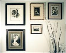 Photo 3
The dried floral arrangement offsets the weight of the frames above, balancing the unit.
Emphasis
When there is a great deal of negative space surrounding a grouping in the wall, the wider the spacing between the frames may be. The tighter the wall space...the closer the placement. This placement, or focal emphasis, is an important point when arranging a clustered unit. Designers and galleries are frequently combining furniture settings with framed art to create an entire mood. The placement of frames directly relates to the visual concentration or focal point within an entire presentation. All items selected must relate to their surroundings. This is why hunt scenes work well in the library while florals are better in the bedroom.
Emphasis is also created by the specific placement of which piece is hung where in a group. Portraits should face into the center and the largest, boldest pieces generally work well placed in the center with accompanying accent pieces working outward, enhancing it (photo 4). The trombone is the most eye catching element in this grouping or the dominant focal emphasis, with the certificates and letter working outward in both directions from it.
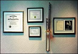 Photo 4
The trombone is the focal emphasis. There is no common line between the frames, balance is the dominant element.
Balance, Proportion and Symmetry
Proportion deals with the ratios and relationships of one part to another, within a frame this would be the actual frameable image vs. the outer dimensions of mat and frame in relation to it. Within a grouping it becomes the amount of space between the items of the group as well as the group's relationship to the entire wall space. Is it too much for too small a wall, or is the wall to vast for a cluster of small framed pieces? In photo 3, if the frames were any closer together they might look fine close up, in relation to each other as a grouping, but would be overcome by the large expanse of white wall and high ceiling to feel "in proportion" to it's chosen space.
Balance, and in turn the symmetry—or asymmetry—of a grouping, creates a feeling of equality of weight or attention within a group. The trombone in photo 4 adds visual weight to the double opening letter/photo on the right, easily offsetting the three certificates on the left. The grouping is asymmetrically balanced when a vertical axis is drawn through the center.
Traditional Placement
Formal groupings require symmetry in hanging. Strict horizontal, vertical or diagonal placement of like framed pieces may be the easiest way to achieve balanced symmetry with a group. By hanging them all evenly horizontal a natural balance occurs. The idea is to hang them from a common top line at eye level. Even the four square cluster (photo 2) has symmetrical balance as a mirrored image on both sides of an imaginary vertical axis. Establishing a common horizontal top line AND maintaining the exact amount of space between the frames above, below and side to side is safe and comfortable. It is traditional, conservative placement for "like" pieces in a grouping.
Unity
A series of 4-6-8-10 or more pieces framed identically sized, with the same moulding and mats will have an inherent unity, even when border proportions all vary to accommodate the images within. The same occurs with sized botanicals in identical frame designs...the unity is easily translated from the separate pieces into the final grouped presentation. There are many good examples like these showcasing unity in wall groupings in The Art and Framing Council's FRAMEWORKS publication.
But unity may not always be established by using the same moulding, mat colors or print series. It may by artwork of a particular subject matter, like the calligraphic collection in photo 5, or the same artist as photo 6.
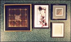 Photo 5
The larger gold/black art on the left is dominant, but is counterbalanced with the stacked pieces at right.
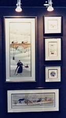 Photo 6
The unified grouping easily showcases all the art.
Common Line Unity
The easiest way to establish unity in composition is through use of a common line. Begin from an imaginary horizontal "top line" placing the top of the frame along it. This should be the actual edge of the top of the frame not the visual top line or outermost dominant portion of the moulding. Then expand the grouping in other directions by finding new vertical and horizontal common lines as needed to accommodate the new additions. Attempt to maintain the same established space between all the frames for continuity.
There is no common line relationship between the frames in photo 4. If the left frame were to align with the top of the one to its right, and the right frame had the same base line as the one to its left...the grouping would have much greater unity.
By working from a horizontal common line at the top, the wall grouping in photo 7 illustrates a collection that continues to grow. It began with only the two certificates at the left, which have remained set apart for added emphasis. As sampler calligraphic pieces were completed the wall grew right, lightly playing off of the two base certificates.
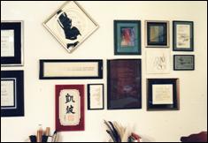 Photo 7
Common line allows new pieces to be added through the years, while still remaining a unified wall grouping.
The diagonal piece at the top breaks the common horizontal top line, but is counter-balanced by the additional negative space at its bottom. All other pieces are placed off of a common line from a proceeding frame. In other words, every piece somehow aligns itself to another piece along one of its edges. This wall will continue to grow. Unity has been established through a common theme of lettering arts, a contemporary framing style, and consistent spacing between the frames.
Educating the public is a large part of you job. Whether conservation framing or "how to hang a wall grouping" its up to you, the gallery/frame shop to stimulate those creative ideas, reinforce multiple sales and establish a long term unity between yourself and your customers.
END
Copyright © 1995 Chris A Paschke
For more articles on mounting basics look under the mounting section in Articles by Subject.
Additional information on all types of mounting is found in:
The Mounting and Laminating Handbook, Second Edition, 2002,
The Mounting And Laminating Handbook, Third Edition, 2008 and
Creative Mounting, Wrapping, And Laminating, 2000 will teach you everything you need to know about getting the most from your dry mount equipment and materials as an innovative frame designer.
All books are available from Designs Ink Publishing through this website.
Chris A Paschke, CPF GCF
Designs Ink
Designs Ink Publishing
785 Tucker Road, Suite G-183
Tehachapi, CA 93561
P 661-821-2188
chris@designsinkart.com