 Photo 1
Color is the most emotional and expressive element of design. It directly and immediately stimulates an emotional reaction, and the viewer never needs to rationalize the response. Pleasing color rhythms and harmonies satisfy our aesthetic desires, for we each individually "like" or are naturally drawn to certain combinations and reject others. This most specifically is recognized by the colors selected when decorating our home, by the colors of clothing we ware, or the mat board colors our customers request to be used in the framing of their artwork.
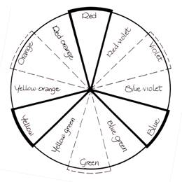
In order to understand the element of color in design and the power we have with its creative uses we need to understand and/or review the basics of color theory. There are two basic theories surrounding the principles of color, additive color theory which is color in relation to light, and subtractive color theory or that used in relation to pigment. The basic concept of the additive color theory of light is based on three primaries of red, blue and green which when overlapped as three spotlights result in a white space.
In opposition, the subtractive color concept of pigment results in three primaries mixing together to create black. The eye detects color by registering the reflected wavelength of a given color. Pigmented white contains and "reflects" ALL color wavelengths so the eye registers "white" or the presence of all colors. Black "absorbs" ALL of the light wavelengths and reflects none, hence no color is visibly detectable. Spectrum colors (photo/diagram 1) are pure and represent the greatest intensity or brightness of any given color. All pigmented colors when mixed in proper proportions will create some form of grey ("Color", PFM September-November 1993).
Photo 1
Properties of Color
Every color has three basic color properties: hue, value and intensity. Hue refers specifically to the position of a color in the spectrum. The hue of a color will change only when mixed with another pure color, for it remains a spectrum color.
The value of a color is the "quantity" of light that a color actually reflects, hence its apparent lightness or darkness. The value of an pure color is varied when a spectrum color is mixed with a neutral, such as white to create a tint, or black to create a shade. Neutrals are surface tones which do not reflect any single wavelength of light but rather all of them at once. No single color is then noticed, but rather a general sense of light or dark such as white, grey or black.
Intensity, or chroma, is the "quality" of light (not the quantity as in color value) in a specific color as pigments are mixed together. This quality translates into the specific brightness or dullness of a color. You cannot change the value of a color by tinting or shading it without changing the intensity also.
Color in Framing
In framing, color is used to accent or harmonize with the art to assist in creating an overall mood, visual effect or response through the use of colored matboards, moulding, fabrics and surface design. Color should never be used solely for its own character or emotive reaction, but always in relation to the image or object being framed.
As mentioned in last month's discussion of "line" many principles of design are ultimately woven together into successful unified designs. This remains quite evident when color is integrated into a double matted project where different colored mats are used. This readily becomes the use of two design principles, line and color, for any narrow inner liner mat will in essence be creating a line.
Last month the basic given design was established as a single mat with a rectangular opening and traditional wood frame. The mat can be any monochromatic color base, not necessarily a neutral, but as soon as a second color is introduced regardless of whether it's a liner mat, panel design or contrasting creative metal or wood moulding, then color must be counted as an additional principle used in the total presentation. Remember, the goal is to limit the elements/principles to a total of no more than 3-5. Do remember, use of more than one color will not count as more than one additional element (photo 2).
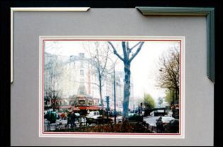 Photo 2
The black Whistler frame draws the eye into the tree and the dark areas in the lower front of the photo, while the narrow neutral metal has little effect.
The Emotion of Color
The basis for a great deal of design comes from the use of color in an emotional or psychological way by somewhat manipulating the viewer. Warm colors such as red, orange and gold are considered emotionally stimulating, passionate and often appeal to the senses like a sunset or fire. Warm colors also generally advance, meaning a double matted picture will pull a red liner out towards the viewer away from the image while a cooler mauve or blue liner will recede into the picture (photo 3). A massively heavy, dark moulding with multiple warm mats on a very small image will often succeed in dwarfing the artwork and creating a claustrophobic feeling or emotion for the viewer.
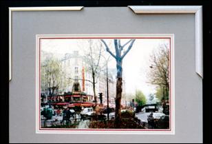 Photo 3
The soft matching mauve tones of the moulding samples are not a showcasing of color but the red liner mat is. Notice how the ⅛" red liner moves forward toward the viewer while the ¼" middle mat recedes back. The red liner also draws the eye into the red accents in the photo.
Cool colors are often equated to air, sky and water, are much more passive, isolated, relaxing and open in nature and as mentioned will visually sink or recede to the back ground more. In interior design, a good example of color to control a situation would be using soft, light, cool colors for furniture fabrics and carpets to enlarge the feeling of a small room, the same goes for framing images and objects.
Note the samples of matted calligraphy (photo 4a, 4b). Although the lettering and placement are identical in each the color of the paper creates an optical illusion of them being different in size, plus the paper has a tendency to attempt to move in front of and behind the lettering. The darker paper dwarfs the lettering more making it the framer's problem to open up the image in a visual way.
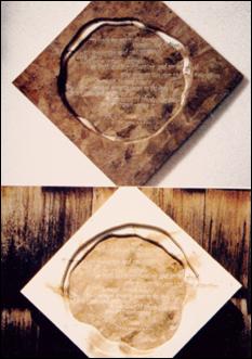 Photo 4a
The top calligraphy on dark Mexican bark paper with hand wrapped mat draws the eye out and back into the lettering.
The light cream wrapped mat closes up the art and isolates it.
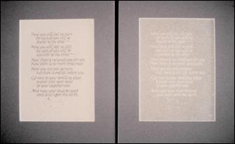 Photo 4b
Though both samples of original calligraphy are on identical size sheets with exactly the same written text they appear different as a result of the reverse color play of paper and lettering color.
Simultaneous Contrast
It is important to mention that surrounding colors may also alter the degree of warm and cool colors. Whenever two different color tones (spectrum color with added grey) come into contrast with each other, as in the liners of a double mat or surface panel design, the contrast will intensify the differences between them. (photo 5) This is most recognizable with colors directly contrasting in hue but also occurs if colors have a specific relationship.
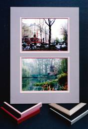 Photo 5
In the selection process, mats and moulding colors must work together.
All contemporary metal mouldings shown offer different visual responses and different emphasis within the photos. The mauve in the top mat and ¼" liner mat appear more blue because of simultaneous contrast to the ⅛" red liner. If the ⅛" liner was blue the top mats would appear more red-base.
For example, if a yellow-green liner is topped with a green mat the liner will appear more yellow than if it were topped with a yellow mat making it appear greener. This occurs often with metallic golds (red based vs. yellow based) and neutrals tinted or toned from a base red, yellow or blue primary. Be very careful with matboard and moulding selection not to unintentionally mix different bases.
The intensity (brightness) and value may also vary in relation to the proximity of additional colors. A grayed blue (toned blue) appears brighter against a grey, but the same color looks greyer against blue. Also a warm color will always appear warmer against a cool and vice-versa.
As a Design Tool
Color has a number of fairly specific purposes in design. Obviously emotions may be stimulated by the use of color, and warmth or coolness may be created, but there is more. I've already stated 'never to use color for it's own sake, but always to use it as a "tool" for creating a total feeling'.
As a tool consider the potential:
All color has hue, value and intensity and anytime color is integrated into a framing design in any way it then becomes an element of design which must be counted.
Color in Summary
When using color in relation to framing it is important to interrelate, interweave and balance the selected colors. Warmth and coolness, subtlety and brashness, lightness and darkness are all potential applications and they must work together toward a unified whole. A single stroke of color contrast such as a bold ⅛" liner mat may make the difference between a mediocre design and a masterpiece. A marbled panel design with accented metallics may transform a crude design into a distinguished presentation.
Physicists tell us about the make-up of color composition, psychologists explain how the human eye perceives a given color and color stylists tell us how color affects us physically and emotionally. It is up to framing designer to then assimilate all of this information and sell it to the client in the most dynamic and price effective solution possible.
Glossary of Color Terms
Achromatic Neutrals: Colorless scheme of black, white and grays, no color properties exist.
Additive Color Theory: Color as applied to light with primaries of red, blue and green; secondaries of r/b=magenta, b/g=cyan (turquoise), r/g=yellow; when all overlap the presence of all color becomes white.
Analogous: Any two colors adjacent to a key color on a color wheel.
Complementary: Directly opposite on wheel; most enhancing.
Definition: Character of a surface which is the result of vision sensitivity to reflected wavelengths of light; i.e., in order to see green, all light wavelengths but green are absorbed into an object, green is reflected and the eye registers it as green.
Hue: Designates the name of the actual pure color as determined by it's light wavelength and indicates it's position in the spectrum or on the wheel.
Intensity: AKA "chroma"; indicates the brightness or dullness.
Intermediate: One primary and one secondary mixed together.
Monochromatic: One color of a single hue with various values added of black, white and grey.
Neutrals: Surface grayed tones which do not reflect any single wavelength but ALL at once. No color is recognized but the light and dark, such as white, grey and black.
Neutralized Color: A "grayed" spectrum color reduced in intensity by mixture with neutrals or it's complementary.
Neutral Grey: Three primaries mixed together; black plus white.
Objective Color: The naturalistic color of an object as seen by the eye such as green grass, blue sky or red fire.
Primary: Red, yellow, blue; make up the rest of the wheel.
Secondary: Orange, green, purple; mixture of two primaries.
Shade: Color plus black; darker then it's normal value.
Split Complementary: Key color combined with two colors that are on either side of the complement.
Subjective Color: Colors chosen by an artist/framer without regard to the real or natural appearance of the object portrayed; totally non-objective, very non-representational, abstract in nature.
Subtractive Color Theory: Color in relation to pigment or reflected light; relating to the color wheel the blending or presence of all color produces black.
Tetrad: A double complementary contrast (ie: red/green + yellow/purple) forming a rectangle on the wheel.
Tint: Color plus white; lighter than it's normal value.
Tone: Color plus grey.
Triadic: Three colors evenly spaced on the wheel forming a triangle; there are one primary, one secondary and two intermediates on the wheel.
Value: A characteristic in terms of light reflected from it; the total lightness or darkness of a color.
Psychology of Color
Black = Grief/death (achromatic color of nothingness)
White = Innocence/purity (neither warm or cool)
Grey = Neutral
Red = Love/fire/revolution/sensuality/desire/passion/excitement (appeals to the senses like warm colors do)
Pink = Tenderness/poetry
Yellow/Orange = Warmth
Brown = Earthiness/solidity/firmness
Violet = Meditation/mystery/occult/exotic
Lilac/Mauve = White added keeps viewer at distance
Purple (more blue) = Aristocratic/dignified/worldly/royal
Blue = Loyalty/passive/dreamy/isolation/deep feelings/honesty/sadness/dignified
Blue/Green = Water (opposite to fire)
Green = Organic/calming (neither cool nor warm)
Metallics have no real emotion/only accents
Gold = Warm
Silver = Cool
END
Copyright © 1994 Chris A Paschke
For more articles on mounting basics look under the mounting section in Articles by Subject.
Additional information on all types of mounting is found in:
The Mounting and Laminating Handbook, Second Edition, 2002,
The Mounting And Laminating Handbook, Third Edition, 2008 and
Creative Mounting, Wrapping, And Laminating, 2000 will teach you everything you need to know about getting the most from your dry mount equipment and materials as an innovative frame designer.
All books are available from Designs Ink Publishing through this website.
Chris A Paschke, CPF GCF
Designs Ink
Designs Ink Publishing
785 Tucker Road, Suite G-183
Tehachapi, CA 93561
P 661-821-2188
chris@designsinkart.com