 Photo 1: Aged Old Photos
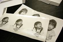
This set of 30 year old, fiber-base photographs was discovered stuffed in an old box of family papers in a garage.
In today's framing world of digital headaches it is a sincere pleasure to occasional find happiness in that same frustrating technology. Recently my favorite client uncovered a set of 30 year old, fiber-base photographs of her baby brother and herself (photo 1). She wanted to have these originals framed for her mother; and two sets of digitally reproduced copies: one for her brother; one for her.
Photo 1: Aged Old Photos
This set of 30 year old, fiber-base photographs was discovered stuffed in an old box of family papers in a garage.
They appeared to have been taken by a professional portrait studio; circa 1970, but since there were no identifying stickers, labels, or imprints on the back, no copyright permission could be sought prior to digital reproduction. Fortunately we were able to have them professionally scanned and reprinted with no problems or questions over copyright.
The Challenge
The photos had been badly treated having been loosely thrown into an old cardboard box in the garage with assorted other papers to fend for themselves for at least the last fifteen years. Their only saving grace was they live in Southern California where the temperatures and weather are not too cold, too hot, too wet or too humid...so they looked pretty good over all.
Each was printed in oval format, with three different childhood poses in a horizontal presentation, measuring 7"x15-¼". Tiffany loved the aged character of these originals so she opted not to have the originals touched up or restored, but rather framed in all their deteriorating glory. The photos were curled at all the edges and required dry mounting to flatten them for best visual presentation (photo 2). There was some yellowing of the emulsion and there were numerous cracks, tiny tears, and a few age and dirt spots, most of which were in the surrounding creme colored background (photo 3). Most of the damage was around the exterior and would be covered by the bottom mat so repair was not required.
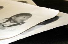 Photo 2: Badly Curled
The original photos were badly curled at all the edges and required dry mounting to flatten for best visual presentation.
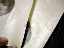 Photo 3: Cracked and Torn
The cracks, tiny tears and age spots, seen here were mostly to be covered by the oval mat so did not require touch up.
A few of the emulsion cracks crossed down into the portraits which needed to be digitally touched up when reproduced (photo 4). Neither Tiffany nor I were bothered by the cracks on the originals, because they were actual three dimensional broken paper fibers, which actually gave the photos real life intrigue. However, the thought of these same cracks showing up as flat, photographic replicas of damaged photos seemed just too artificial, so we opted to have them lightly retouched after they were scanned.
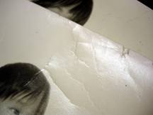 Photo 4: Touch-ups
The cracked line down the center of the Matthew's head was visually distracting and needed to be digitally touched up when reproduced.
The Reproductions
Roy Hermann, CPF turned me on to a fabulous company in Los Angeles, California called A&I Digital who was eventually selected to scan and reproduce the two additional sets of portraits. Digital reproductions and retouching encompass many alternatives. Softening, fuzzing out, deletion, addition, correction, color tinting, color enhancing, cropping, enlarging, the possibilities are endless. But sometimes changing the history or trying to improve on reality just doesn't feel right, so less was more in this case.
A Hi-Res Scitex Scan of the originals produced working image reproductions which when digitized could be touched up to repair the white damage creases. The digital technician was asked only to do minimal touching up, just enough to cover the white creases in the dark hair and remove a few visible brown blotches on Tiffany's face, she was also instructed to match the output size exactly of the oval portraits and the aged color of the originals as closely as possible. The new images were printed as 10" x20", with ovals perfectly matching the original size, using RA-4 chemicals on traditional photo paper (photo 5).
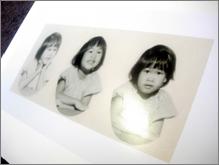 Photo 5: Digitized Reproductions
The digitized copies were scanned, touched up and printed as 10"x20" photos using RA-4 chemicals on traditional photo paper. The image shown has already been dry mounted.
The Colors and Mats
Though I was promised they would copy these photos as closely as digitally possible in both size and color, I waited for the reproductions to be completed prior to ordering my mat boards and moulding. In previous projects I have experienced the color variations that can occur with digital duplications of originals. The inner three oval opening mat was to be cut on a Wizard and I also needed to verify the actual oval dimensions prior to cutting the six matching mats. When the reproductions and originals finally arrived, the sizes were perfect and the ovals matched exactly, but the colors were slightly shifted as predicted. The originals required Artcare Alpharag Natural White #8656 for the bottom oval triptych, with Alpharag Antique White #8640 used to pick up the highlights; while the new digital reproductions needed Crescent Rag Mat Inverness #1121 Alpharag Natural White to match the highlights. Though subtle variations these color differences were very visible.
The Mounting
Since they were to be dry mounted Artcare Restore was chosen for both for its preservation reversibility and the short dwell time/low temperature. The photos were mounted in a 210M-X mechanical press for 15 seconds at 150ºF, and then cooled under a weight. The mounted images looked great and all the curl was removed from the warped originals.
The reproduction photos were printed using real photo paper and RA-4 chemicals making them safe to mount as any traditional photo, but the gloss surface still needed to be protected. A thin sheet of Drytac Glazing Foil was laid over the photo to protect it from any possible surface damage or emulsion reaction to the silicone release materials (photo 6). Even though this is called "foil" it is a thin sheet of clear acetate film. The glazing foil should not be used as a release paper substitute, but rather an additional sheet to protect the photo surface from coming in contact with the silicone coated release material. Release paper in the mounting package is always required to protect the platen above the mount and sponge pad beneath the mount (photo 7). The glazing foil will appear to have adhered itself to any exposed adhesive that extends beyond the edges of the photo, but will easily roll off that adhesive once cooled (photo 8).
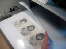 Photo 6: Glazing Foil
A thin acetate sheet was placed over the photo to insure its gloss finish and protect it from the silicone coated release paper during mounting.
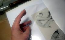 Photo 7: Dry Mounted
The hazy appearance of the photo is the glazing foil over the image in the release paper envelope ready for mounting. It was mounted with a 210M-X mechanical press.
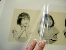 Photo 8: Remove After Cooling
Glazing foil sticks to adhesives briefly when first removed from the press, but after cooling under a weight will easily peel off.
The Sizing
Since there are three portraits that required perfect mat placement, the most time effective way to align this project was to mount the photo to a slightly oversized piece of Restore, align the oval triptych mat into position and draw a pencil line around the perimeter of the mat to determine the actual edges (photo 9). Since the completed four mat unit was going to have a book hinged mat and not separate ATG applied mat layers, the pencil line allows for the trim line to be visible (photo 10) for exact sizing with the square cut side of a straightline mat cutter, or manually being trimmed with a cork backed ruler and straightedge (photo 11). If the mats were to be ATG taped together they could have all been taped and aligned, then trimmed at the edges without the pencil marks.
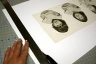 Photo 9: Substrate Sizing
Align the tri-opening mat over the mounted oversized. Restore and draw a pencil line to determine outer mat edges.
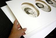 Photo 10: Pencil Line
The pencil line allows for accurate trimming of the mount board by straight line cutter, wall cutter, or by hand.
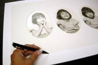 Photo 11: Trim to Size
With a sharp blade and straightedge, cut along pencil lines to trim away excess foam backing.
The Accent Strips
Four mats were chosen for this project. The oval bottom mat was necessary because of the portraiture shapes; the two different shades of white were chosen to pick up the appropriate highlights and background colors; and the black AlphaRag tiered mat picked up the dark hair color and shadows in the kids portraits. The rectangular overlay mat helps transition form lower oval opening to outer rectangular frame (photo 12). In order to tie in the soft silvery gold tones of the frame, a tiny accent strip of Maziarcyk Pastepaper was chosen to attach to the back of the second mat window edge (photo 13). This would act as another transitional element helping direct the eye both into the image while integrating the metallic finish frame.
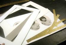 Photo 12: Oval and Rectangle Windows
The inner oval mat surrounds the original oval portraits while the second liner mat will help visually make the transition to the outer rectangular frame.
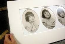 Photo 13: Pastepaper Accent Strips
There are four total mats including the inner most oval trio. Strips of 1" gold pastepaper were cut as accent strips to be placed behind the second mat window.
The paper strips were cut 1" wide on a straightline mat cutter so the small black marks surrounded and pointing into the mat window.— A strip of ATG tape was aligned at the very inner edge of the back of the window in preparation for the accent strips (photo 14). The strips were stuck to the tape while visually aligning them from the front of the window allowing only ⅛" to be seen, then laid face down, and burnished with a bone for maximum p-s tape activation (photo 15). Since only a tiny line of the gold strip is visible the corners were not mitered, but simply overlapped (photo 16).
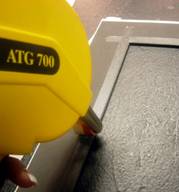 Photo 14: Tape to Back of Mat
A strip of ½" ATG is applied along the back side inner window edge of the second mat, which is black AlphaRag with two sheets of Canson MiTeintes paper surface tired using Fusion 4000.
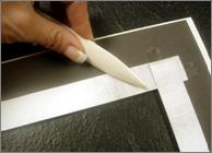 Photo 15: Burnish to Activate Tape
Align the strips with the window face up, tack lightly to hold in place, then turn the window face down and rub firmly with a bone burnisher to activate the pressure-sensitive tape.
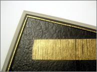 Photo 16: Completed Pastepaper Accent
The top mat and bottom oval trio mat are Crescent Inverness #1121. Second is surface tiered grey papers on Bainbridge Alpharag Black Shadow #8669. The accent strip of Maziarcyk #78 Gold Midnight Grain pastepaper peeks out from behind the second mat and is crossed at the corners rather than mitered.
The Final Design Review
From bottom to top (diagram 1): the bottom oval Crescent Inverness #1121 mat surrounds the original oval portraits as needed, contrasting the actual photo background color while by picking up the highlights. The next mat up is the rectangular window of Alpharag Natural White #8656 which matches the photo background color and draws the eye back in.— The surface tiered mat is two sheets of Canson MiTientes papers on Bainbridge Alpharag Black Shadow #8669 backed with Maziarcyk #78 Gold Midnight Grain pastepaper. The top mat #1121 matches the bottom for continuity and remained white for neutrality (photo 17).
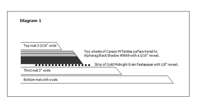
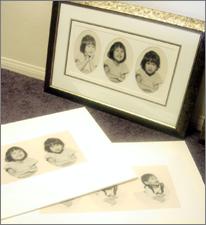 Photo 17: Too Cute
A delicate graphite calligraphy line was added centered on the wide reveal of the third mat with the name and birth date of each child, then framed with Larson-Juhl Silver Venezia #414892.
Once assembled a faint line of calligraphy was added in graphite with the full name of each child and their birth date, for personalization and that final warm and fuzzy feeling. Too cute! I know that Tiffany was thrilled with the project, and I have heard that little brother Matthew was warmly touched, and that Mom cried. I love my job.
END
Copyright © 2006 Chris A Paschke
For more articles on mounting basics look under the mounting section in Articles by Subject.
Additional information on all types of mounting is found in:
The Mounting and Laminating Handbook, Second Edition, 2002,
The Mounting And Laminating Handbook, Third Edition, 2008 and
Creative Mounting, Wrapping, And Laminating, 2000 will teach you everything you need to know about getting the most from your dry mount equipment and materials as an innovative frame designer.
All books are available from Designs Ink Publishing through this website.
Chris A Paschke, CPF GCF
Designs Ink
Designs Ink Publishing
785 Tucker Road, Suite G-183
Tehachapi, CA 93561
P 661-821-2188
chris@designsinkart.com