Paschke Online
Designs Ink Publishing Article Archive and Reference Library
Articles by Chris A. Paschke, CPF GCF
"The Essence of Design: Intensity"
December 2000
Intensity and textile framing seem to go hand in hand. Seems that very often the concept of doilies, stitcheries, and antiquities require depth or shadowbox framing to best showcase their warmth and intricate detailings. What better issue than to be discussing the intensity of highlights and shadows in the frame.
Intensity and value are most often used in relation to discussions of color, so they become rather esoteric terms in framing. To more completely understand the meaning of intensity in framing we must include tone, brightness and shade, highlights and shadows, all far beyond the simple realm of color. Webster's dictionary defines intensity as "the relationship of one part or detail in a picture to another with respect to lightness and darkness." Framers create intensity through use of strong creative applications and design statements including: glass etching, deep bevel wrapping, and stacked mouldings.
Value and intensity in framing are partnered together and become the most dramatic of the elements. They are the ones that seem to set the stage for visual impact and are frequently used to stimulate feelings. It is the "visual energy of emotion" evoking viewer reaction, mood, depth and involvement.
Intensity as it Relates to Light
Intensity is measured by the quality of light or the specific brightness or dullness of an image. The value of an image is measured by the quantity of light that it reflects, hence its apparent lightness or darkness often related to as highlights and shadows. A shadow is a dark area created on a surface when another form is placed so as to prevent light from falling on that surface. Adversely, a highlight is an area or shape which receives the greatest amount of light.
Highlighted values are pleasant, shadowed lower values are more dramatic, and the extreme contrasts between these two are often quite visually stimulating. The somewhat aggressive combinations of miters used in the assembly of the featured mirror frame in photo 1, clearly illustrates extreme value contrasts, both by the frame shape itself and the mirror it houses. Use of extremes in intensity not only attract attention but may also be exciting, powerful, and strong. As the frame for this mirror, the sample uses only intensity and shape as design elements. Though this frame is an exciting accent for the mirror, and makes a strong statement, but it could overpower most other artwork.
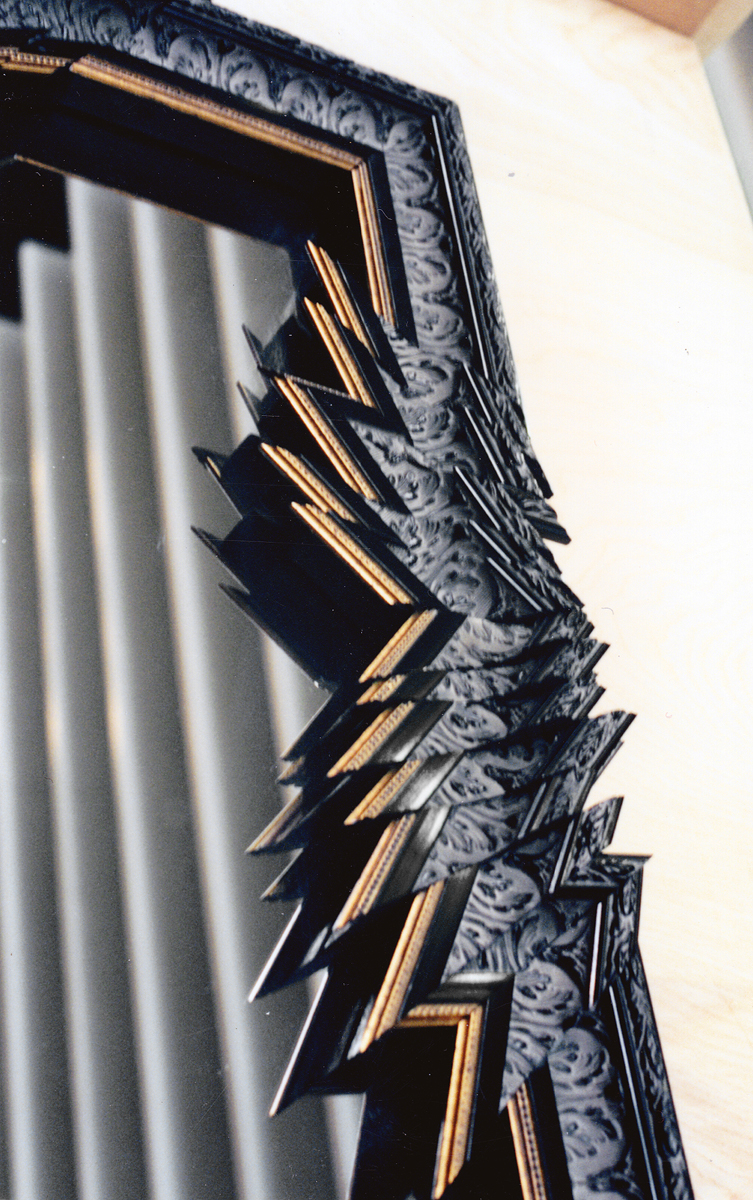 Photo 1
This detail of the side moulding assembly from a large framed mirror clearly illustrates the dramatic use of intensity.Highlights and shadows are reflected and images play off each other not only demanding intensity be counted as an element, but also shape. Mirror framed and showcased courtesy of Roma Moulding.
Impact on Other Elements
All design elements exhibit some form of contrast in order to be visible. A viewer's attention may be grasped by extreme high or low image values, but contrast or visual surprises are much more interesting and eye-catching. Anytime the use of highlights and shadows are used to dramatize or showcase the art or objects, intensity becomes a countable element.
Fillet lined cutouts or odd shaped windows may also stimulate intensity, particularly when there is depth involved. In photo 2 the recessed gold inlayed mat, used to showcase the fish stamp, echoes the shape of the outer window. Highlights and shadows are used to accent the fishing flies and the stamp itself by the small window cutouts and the recessed stamp. Line, color, texture (the gold mat has a subtle texture variation in it), shape, and intensity are all counted for a total of five elements.
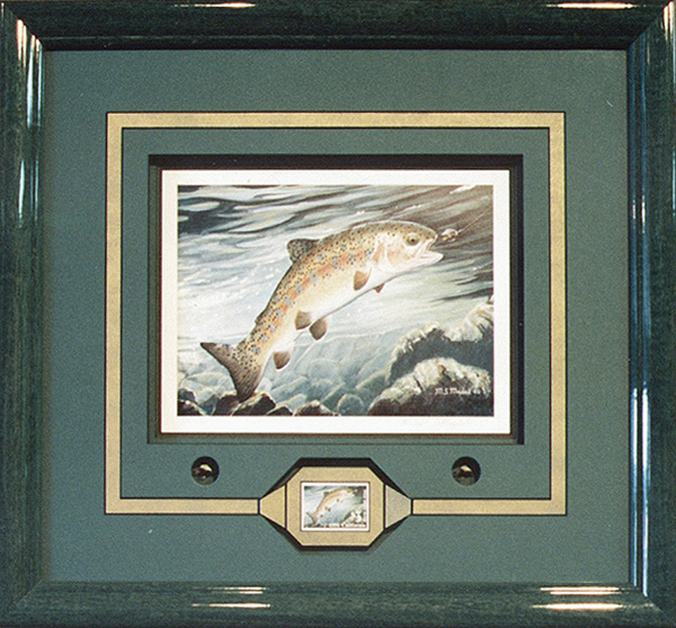 Photo 2
Highlights and shadows are used to accent the fishing flies and the stamp itself by the small window cutouts and the recessed stamp. Line, color, texture (the gold mat has a subtle texture variation in it), shape, and intensity are all counted for a total of five elements. This award winning design complements of Ray Dwyer.
Value is relative and effected by all other elements, but it is most often linked with color. The existence of color is entirely dependent on the presence of value. For example, yellow is lighter than violet, but it may be modified to be nearly equal in visual impact. Weaknesses in designs utilizing color value are easily identified by examining black & white photos of the completed project to reveal a lack of contrast.
Expressive Uses of Intensity
Light and shadow exist in Nature as a by-product of physical laws. The artist/designer must adjust them in order to create an interesting visual language. In framing, the result becomes a stressing of the decorative effects, by ignoring conventional light sources or neglecting the representation of light altogether until it naturally occurs within the frame.
By mounting a doily onto a centrally floated piece of glass, the shadows cast by both the spaced mats and the doily itself exemplify these decorative effects (photo 3). The resulting effects of light as highlights and shadows must be taken into consideration based upon their contribution to the total visual framing presentation. Light will establish intensity and value as a valid design element in any given framing project.
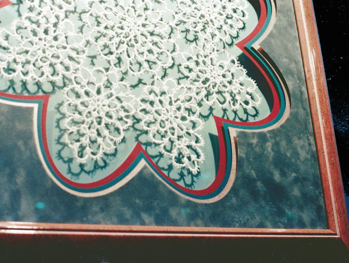 Photo 3
A perfect example of intensity and value is shown through the use of highlight and shadow in this scalloped triple window mat shadowbox. This detail clearly shows elements of color, texture, shape, and intensity.Photo courtesy of Circle Master Company.
Intensity as Depth
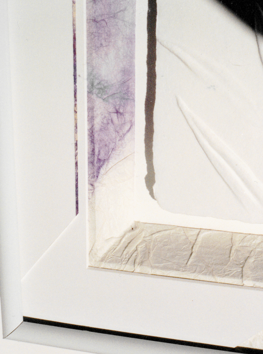
One of the easiest ways to establish a dramatic interaction between highlight and shadow is to use spacers or deep bevel designing. Wrapped foam boards of ⅛", 3/16", or ½", will naturally create more shadows within a frame than thinner 4-ply mats. Add to these, spacers and mats, regardless of the art or objects being framed, and intensity becomes an element (photo 4). Both tactile and visual textures are shown here by the detail of the wrinkled rice paper (tactile texture), wrapped, freeform window mats of 3/16" acid free foam board. Smooth (visual texture) 4-ply freeform window mats highly contrast with an added spacer increasing the shadows of this framing design of a piece of original calligraphic artwork.
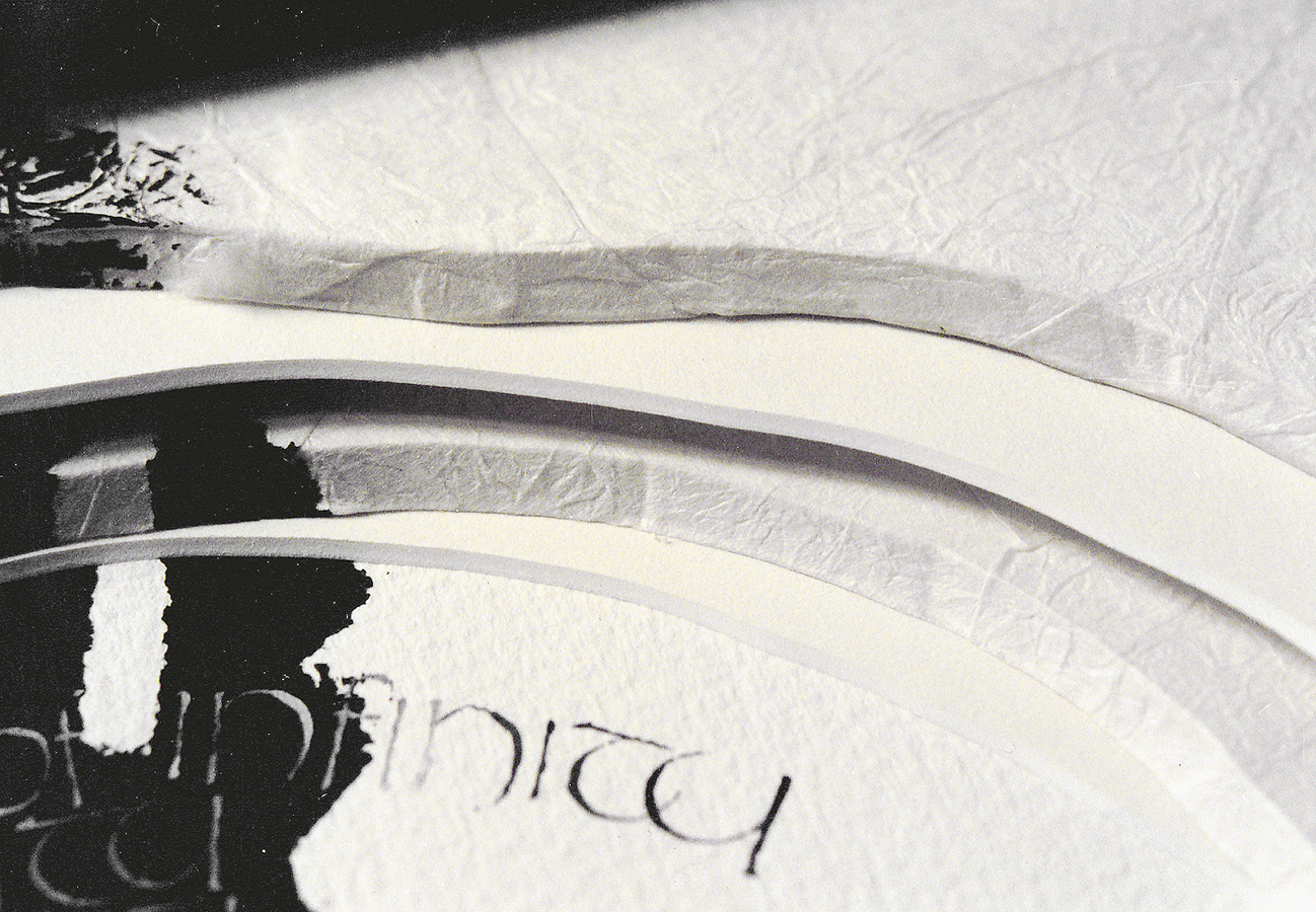 Photo 4
Wrapped foam boards naturally create deeper mats and in turn more highlights and shadows. This detail illustrates use of line, texture, shape, and intensity.
Deep bevel designs can also be used as stacked foam boards or bevel board strips. Though shadowboxes are often thought of as deep frames that pull together memorabilia and goodies, they can also be as simple as a deep bevel to allow for a think piece of artwork, or paper sculpture (photo 5).
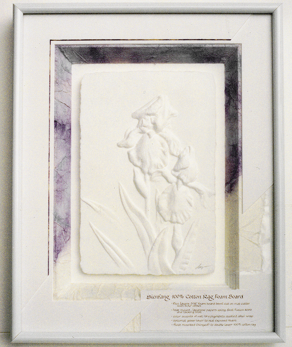 Photo 5
This unfinished framing project of the small three dimensional paper sculpture easily shows the depth of the triple 3/16" foam board mat ready to be wrapped. The decked edges will create wonderful shadows surrounding the outer edges while the white on white sculpture will highlight itself by reflecting natural light.
Another style of deep bevel designing uses the intensity of shadow and value contrasts to highlight the natural deckle of a heavy paper casting. Shadows play from beneath the art creating a value difference accenting the visual impact. This small 4"x 6" three-dimensional paper sculpture has four highly deckled edges screaming to be showcased as a floated deep box design. This sample was left unfinished to best showcase the three layers of 3/16" foam board bevel cut windows stacked to create the depth surrounding the bunnies. This window mat is now ready to be wrapped, textured, colored or otherwise decorated to best enhance this white on white open edition image.
Intensity as a Shadow Box
The very placement of an item within a deep box setting creates the use of intensity regardless of the mood it establishes. The soft fabric mat and fillet combination used in the object box by Greg Perkins (Larson-Juhl) for the antique necklace incorporates the elements of line, texture, color and intensity. Notice the natural shadows created by the deep mat covered sides of the box and the odd shapes of the necklace itself (photo 6).
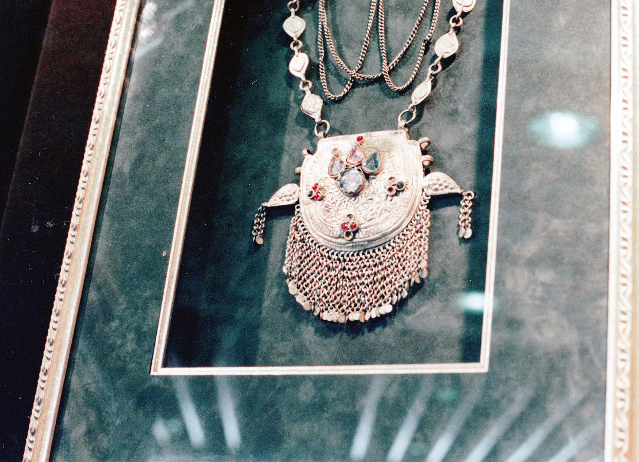 Photo 6
The antique necklace is framed in a deep shadowbox design, using colored textured mats, backing and sides with a delicate fillet accenting the window. Notice the natural shadows along the right and left cast from the top mat onto the bottom as exterior light attempts to eliminate the jewelry.This is intensity in framing.(Photo courtesy of Larson-Juhl)
Store Samples of Intensity
Deep bevels can be created using any assortment of materials, and in turn colors, and textures. Two pieces of 3/16" foam board stacked together have created these corner samples for store sales (photo 7). All wrapped using different techniques and showcasing different possibilities, if a picture is worth a thousand words, then store samples are no doubt worth profit dollars too.
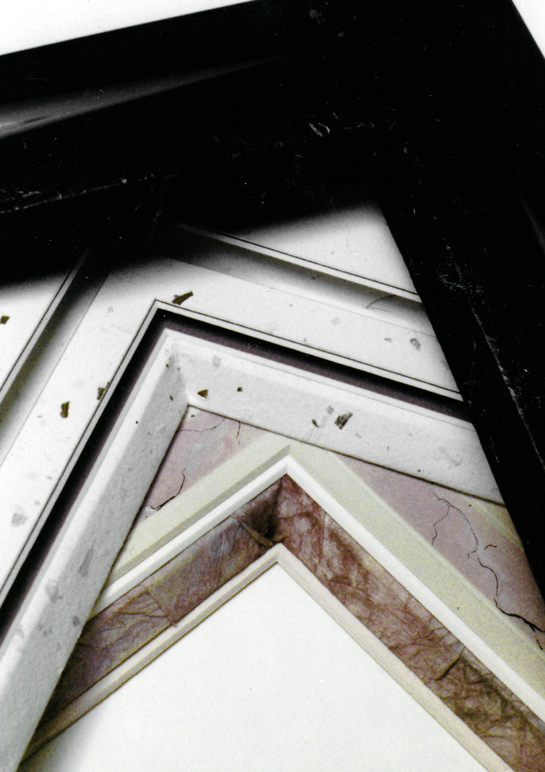 Photo 7
The top sample is a black leather-look corner created with Strathmore black charcoal paper and gloss laminates; the center is panel mat using Larrouque Mouchette handmade paper in a tiered mat presentation, complete with spacers and accent strips of matching paper; the bottom is a wrinkled rice paper wrapped deep bevel with dry pigment coloring and painted dry pigment marbled surface panel.
A customer will never understand nor needs to be taught about design principles, but they will be drawn to designs that are indeed unified, because the elements and factors have been well assembled. The three corner samples in photo 7 are used to make sales. The depth of the designs will work for paper sculptures like the Rabbit above, or three dimensionals like the collectible necklace. These are double 3/16" foam board wrapped, colored, textured, with and without spacers. Numerous elements are showcased in these, but always attempt to keep the total to between three and five (inclusive).
Identifying and Establishing Intensity
Remember, the series of five basic steps in the design process include definition, creativity, analysis, production, and clarification. Once the item has been labeled fine art or decorative art during the definition stage, only then can the creativity stage be activated. The purpose of framing fine art is to preserve, enhance and protect the art, while framing decorative art allows for greater carte blanche. If a creative approach has been chosen, and intensity becomes an element and the procedures must be approved during analysis to insure proper handling of the object or art.
The three dimensional paper sculpture in photo 8, has been conservationally enhanced and protected. The deep bevel wrapped foam boards have been wrapped with wrinkled rice paper and colored with dry pigment to work with the colors of the art. Spacers have been added to create extra depth but also adds intensity to the project. As an element, intensity will not leap to mind as texture or color do, but it greatly affects the overall dramatics within a two-dimensional or three-dimensional presentation. It does become obvious.
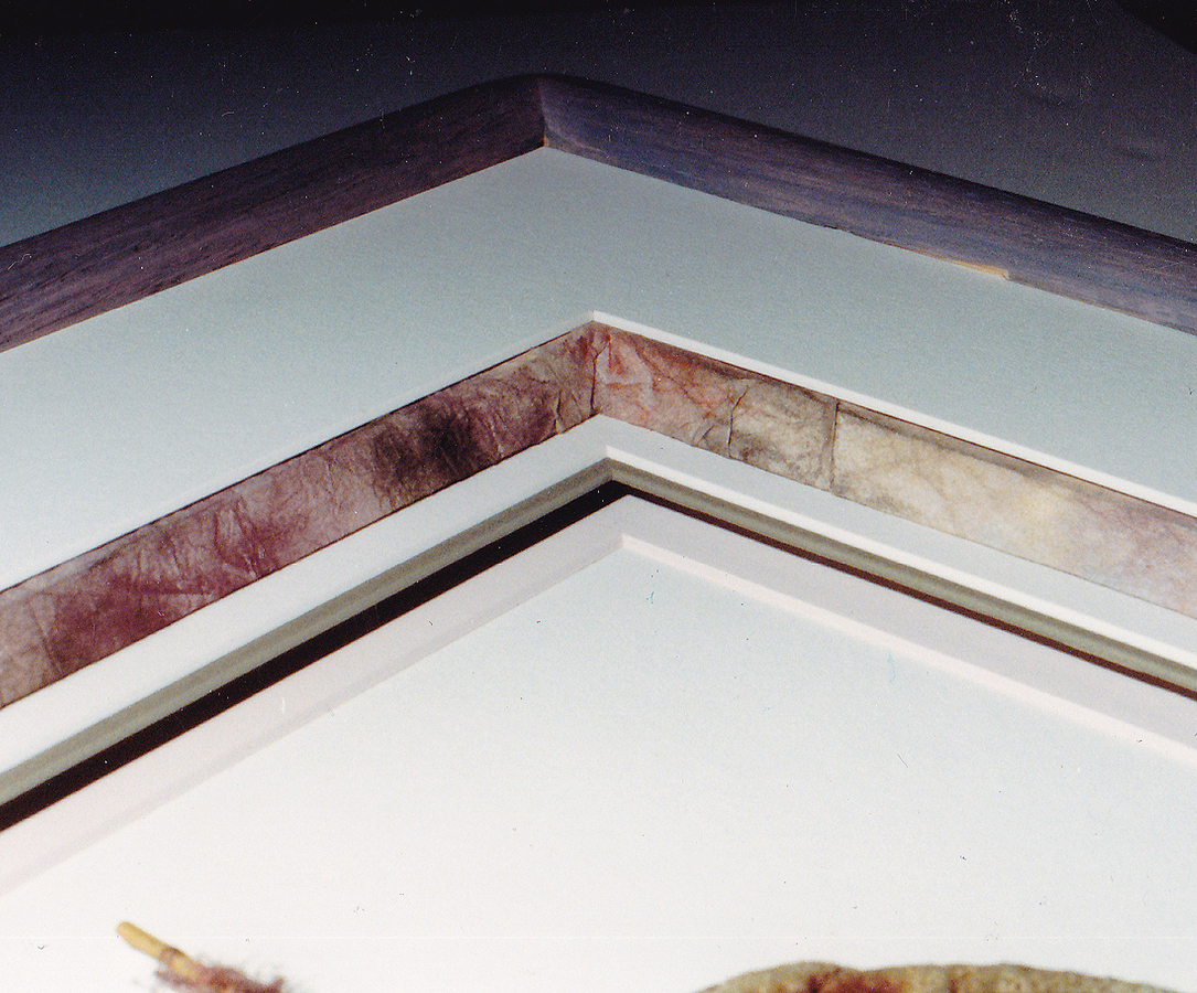 Photo 8
A good designer uses his/her elements instinctively as the tools they were meant to be. Intensity is a multi-purpose tool utilizing light, shadow, contrast and depth to help establish an overall mood and produce a spatial unity. The success of a framing design will largely be based upon the effectiveness in which the designer has made intensity and value serve these functions.
Art is concerned with creation of a work that will arouse an aesthetic response. What we perceive with our eyes in paint, sculpture, drawing, prints, photos, and framing, may result in our feeling of delight, admiration, shock, rapture, intrigue or disinterest. It's up to the frame designer to understand and control the presentation, intensity is just another step toward the entire picture. Happy holidays and try not to be too intense!
END
Copyright © 2000 Chris A Paschke
For more articles on mounting basics look under the mounting section in Articles by Subject.
Additional information on all types of mounting is found in:
The Mounting and Laminating Handbook, Second Edition, 2002,
The Mounting And Laminating Handbook, Third Edition, 2008 and
Creative Mounting, Wrapping, And Laminating, 2000 will teach you everything you need to know about getting the most from your dry mount equipment and materials as an innovative frame designer.
All books are available from Designs Ink Publishing through this website.
Chris A Paschke, CPF GCF
Designs Ink
Designs Ink Publishing
785 Tucker Road, Suite G-183
Tehachapi, CA 93561
P 661-821-2188
chris@designsinkart.com