 Photo 1
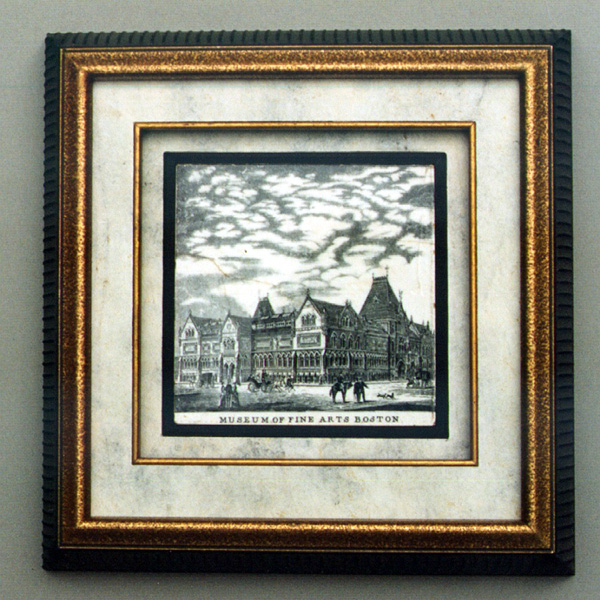
An antique tile of the original Museum of Fine Arts Boston building, allowed for critique courtesy of Gift Planning .Solutions, CA.
Last month we played with the framing of decorative art and by most standards probably bent the design invasion rules to almost the breaking point. The piece selected for critique this month still varies from the traditional in that there is no glazing to block the tile from being touched. Protected from potential damage of actual handling, the antique piece is showcased so the owner may enjoy it while still being framed for hanging.
Defining the Project
The antique black and white ceramic tile is about ⅜" thick, measuring square at nearly 6"x 6" (5-15/16"x 5-15/16") and showing the original Museum of Fine Arts Boston building. The tile has naturally aged to an off white, has slight fissures and chips around the edges as well as hairline fractures beginning to run across it.
Photo 1
An antique tile of the original Museum of Fine Arts Boston building, allowed for critique courtesy of Gift Planning .Solutions, CA.
The client has emotional attachment to this tile and wished it protected while still being able to touch and closely examine it without actually picking it up. It currently hangs in the corporate California offices of Gift Planning Solutions, and is shared with us courtesy of them. Colors and overall design were specified only to best enhance and protect the tile, not to fit any specific office decor.
Creating a Solution
Though still in one piece, the tile has an antique delicacy that needed protection from continued edge damage. It was decided to frame for hanging on the wall, without locking it behind glass. The tactile smooth texture of the architectural ceramic image and coolness of the tile when touched enhanced it's overall beauty as an antique collectible.
Matching the natural aging of the whites and respecting the ash gray appearance of the black was very important for color unity. Also the visual texture of the surrounding mats needed to reflect the same texture from within the tile.
Analyzing the Materials/Limitations
No dollar limitation was set for this project as long as the requirements were adequately met. There was a two week turn around required since the client was relocating from Massachusetts to California and wished the tile safely preserved for travel.
Overall frame dimensions were 10-¼"x 10-½" using a Larson-Juhl black Treviso moulding #404 N, 1-⅜" wide with 1-¾" rabbet depth. The moulding was chosen for it's vertical linear lines, washed dusty black color, and depth. A narrow, antiqued gold fillet, Victor Moulding #11064, was selected to match the frame for the inner liner.
Bleached Mexican Bark paper was chosen for it's mottled marbled appearance to be wrapped around two 4-ply Black Strathmore museum boards #134-614 mounted together for the top mat and fillet. A wrapped 3/16" foam was used for the bottom, straight cut just large enough to snugly fit and hold the tile in place.
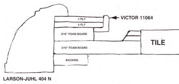 Diagram 1
Strips of scrap 8-ply boards about ½" wide were measured, mitered and glued to the bottom support and flush against the tile after being placed into position.
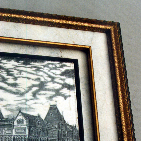 Photo 2
Reverse bevel cut ½" strips of 8-ply board were measured, mitered and glued to the bottom support and flush against the tile as additional support.
Who, What, When, Where, Why
Visual emphasis is pretty straight forward. Though the eye (who) may quickly scan the outer frame, it is generally drawn into the details of the museum building (what) by the familiarity of the vertical grooves in the moulding. These appear to emulate the tall, narrow, vertical Gothic window structure of the museum itself. The gold fillet draws the eye inward to the tile, but plays off the gold top of the outer frame thus tying them together, and adding an accent color to the otherwise neutral black and white presentation.
Visual transition from point to point, all happens remarkably fast (when) and the focal point remains locked on the tile (where) as it should be. Actual eye movement remains within the artistic details of the tile itself rather than flashing around a frame design that is too highly ornamented (why).
Analyzing the Elements
Now lets examine the elements more closely. The innermost black 4-ply strips surrounding the tile introduced a ½" wide black line to the design. That in addition to the inner fillet establishes a strong use of line (1). Color (2) is countable as a result of the same two items. The black square reinforces the pull of the eye from the outer black moulding in towards the tile, just as the gold fillet ties in the outer moulding with the inner fillet emphasis. The eye comfortably moves back and forth from frame to tile.
The "given" texture of the bark paper would not have become a countable element if it were all that were used. The smooth texture of the ½" black strip vs. the mottled bark paper vs. the speckled gold moulding accents requires texture (3) to be counted also. Neither shape nor space are actively used in this basic design, however, intensity (4) has by use of the added 3/16" spacer between the top fillet/mat and the lower support surrounding the tile.
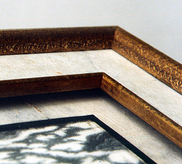 Photo 3
A 3/16" foam spacer added depth and dimension creates intensity to establish the fourth element used in the design.
Establishing the Factors
Total countable elements hold to four, what about factors? Rhythm heads the list as the most countable of factors, and yes, rhythm (5) should be counted in this project. The selected moulding with it's vertical lines echo the patterns of the vertical Gothic windows in the buildings of the tile. Plus the mottled bark paper emulates the cloud patterns.
With the exception of rhythm, remember that factors generally establish how the elements are controlled or used. Proportions feel comfortable in this design, creating no visual stress. Though the tile is small, and the moulding relatively heavy, they seem to be appropriate.
The fillet is placed within the first inner third of the mat design and balance of the piece is about as symmetrical as any piece can be. Emphasis has been discussed already in the draw and control of the viewer's eye which easily remains with the art.
The only factor remaining then is unity. Since all of the selected elements have been factored into the design correctly, and proper attention was paid to an acceptable period and style, this design appears quite unified. Line, color, texture, intensity and rhythm, a total of 5 countable items, work together well.
Conservation framed? The tile has been adequately preserved as a touchable antique, remains the focal point of the frame design and is able to be visually enjoyed daily. It remains, however, continually exposed to light, humidity and everyday pollutants without special precautions to protect it. This critique is restricted to design only and not a study of appropriateness of the selected conservation approach to it's archival longevity.
General Design Philosophy
In search of unity, a safe generality is to utilize between 3-5 elements and factors. More might work, less might work, and all may not even be used. When an artwork is very busy, the elements are best limited to fewer. A simpler project, such as this tile, can tolerate more elements in the frame design.
The idea is not to utilize all the fundamentals, but to select ones that best showcase the art in a controlled attempt to enhance and protect it. Then to use them correctly through a proper understanding of design and critique.
END
Copyright © 1997 Chris A Paschke
For more articles on mounting basics look under the mounting section in Articles by Subject.
Additional information on all types of mounting is found in:
The Mounting and Laminating Handbook, Second Edition, 2002,
The Mounting And Laminating Handbook, Third Edition, 2008 and
Creative Mounting, Wrapping, And Laminating, 2000 will teach you everything you need to know about getting the most from your dry mount equipment and materials as an innovative frame designer.
All books are available from Designs Ink Publishing through this website.
Chris A Paschke, CPF GCF
Designs Ink
Designs Ink Publishing
785 Tucker Road, Suite G-183
Tehachapi, CA 93561
P 661-821-2188
chris@designsinkart.com