 Photo 1
During 1994 I completed a 12-part series entitled "The Design Process," exploring the basic fundamentals of design targeted and streamlined specifically for today's professional picture frame designer. Then during the first three issues of 1995 I critiqued completed framed artworks based upon use of these modified framing elements and factors discussed during the preceding year. With the presentation of our first issue for this new year, I am thrilled to announce "Design and Critique" a 1997 column devoted to the final stage of design, clarification.
The clarification or critique stage occurs three separate times. First in the back work room upon final fitting. At this point it is critiqued for clean mats, non-finger printed glass and no fuzz inside the package. The second critique is when the frame designer critically overviews the completed design for good use of elements of line, color, texture etc. The final critique is when the customer is presented with their framed art, and you request final payment. They better like what you've done or perhaps it's time to reassess the abilities of the frame designer.
Defining the Project
In honor of this month's "Trends" issue, I want to lightly discuss the differences between framing fine art and framing decorative art prior to critiquing our decorative project. Our job as fine art framers is to enhance and protect the art, while as decorative framers we have carte blanche to embellish and ornament the selected art.
Major mat board manufacturers have been introducing new boards featuring dynamite surface patterns taking us back to the classics, old world imagery, even the look or corrugation. Many of these remain composite boards targeted specifically toward home decoration...in turn decorative art applications.
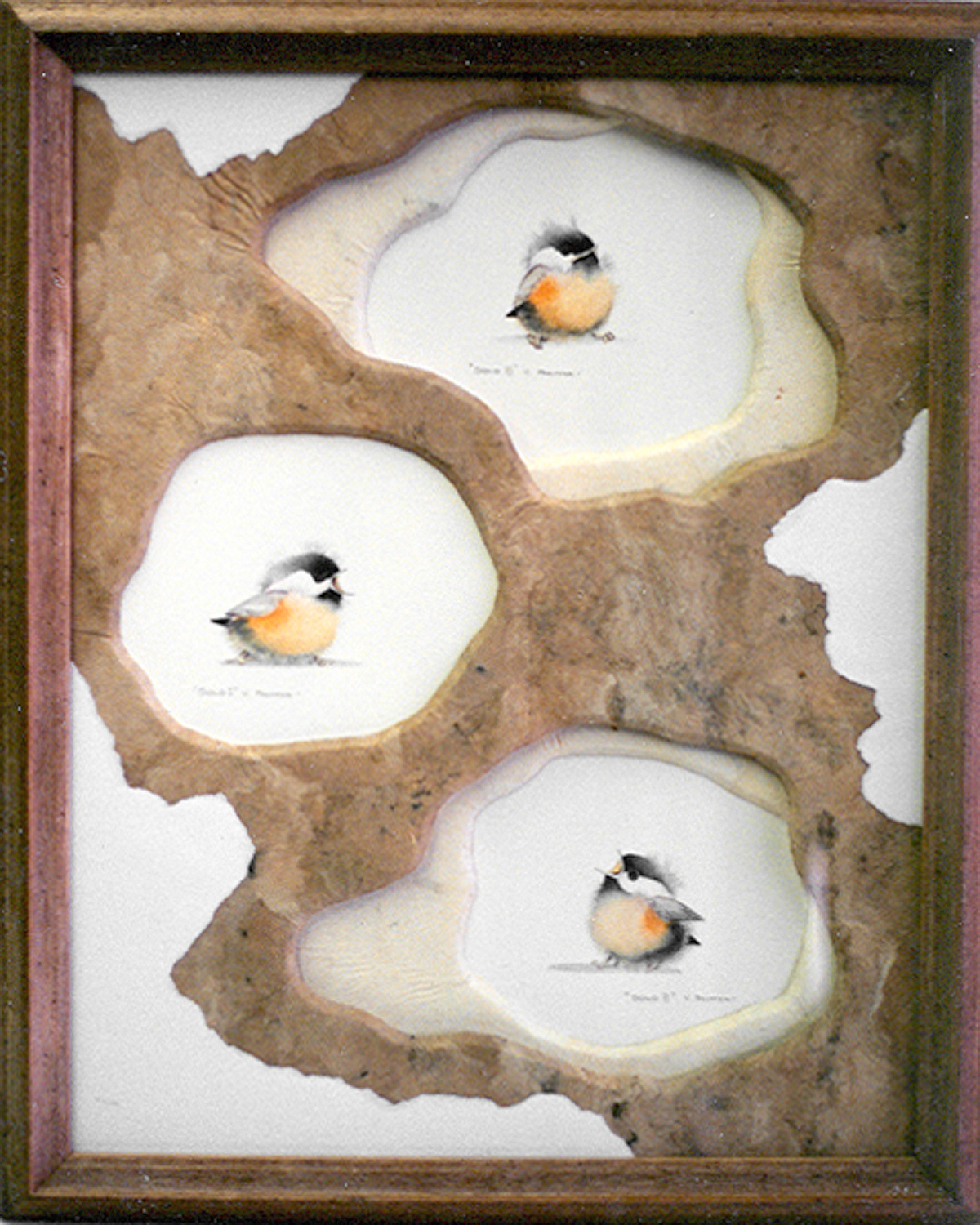
This project was originally commissioned by Bienfang in 1992 to showcase the wrapping ability of their 3/16" foam to create mats using textural materials to enhance home decor. Three decorative 5"x7" cards were selected to be framed together to create a larger overall framed image (photo 1). These are inexpensive open edition images well suited to this type of project.
Photo 1
Creating the Solution
The customer was open to any design suggestions that would showcase a decorative approach to framing a fairly basic piece of decorative art. The idea was to introduce it as a home decor piece for enhancing a newly decorated den rather than to showcase images as fine art.
The design concept was to stimulate the natural feeling of tree bark and free form branches. The neutral cream textural paper was selected to enhance the natural colored chest fluff of the baby birds, and assist in making the transition from their stark white background into the darker brown top mat. The textural Mexican bark paper was selected for the top free-form mat to help integrate the earthy naturalist environment and feeling of a tree. The remaining hardness of the cream to brown transition was softened by the curves and gentle overlapping of the free-form openings.
Analysis of Materials/Limitations
The project turned out to be a double matted 14"x18" using bevel cut 3/16" wrapped Bienfang foam boards. Two pieces of 16"x20" Mexican Bark paper were chosen in natural (brown) and bleached (white) colors to wrap the foam. A top sheet of Stonehenge White paper was used as a visual accent sheet to break up the broad spaces of darker brown. The bottom mat of 3/16" foam serves as both mounting substrate for the center bird and wrapped double mat for top and bottom birds.
The mats were wrapped in a mechanical heat press using Fusion 4000 adhesive. The entire piece was glazed with Tru Vue regular clear glass, and framed with a rustic barnwood type of moulding (now discontinued) from Victor Moulding #8906.
Who, What, When, Where, Why
In the initial overview of this piece, the who, what, when, where, why approach will begin to identify how well emphasis or focal point is used as well as establishing the basics. The viewer's eye (who) will generally centered on one of the birds, I see the top right image (what). It hesitates there briefly (when) then drifts central left to the second bird (where), ending up at the lower right bird. The bottom bird looking up and center, draws the eye back up into the second then top again.
Why is defined best by determining whether or not the completed design has unity, and involves the specific uses of contrasts and accents to establish a particular viewer reaction. As the eye flashes around the frame to the separate bird images it is also attracted by the torn white paper patches. These white spaces achieve two things. First the white paper relates directly to the white background of the original cards visually tying it together and creating greater illusion of depth, and second, it breaks up the brown into more branch-like shapes.
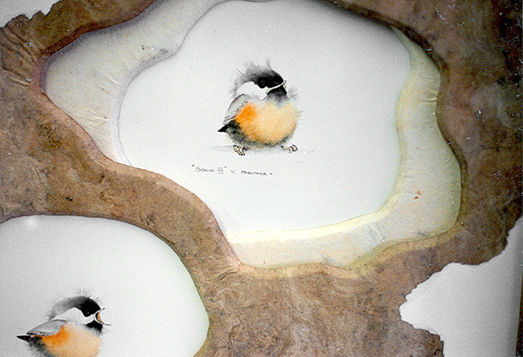 Photo 2
Handling the Elements
Line as we generally identify it was not an element actively used in this project. When a line curves into other patterns, as it is in the mat openings, it is identified as shape (1). Color (2) was used as a transition from the inner white background to the outer tree brown. If the given was the bleached paper, then the natural brown establishes color. Texture is also counted in this piece because the given texture of the bark paper is repeated in each mat, but the Stonehenge torn top layers are of a smoother nature and establish the countable use of texture (3).
The odd shapes of the mat openings contrasted by the expanse of brown with white accents would establish the use of space (4) as an element, especially since the mats don't utilize proportion and space in a traditional manner. The final element of intensity (5) should also be counted because of the overlapping of the free-form mat openings creating natural highlights and shadows within the frame.
Factoring it Together
If elements are the building blocks easiest to identify for counting, then factors of proportion, emphasis, and balance are all the way in which the blocks are used. Proportion has been addressed by the way that shape and space were used to interact to create unity.
The next factor to consider is balance, which is asymmetrical in nature. A divided line down the center of the project (diagram 1) offsets the top and bottom birds and counterweights the single matted center bird with the larger white accent paper in the lower left corner. This helps keep the layout in balance. The only additionally countable fundamental is rhythm and in this piece there really is nothing from the original art that is literally echoed in the design.
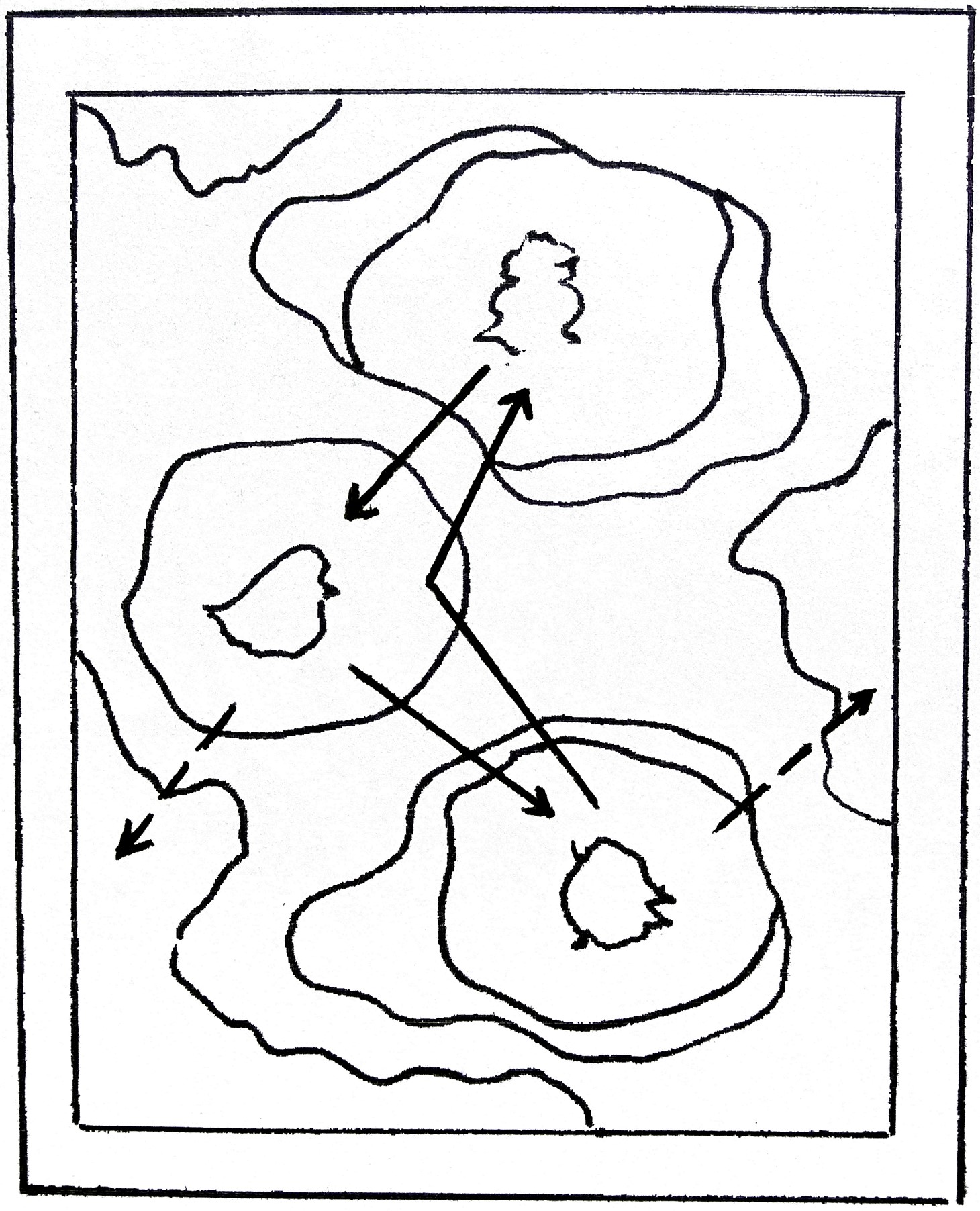 Diagram 1: Emphasis
Focal point (focus) will begin with top bird, then moves center left then lower right, reinforced by direction birds are facing (heavier black lines). Eye will flash to white paper accents (broken lines) but stays on track.
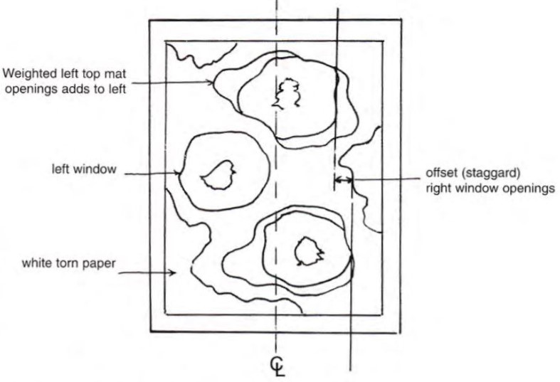 Diagram 2: Balance
The center line (CL) divides the framed image to establish balance, or lack of. The staggered right window openings are countered by the full offset left opening. Additional weight is added by the visually heavy white torn papers.
Design Philosophy
There are five (5) countable fundamentals used in the execution of this particular project, which is comfortably kept within the 3-5 suggested range. Unity is achieved by proper use of elements while always taking into account the overall dignity of the period and style to hold the art together.
In search of unity, the ultimate critique and final overview which should be used as a guide to help point out design strengths and potential weaknesses. In this decorative art piece, one slated strictly for home interior accent, the contemporary, floated little birds are introduced in a natural environment through selection of textural papers and barnwood.
Does this design invade the dignity of the art? Probably. Do you spend more time looking at the framing than the watercolor images? Perhaps. Is it a successful frame design? It is very popular with the customers and that means sales. If twenty dollars of art turns into $250 of designer accent piece is that bad?
Though all framed art should probably concentrate on enhancing the art, there are times when inexpensive images may allow the design to play with the offerings of textural papers, new wave mat boards and showy fun framing.
END
Copyright © 1997 Chris A Paschke
For more articles on mounting basics look under the mounting section in Articles by Subject.
Additional information on all types of mounting is found in:
The Mounting and Laminating Handbook, Second Edition, 2002,
The Mounting And Laminating Handbook, Third Edition, 2008 and
Creative Mounting, Wrapping, And Laminating, 2000 will teach you everything you need to know about getting the most from your dry mount equipment and materials as an innovative frame designer.
All books are available from Designs Ink Publishing through this website.
Chris A Paschke, CPF GCF
Designs Ink
Designs Ink Publishing
785 Tucker Road, Suite G-183
Tehachapi, CA 93561
P 661-821-2188
chris@designsinkart.com