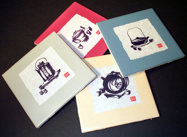
 Photo 1: Kitchen Tiles
Tiles are used as accents in bathrooms and splash guards in kitchens as seen in these 6x6" standard sized unframed kitchen tiles, produced from images of artwork published by Wild Apple Graphics of Chris A. Paschke.
What to do with tiles is a question that arises from time to time. We walk on them, shower with them, and collect them. We use them as functional backsplashes (Teapots, photo 1), as heat resistant trivets (Renaissance Herbs, photo 2), as accents for home decor (Asian Seasons, photo 3), as collectible keepsakes from travels abroad (Chinese Phoenix, photo 4), and as treasured antiques (Boston Museum, photo 5). They are waterproof, heat resistant, fade resistant, tolerant of much abuse and all around relatively durable. They are, after all, ceramics that have been designed to be used and not just admired.
First Identify
But what do we do with them? Are they decorative or collectible? Glue them down or preservationally mount them? Glaze them or not? Safe for outdoors or indoors only? Decorative tiles are to countertops what border designs are to wallpaper, in relation to home interiors. They are found as accent pieces to enhance a potentially plain counter or backsplash in both kitchens and bathrooms (photo 1). If designed for use outdoors, they are both functional and decorative as numbers and/or letters to identify the homeowners surname or street address, tolerant to the elements.
Photo 1: Kitchen Tiles
Tiles are used as accents in bathrooms and splash guards in kitchens as seen in these 6x6" standard sized unframed kitchen tiles, produced from images of artwork published by Wild Apple Graphics of Chris A. Paschke.
Since tiles are durable it appears the design solutions must surround the use and the protection of them. They may tolerate heat and sunlight, but if the framing is to enhance and ensure their long term protection, then additional care should be introduced. I have stated before that even though an original watercolor will tolerate the heat of dry mounting, that does not make it the thing to do. Same here. A tile may tolerate silicone adhesive, the acids from wood, and direct sunlight, but we as framers must help protect them from cracking, chipping, and damage from bad framing practices.
Renaissance Trivets
Tiles that are kiln fired are heat tolerant ceramics, and are often sold as trivets, as in the case of the Renaissance kitchen herbs pair (photo 2). This pair of 8x8" brown accented ceramic tiles were purchased thirty years ago at a Renaissance Faire in California. A street vendor at the faire sold them unframed as trivets. I decided against using them as the trivets for which they were originally intended and framed them in an aged, barn wood style solid oak moulding, circa 1980s from Victor Moulding. The oak moulding is reminiscent of the worn looking half-timbered styling of houses during the middle ages and well suited the period of the tiles. They have hung in my dining room ever since.
 Photo 2: Renaissance Tiles Trivet, Close-up
These are a pair of 8x8" brown accented ceramic tiles purchased thirty years ago at the annual Renaissance Faire in Novato, CA. They feature herbs from the middle ages and their healing powers. A street vendor sold them unframed as trivets. They were framed in an old antiqued looking sold oak moulding from Victor Moulding during the 1980s.
Since wood mouldings will expand and contract with heat and humidity I needed to leave the standard framing allowance so not to break the tiles if the moulding shrunk. This allowance would in turn allow the tile to clink around in the frame which might contribute to possible chipping later on. Because the tiles are ceramic I elected to line the inside rabbet of the moulding with a felt strip to act as a cushion between the tiles and the hardwood oak moulding during fitting (diagram 1). The felt liner helps support the tile without the possibility of damage.
Decorative Asian Tiles
The set of 6x6" Asian tiles (photo 3) were designed for use as accent in a backsplash or bathroom grouted tile installation, but as illustrated here can also be framed to be hung vertically as home decoration. The four seasons are actually meant to be displayed hung top to bottom spring, summer, autumn, winter rather than the way they are photographed for this article.
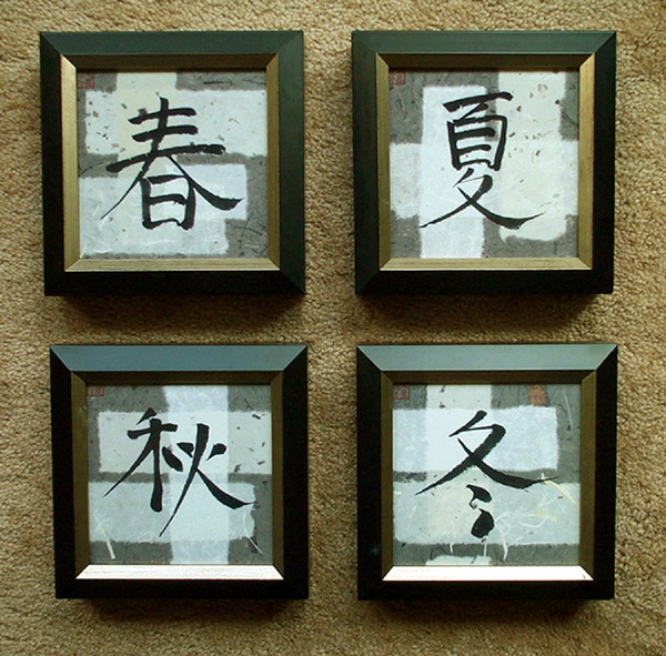
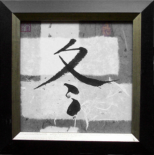 Photo 3: Asian Tiles, "Winter" Close-up
This set of 6x6" decorative Asian tiles were framed with Larson-Juhl Soho moulding #345084 to be hung as home decoration. They are correctly displayed hung top to bottom as spring, summer, autumn, winter rather than the way they are photographed here. Courtesy of Wild Apple Licensing and Chris A. Paschke
The selected moulding is Larson-Juhl Soho black with silver #345084. Though it may appear a little heavy or bulky for these small tiles, this selection actually accents and showcases the tiles so much better than any bamboo or Asian moulding I tested during the design process.
This is a rather deep moulding which holds the tiles off the wall over an inch, which also enhanced their clean, modern look.— The contemporary nature of this moulding worked well with the patchwork mulberry paper strips in the background of the tiles, while the soft matte black finish accents and visually brings the eye into the Chinese characters. The soft silver bevel of the moulding works as a liner to both separate and showcase the inner tiles. As with the Renaissance tiles, the inner rabbets of this moulding have also been lined to cushion the tiles before fitting.
Phoenix Collectible
What I love most about framing tiles is how unpredictable the mouldings have turned out to be. Both with the above Asian tiles and with this Chinese Phoenix I anticipated the selected moulding to have an Asian flavor to it. In the above project the tiles, though Asian in subject matter, are extremely contemporary. The same thing occurred with the phoenix. Though I thought I would frame it with one of the marvelous bamboo or Asian influences mouldings out there, they did nothing for the tile. The bright colors of the phoenix really called out for a moulding that could stand up to it, and the softer bamboos were both too narrow and the colors were too subdued. They were too natural, too bamboo colored.
I ended up selecting the wide Larson-Juhl moulding #635 AB with its European look and beautiful rust colored inner wood strip (photo 4). Not only does the rust strip match the color of the head feathers of the phoenix, but the carving of the moulding seemed to reflect that of the feathers of the bird. Even the antiqued gold of the carved moulding seemed to emulate the linear pattern of the feathers in the wings and tail of the bird.
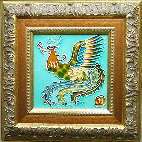 Photo 4: Phoenix
This tile was designed by Chinese artisans and brought back as a travel collectible from a trip to mainland China. It is framed for the wall with Larson-Juhl 635 AB moulding that best accented its colors and visual lines. Image courtesy of Thaer A. P. Irvin.
Design Period and Style
I have discovered that when an image is painted, cast, or created in our contemporary time with our contemporary techniques it often has a contemporary flavor. Yes, the Asian tiles are Chinese characters, but they have been painted very stylized using abstracted paper backgrounds, the traditional bamboo look fought with them while the contemporary moulding worked better.
The phoenix, was produced using traditional firing and painting techniques from the Tang Dynasty, the image is very contemporary and bamboo mouldings were too drab. Perhaps this can be explained as a contemporary rebirth of the Chinoiserie (sheen woz'uh ree') styling of the 18th century Europe. That is when popular Asian designs of Japanese and Indonesian origin were mixed with other highly ornamented popular decorating style trends of 18th century Europe including Gothic, Neoclassic and Rococo periods. The phoenix tile seems to support the look of Chinoiserie, a tile with basic Asian flair that rests well in a highly decorated almost Rococo moulding.
As a frame designer and PPFA Accredited Judge I lecture about the period and style of the framing being something that should fit with the image. By that I have meant an early American image should be framed in an early American moulding style. A Renaissance or Baroque painting belongs in a moulding emulating that time period.— Maybe that is true when dealing with traditional paintings and artwork created in the traditional style using traditional techniques.
I am beginning to see more often that periods and styles can be overlapping and at times interchangeable. The hard edges solid rules of design are softening. Maybe it's the current eclectic nature of home interior design trends today. Or these Asian tiles are simply a perfect example of 21st century Chinoiserie.
Antique Collectible Tile
The featured tile project is an antique image of the original Museum of Fine Arts Boston founded in 1870, which moved to Copley Square in 1876, then doubled in size in 1890. It finally relocated to the current Huntington Avenue location in 1909. My client has emotional attachment to this tile, having worked with the Museum in a consulting capacity nearly twenty years ago. Originally framed in 1996, it currently hangs in the corporate California offices of Gift Planning Solutions, and is shared with us courtesy of them.
This antique black and white ceramic tile is ⅜" thick, measuring square 5-15/16"x 5-15/16" and showing the original Museum of Fine Arts Boston building from 1876 (photo 5). The tile has naturally aged to an off white, and has slight fissures and chips around the edges as well as tiny hairline fractures beginning to run across it. Though still in one piece, it has an antique delicacy that needs protection from continued edge damage (photo 6). The tactile smooth texture of the architectural ceramic image and coolness of the tile when touched enhanced its overall beauty as an antique collectible. They wished the tile be protected in a frame, but did not want it to be glassed.
 Photo 5: Antique Collectible Tile
An antique tile of the original Museum of Fine Arts Boston building. Shown courtesy of Gift Planning Solutions, Copperopolis, California.
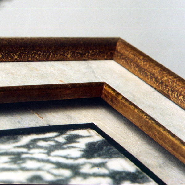
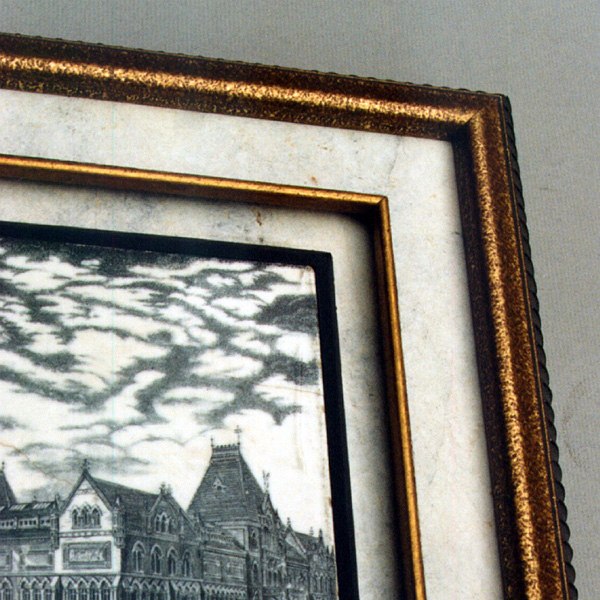 Photo 6: Corner Detail
Reverse bevel cut ½" strips of 8-ply board were measured, mitered and glued to the bottom support and flush against the tile as additional support.
The Tile Solution
Matching the natural aging of the whites and respecting the ash grey appearance of the black glazes was very important for color unity. Also the visual texture of the surrounding mats, fillets and liners, needed to reflect the same texture from within the tile. Overall frame dimensions calculated 10-¼"x 10-½" using a Larson-Juhl black Treviso moulding #404 N, 1-⅜" wide with 1-¾" rabbet depth. The moulding was chosen for its vertical linear lines, washed dusty black color, and depth. A narrow, antiqued gold fillet, Victor Moulding #11064, was selected to match the frame for the inner liner (diagram 2).
Technical Details
Bleached Mexican bark paper was chosen for its marvelous mottled, marbled appearance to be wrapped around two 4-ply black Strathmore museum boards #134-614 dry mounted together for the top mat and fillet accent (photo 7). A 3/16" black foam board was used for the bottom window opening mat, straight cut just large enough to snugly fit and hold the tile in place. The bark paper was mounted to the face of the 8-ply blunt cut window opening with pure film adhesive in a 210M-X mechanical press at 190ºF for 2 minutes and cooled under a weight.
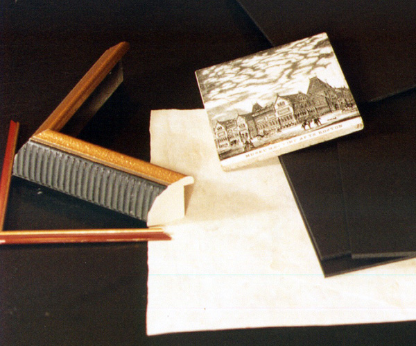 Photo 7: Materials
A Victor Moulding fillet 11064, Larson-Juhl 404N moulding, bleached Mexican bark paper, 3/16" acid free foam board, and 4-ply black Strathmore museum boards were used in the project.
The mounted paper mat was then cut to expose the open window leaving a 1" trim with mitered 45 degree corners. The bevel was ironed to bond the paper/adhesive to the square edged board and the resulting tabs were turned to the back and pressed with a heated tacking iron (photo 8). The top mat was wrapped in the same way then the fillet was chopped, glued and fitted into the window. Bulldog clips were used to hold the fillet tight against the mat while it dried (photo 9).
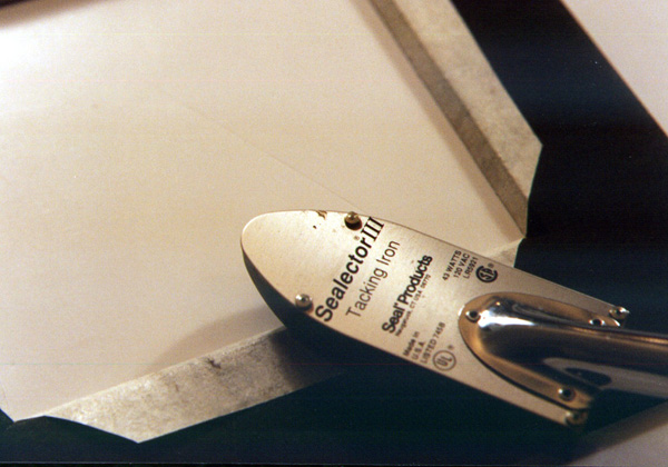 Photo 8: Wrapping Museum Board
Mount the bark paper to the face of the created 8-ply blunt cut window opening, remove center, miter corners and wrap to the back of the opening with a tacking iron.
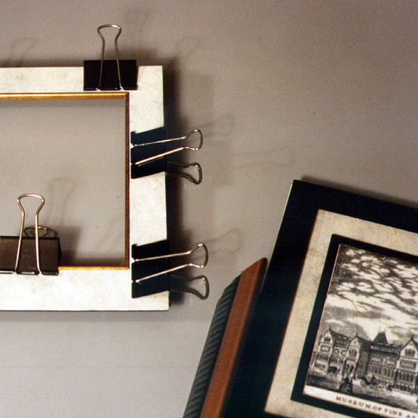 Photo 9: Gluing Fillet
The fillet was chopped and fitted, glued and held to dry with bulldog clips for the top mat accent.
The tile is fitted into the modified sink mat unit. Strips of scrap 8-ply boards about ½" wide were measured, mitered and glued to the bottom mat after the tile was inserted. These were placed flush against the upper edge of the tile for support and color accent. A ⅛" black spacer is reverse bevel cut and positioned under the top filleted window accent mat and the project is ready for the final addition of the top wrapped mat/fillet window piece for completion.
Conservation Framed?
Most materials selected for this project were acid free in nature or inert as in the dry mount film adhesive. The Mexican bark paper is wood based and is in direct contact with the tile edges. The tile itself had been held in storage for nearly eighty years in non-conservation tissue paper and an acidic cardboard gift box. Tiles appear to be somewhat tolerant of acids since they originate from natural materials and elements from the earth. Perhaps it is their ceramic nature and the fact they have fired glazes that protect and waterproof them.
This antique tile has been adequately preserved as a touchable antique as the client requested, but is the customer always right?— As framing professionals we know the value of teaching conservation framing, there are items we frame that will remain somewhat chemically inert. In many cases, tiles need to be protected more from chipping, cracking and damage from mishandling more than from acids and out-gassing.
In this case the Boston Museum of Fine Arts remains the focal point of the frame design, has been protected from further damage by protecting its edges and relieving any stresses, and is still able to be visually enjoyed. It remains, however, continually exposed to light, humidity and everyday pollutants without special precautions to protect it. I recently saw this piece which was framed in 1996, and it looks as fantastic and well preserved as it did when my client first picked it up.
What's in a Design
If tiles are designed to be grouted into shower walls or washed daily as a backsplash in a kitchen exposed to grease and detergents, surely they can tolerate the riggers of fine picture framing practices. Perhaps we should always consider the nature of the beast though. Tiles of numbers for the front porch might be siliconed into place, but an antique tile at least deserves the framing dignity of any 100 year old piece of fine art, and we must always design for the art. There will forever be a difference between decorative art and fine art, whether it be an open edition reproduction, a limited edition or tile.
END
Copyright © 2002 Chris A Paschke
For more articles on mounting basics look under the mounting section in Articles by Subject.
Additional information on all types of mounting is found in:
The Mounting and Laminating Handbook, Second Edition, 2002,
The Mounting And Laminating Handbook, Third Edition, 2008 and
Creative Mounting, Wrapping, And Laminating, 2000 will teach you everything you need to know about getting the most from your dry mount equipment and materials as an innovative frame designer.
All books are available from Designs Ink Publishing through this website.
Chris A Paschke, CPF GCF
Designs Ink
Designs Ink Publishing
785 Tucker Road, Suite G-183
Tehachapi, CA 93561
P 661-821-2188
chris@designsinkart.com