Paschke Online
Designs Ink Publishing Article Archive and Reference Library
Articles by Chris A. Paschke, CPF GCF
"The Essence of Design: Texture"
August 2000
With this month's discussion of texture we also find it placed in the annual gilding issue. The intensity of brilliantly burnished smooth gold highlights as compared to softer brushed finishes, textural three-dimensional leafed patterns, and the variables of gold leaf vs. compo leaf, all can contribute to texture when considering framing design. Line is the most fundamental of the design elements. Color elicits the greatest emotional and expressive response of all the design elements. But texture is the most tactile, or touch oriented, of the principles in the essence of design.
Definitions of Texture
Texture defines as the surface character of all materials determined by their actual physical structure. Everything surrounding us has an internal, structural texture (i.e. grain within a wood moulding holding it together); an external, tactile texture which is directly effected by the internal composition (i.e. glass is smooth, but engraved glass is rough to the touch); and a visual texture or design which may be manually applied to the surface (ie: printed fabrics or marbled papers).
Texture and pattern are intricately intertwined, a brick wall has a distinct pattern which can also be felt when touched. People often react to textures in psychological ways. This psychological reaction allows us to mentally feel without ever actually touching a given item. This establishes the difference between tactile and visual textures.
Tactile Textures
Actual alterations in a plane which may be felt when touched are tactile textures in the strictest sense of the word.Examples would be lava rock in nature or a tiered mat made with soft handmade surface paper in framing (photo 1). Commercial mat boards including Nielsen Bainbridge Sculptured Flora Designs and Grasscloth; or Crescent Pebble Embossed and Intaglio Series are all tactile. They are more three-dimensional and depend more on touch or the familiarity of previous contact to establish texture, most framing fabrics fall into this category.
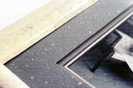 Photo 1
This tiered surface mat has a piece of soft textural green Larroque handmade paper with natural off-white paper specks mounted to a piece of white Blackcore mat board. There is a double liner mat of Medium Gray and Mist Gray with a 3/16" foam spacer between. Line, color, texture and intensity (upcoming in Part Six) are the four elements counted.
The tactile texture of a given surface may also be manually created from a smooth surface by initiating various techniques such as deep bevel wrapping the smooth surface and bevel with wrinkled rice papers (photo 2) or creating designer mats with various handmade papers either wrapped (photo 3) or surface mounted then cut into mats as in photo 1. The Ogura (left) and leather-look (center) are tactile while the Unryu (right) is more a visual texture.
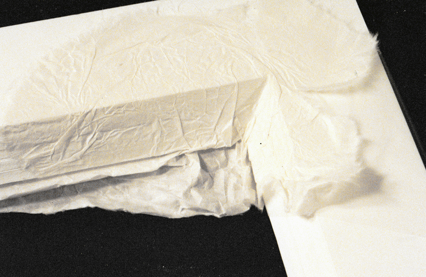 Photo 2
The tactile texture of a given surface may also be manually created from a smooth surface by initiating various techniques such as deep bevel wrapping the smooth surface and bevel with wrinkled rice papers.
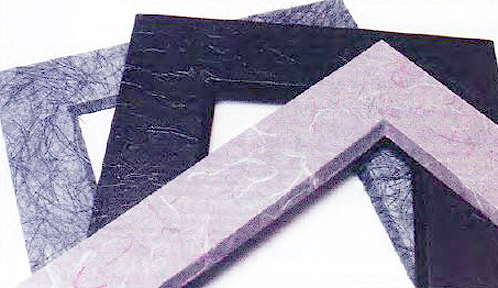 Photo 3
Handmade and imported papers make excellent materials as well as fabrics for wrapping mats for creating both tactile and visual textures. Far left is blue Ogura creating a hard, rough yet warm texture; center is leather-look a smooth, glossy, hard tactile texture; right is Unryu paper creating a soft, visual texture.
Visual Textures
Variations in light and dark on a smooth or rough surface which are two-dimensional in nature are visual textures, such as a smooth piece of granite. The surface of the rock remains smooth to the touch but is visibly textured by the physical composition of the stone with flecks of color under its surface. Matboard examples would be Flannel, Palazzo, or Faux Marble finishes which remain rather smooth to the touch yet appear rougher. Visual textures are most common in framing design, if for no other reason than the inability to touch the inner parts of framed artwork.
Tactile textures may also be visually textured. A 4-ply museum board can have both a slight visual roughness and does indeed feel lightly lumpy to the touch.Adversely, the granite Canson paper applied to the museum board in photo 4 gives a visual sense of texture (as a Flannel mat) even when no tactile texture exists. It does however, remain an element of texture. These two boards in photo 4 have very distinct visual and tactile textures.
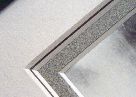 Photo 4
A sheet of granite gray Canson paper was surface tiered to a piece of Crescent 4-ply gray museum board to better match the photo reproduction being framed. It gives a visual sense of tactile texture even when no tactile texture exists, the paper is smooth to the touch. It does however, remain an element of texture.
The moulding selected for the frame in photo 1 has a distinct threaded marble pattern that is smooth and hard to the touch. Though it is able to be touched it is much more a visual texture than the tactile texture of the inner green surface mat which is actually very soft and tactile.
Texture Through Structure
Variations or inconsistencies in materials create texture through structure, a form of textural contrast. In a monotone (single colored) weaving or wall hanging, varying widths and thicknesses of threads used in the art would create a 'tone on tone' or physical variance within its texture without resorting to the use of color. Textural imagery, intrigue and interest is created simply by using all the same colors with different weights and/or fibers.
A commonly used and successful framing design features monotone coloration, allowing all the other elements besides color to showcase their potential in a powerful and unified design. Shadow boxes would be an ideal candidate for this type of presentation. By using the same color family, yet varying the surface textures for design interest, the framer would maintain concentration on the subject within the box and continue to control the use of the elements.
Texture Through Light
Using light to create texture often requires tactile textures to set the stage for highlights and shadows to be created into visual textures within a design. Stacked mouldings, fillets and spacers naturally create three-dimensional spaces and reflections where two-dimensional shadows are a result. Though this concept is generally reserved for architecture and interior design it could become an conscious use of visual texture as an element for presentations in deep acrylic boxes for very three-dimensional sculptures, masks, and textiles. Part six: Intensity.
Emotional Effects of Texture
There are two different ranges when considering textures, smooth to rough and soft to hard. Viewers react in an emotional way to colors, tints and shades as discussed in Essence of Design, Part three: Color. They react equally to textures in a psychological or emotional way. Textures may stimulate feelings of elegance and class with smooth, polished marble pillars, or warmth and romance with soft, frilly lace.
Smooth textures are often unobtrusive, undemanding and may be understated enough to allow showcasing other elements as form, color and space without becoming an additionally counted element.— Remember we must begin with a "given" and when considering texture, often beginning with smooth. It is cool, tranquil and precise almost feeling unfriendly like an austere, contemporary, white living room with cathedral ceiling and all chrome accents. Another example would be the smooth surface of a hot press watercolor paper, which also appears unfriendly, nonabsorbent and hard, though it is not.
Rough textures will attract attention, activate eye movement but can overshadow the use of form and color. They emulate the natural aspects of the earth and make people feel more at ease, more conformable. Rough surfaces can often appear warmer and informal as fabric wrapped mats can contrast with a plain 4-ply matboard. Ogura, papyrus and bark papers are great textural examples to intrigue and stimulate one's visual texture.
A textural softness beckons to be touched or cuddled. It is friendly, cozy, appealing and inviting like a Victorian family portrait incorporating velvets and laces. Softness need not portray only a feminine or juvenile subject, always keep an open mind, for velvets may appear quite masculine and dramatic if the right color is selected.
A hard texture will evoke emotional reactions of strong, vigorous feeling often masculine in nature. By adding brilliance, such as with crystal, or polish as with the fine look of expensive marble to the concept of a hard texture the result could feel much more tactually and visually satisfying. Bare wood feels hard and rough, very natural and aggressive; but strength and elegance is achieved through hard, smooth, waxed and polished burls.
Texture as a Framing Element
Intermixing textures to attempt to stimulate a viewer's emotional response to a framed artwork is rarely identified, though we subconsciously select materials on that basis all the time. Lace for weddings, flannel for babies and leather for men is used routinely to set a mood just as you do with color. Since texture is creatively used by artists and designers to gently visually stimulate or evoke a particular mood or feeling within a viewer we must also control our desire to overdo a good thing.
Textures are seen as mats, fabrics, mouldings, as well as all of the items or artwork being framed. If more than one color of the same texture is selected to be used (blue and green flannel matboard) the element of color will be the only one counted. If however various textures of the same color are used (green flannel and green marble matboard) then only the element of texture will be counted. If new mat colors and surface textures are introduced, and perhaps a panel design...then color, texture, and line will all be counted.
Texture as a Panel Design
Texture can be easily understood and integrated as a new fabric or paper wrapped mat, surface tiered mat using handmade papers, or a heavily gessoed texture to emulate a stucco wall. But texture also comes into play as a narrow ¼" to ¼" newly introduced cut or painted panel on the mat surface (photo 5). I discussed in Essence of Design, Part two: Line that a line can be anything from a narrow hairline to a wide panel. Anytime the base "given" texture is modified then texture must be counted as an element used. The panel in the photo is a hand painted Sandstone with two embossed accent lines to the outside, this is absolutely a new texture added to the mat.
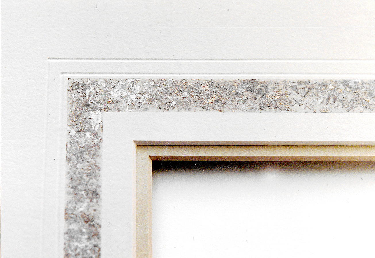 Photo 5
The mat corner detail is a double mat of Crescent Antique Tan and Vintage Gray with a hand painted sandstone ½" panel painted using two colors and silver. There are two 1/16" embossed lines to the outside of the painted panel. Color, texture, and line are all to be counted.
The new Wizard daVinci surface painting system of applying French mat lines and panel designs to blank white mat boards clearly integrates this concept into mat designing. Since the computer system encourages the addition of colors, lines and textures, overdesigning can easily occur. Whether accenting these visual textures of colored marble paper, slate stonework, or crumpled Kraft paper, any two different textural panel designs will require counting.The same goes for colors used within the textural designs. If more than one color is used to create the pattern texture still color is only counted once (photo 6).
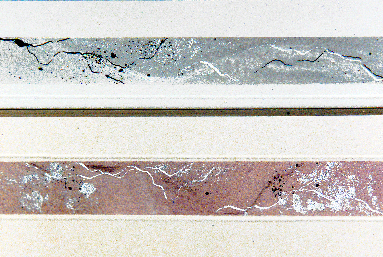 Photo 6
If more than one color is used to create the pattern texture still color is only counted once. In these two samples of hand created marble there are pastel shades and tints as well as highlights of silver veining and black specks. All these color introductions still only count color once. These are two separate corner samples placed side by side not a close up of an actual frame design.
If all the mats are off-white, of the same smooth texture, and there are three of them. Only line would be counted. If a panel design is introduced in any new color both texture and color will be added to that single line element for a total count of three. They can add up quickly, but are only counted once. Multiple panels with various textures and colors will still only count once for the new element introduction. If the items being framed are very busy with visual texture and color, it is far better to limit the total number of additional elements introduced into the framing design. Perhaps more neutral or like colors to enhance and support through a more monotone textural approach. Be careful, textural contrasts though generally only counted once may require additional recognition when they appear to be screaming for attention. A perfect example is the textural while marble moulding arguing for visual dominance over the green mat in photo 1, which will end up being additionally counted as emphasis. See Part ten: Emphasis.
Not Simply the Matting
Textures can set a mood, reinforce a pattern, or emulate an era. Both tactile and visual textures are used in framing, for there are many wonderful materials at our fingertips. Creative moulding designs, refinishing and retexturing mouldings are perfect examples of tactile textures working from the outside in. Always consider everything you do in a framing job, the whole of the presentation, not simply the matting. When it comes to texture...it all counts.
The more you learn about the elements of design the more you may feel you don't know, but subliminally it often all comes together. Placement, pattern, color, contrast, line...all begin to work together as you design with limitations in mind. Remember to control the urge to showcase everything at once, often the best designs work with the most subtle presentations, especially when introducing texture as a principle of your design.
END
Copyright © 2000 Chris A Paschke
For more articles on mounting basics look under the mounting section in Articles by Subject.
Additional information on all types of mounting is found in:
The Mounting and Laminating Handbook, Second Edition, 2002,
The Mounting And Laminating Handbook, Third Edition, 2008 and
Creative Mounting, Wrapping, And Laminating, 2000 will teach you everything you need to know about getting the most from your dry mount equipment and materials as an innovative frame designer.
All books are available from Designs Ink Publishing through this website.
Chris A Paschke, CPF GCF
Designs Ink
Designs Ink Publishing
785 Tucker Road, Suite G-183
Tehachapi, CA 93561
P 661-821-2188
chris@designsinkart.com