 Photo 1
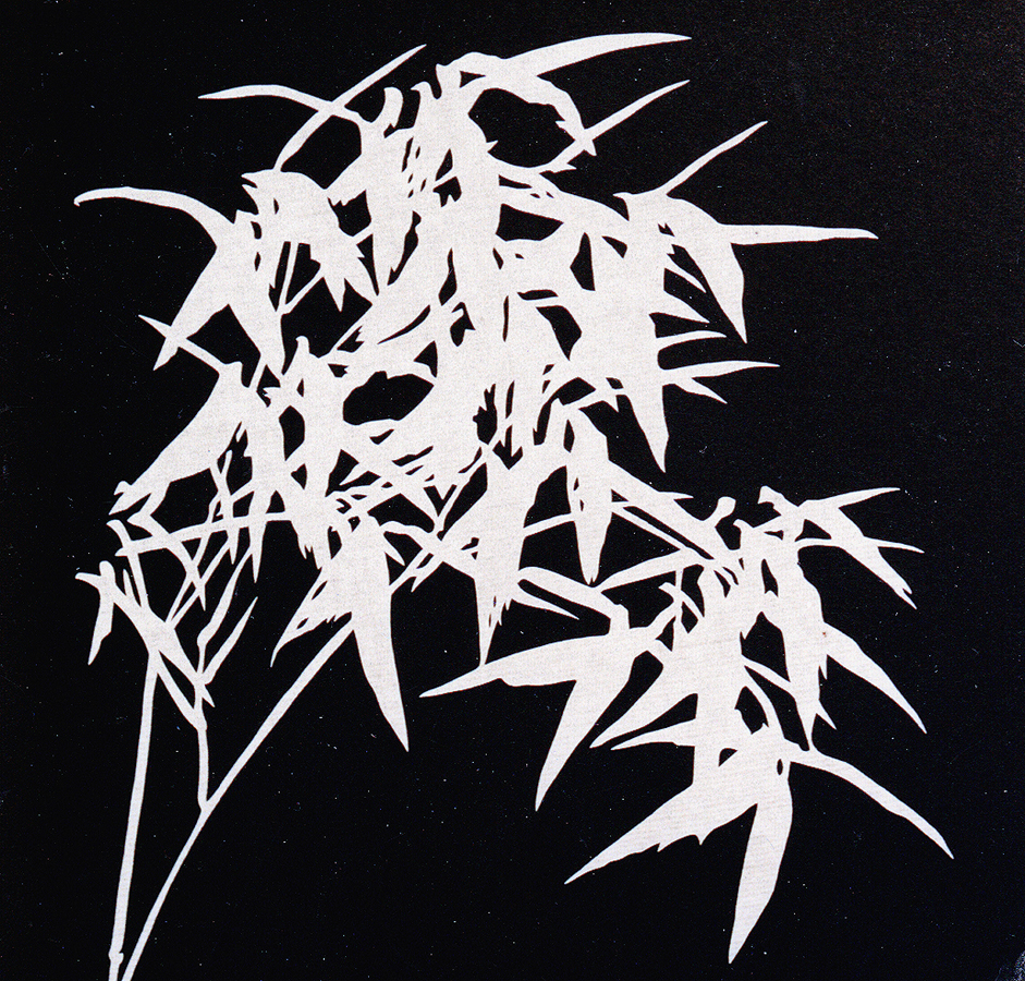
The Chinese paper cut silhouette is a perfect example of two-dimensional pictorial space, limited only to height and width, with no depth or thickness.
I read an interesting commentary on the net the other day in which it was stated that "anyone can be made aware of basic color and design elements and principles and from there it is a matter of making the framer's sense of aesthetics more sophisticated." There was also reference to a comment of mine on limiting the number of elements in relation to better controlling a design as greater sophistication is being learned and achieved. Both of these statements are true.
In this series I teach the depths of design from an academic side, and yes, it is up to each individual to better understand these principles and to put them to proper use. It seems that all of we educators agree that needing to know the basics is only the beginning, and that comparing, studying, analyzing and critiquing completed designs may be an integral part to becoming a better framing designer. I have stated numerous times that it remains the job of the framer to enhance and protect the art, and never to sacrifice that art's dignity for a flashy design. The art must always remain the focal point, the first thing that is recognized and visually explored by the viewer.
Space
As for this month the study is in space. Truly understanding space will better prepare the designer to better utilize it in framing design and when applying the factors of proportion, emphasis, and balance. Space is the distance around or between items used to unify or highlight an image. All physical things exist in space. Space envelops us completely, but its reality is in the forms that give it definition, as in mats and frames. While space defines as a measurable distance between pre-established points, two-dimensional space only involves length and breadth; three-dimensional space adds depth; and four-dimensional space adds time or motion. Visual design is actively concerned with three specific types of space: pictorial, illusionistic and actual.
Pictorial Space
Design relating to a flat surface as in a cutout paper silhouette is known as pictorial space (photo 1). Although there appear to be no borders, the design is contained within obvious dimensions. These types of decorative spatial concepts involve two-dimensional images or those in which a picture has height and width but no depth. Space then exists across a plane rather than in it.
Photo 1
The Chinese paper cut silhouette is a perfect example of two-dimensional pictorial space, limited only to height and width, with no depth or thickness.
Pictorial space is concerned with shapes and space interacting on a flat surface with no implied depth. Cut paper silhouettes, stencils, and flat woodblock prints are good examples of pure pictorial two-dimensional space. These types of images are commonly found as patterns on fabric, decorative marbled papers, panels, wallpaper, and borders.
Illusionistic Space
Once the concept of depth must be achieved, then multiple planes are established through techniques of overlapping, layering, size, and perspective. These plastic spatial concepts, also called illusionistic space, are those dealing with three-dimensional images in relatively two-dimensional presentations. It is the establishment of creating one vertical plane behind another.
Egyptian art utilized pure overlapping to establish depth (photo 2). Paleolithic cave drawings, Mesoamerican wall paintings, tapestries, and banners often used this form of depth dimension. Layering was also used to establish distance by the lower edges of a work being the closest to the viewer with the top edges being farthest away. This is commonly seen in Asian paintings and by Persian artists in both paintings and illuminated manuscripts. Size is also used in conjunction with the above mentioned layering techniques for establishing distance. Most often, the larger an image is in size the closer it appears to the viewing window. By establishing the horizon line as an eye level reference point, the farther down or lower in the picture window the nearer the item will appear. The higher in the widow the farther away (position or vertical location).
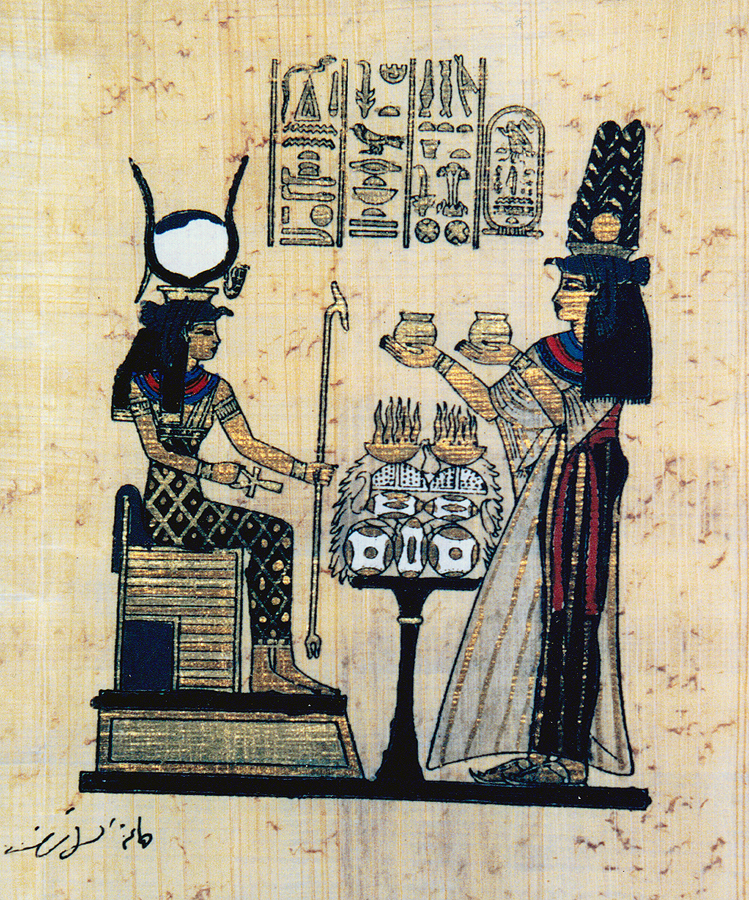 Photo 2
Egyptian and Mesoamerican art are examples of overlapping techniques used in illusionistic space by layering vertical planes in order to establish depth.
Linear perspective, established during the 15th century, first utilized vanishing points to create the illusion of diminishing details and converging parallels as a depiction of space. Diminishing detail simply features sharpness up close with a loss of definition through hazy shapes, indistinct lines and grayed values for distance. Vanishing points are a mathematical system for creating a three-dimensional space on a two-dimensional surface, as exemplified by a set of disappearing railroad tracks. The Western approach to linear perspective involves the closing of spaces as images fade into the distance, away from the viewer.
The Asian approach involves inverse perspective which establishes the viewer as the vanishing point, creating more spatial freedom or openness moving outward from the art through layering and size variations. In this case the objects closest to the viewer are larger and located in front of other shapes. Size is best visually determined in these paintings by actual size ratio: if a mountain is to be ten feet high, the trees will be one foot, a horse one inch, the man a size of a bean.
Subcategories of illusionistic space include shallow space, in which a three-dimensional concept is embraced but there is a total depth limitation, and infinite or deep space, in which images appear to continue on forever. A shadow box would fall into the category of shallow or limited space. A picture frame, however, can act as a window through which one sees an endless recession of dimensional images often creating the illusion of infinite space.
Period hunt prints and landscapes utilize a two-dimensional pictorial concept in which the illusion of three-dimensional space has the quality of endlessness found in the natural environment. Most art for framing deals with illusionistic space, as two-dimensional images which create a visual illusion of depth and space meant to give the feeling of three-dimensionality. As framers we need to be aware of the types of depth so there remains a continuity in design between the art and the framing package.
Actual Space
Pictorial space only implies space on a flat surface through positives and negatives but no depth. Illusionistic space creates the three-dimensional sense of space by adding depth through various artistic techniques. Actual space relates specifically to three-dimensional items where space is real and tangible. It concerns itself with artworks such as pottery, jewelry, sculpture, family mementos, and special objects.
How does all this relate to framing and when does it become a countable element? The very essence of framing establishes layers of glass, mats, fillets and spacers. Spacers are used to create the illusion of depth in a physical way, the reality of three-dimensionality through actual space.
An area, actual three-dimensional space, is shaped into a room by the enclosing planes or walls; likewise, the area within a frame creates a specific three-dimensional space, but that is the "given." A design must be taken one step further for space to become a countable element. A good example being the faux etched mirror which uses two sets of Framespace (as spacers) to create physical depth using actual space (photos 3).
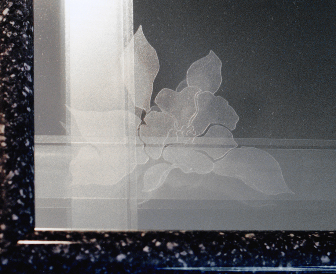 Photo 3a
This is an 8"x 8" layered framed mirror accented with heat applied laminate in a faux glass etch design.
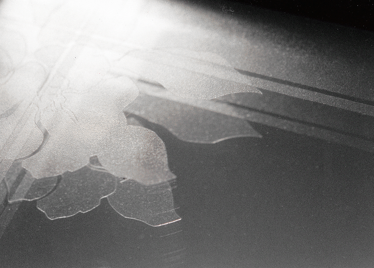 Photo 3b
A mirror is placed behind two sheets of faux glass etched designs three-dimensionally spaced apart using black spacers. Space will be a countable element in this project as it is an integral part of the visual creation.
Space and Line
The physical properties of a line contain other spatial ingredients. They may be long and short, thick and thin, straight, angular, curved, on different spatial planes, or simply placed in contrast to one another. A long thick line will appear larger and closer to the viewer than a short thin line. A diagonal line may appear to transcend planes, while vertical or horizontal lines may feel more static.
A wide v-groove placed on the inside of a narrow v-groove will mentally fight for dominance and ultimately be distracting the viewer from visually moving into the artwork. It works as a stopper. When a double v-groove design is implemented around a window opening the wider of the two should be placed farther to the outside away from the window.
Space and Color
Prior to the days of Paul C—zanne in the late nineteenth century, deep space was considered to begin with the level of the picture plane, then recede from it. Today color is used to address spaces in front of the picture or frame plane. Analogous colors (three or four neighboring colors from the color wheel, diagram 1) create spatial movement while contrasting colors provide accents or focal emphasis. The wider a v-groove line, the lighter the color should be to avoid visual distraction, otherwise there could be too much undesired emphasis.
 Diagram 1
Shallow space features three-dimensionality with a specific depth limitation. Shadow boxes best represent this type of illusionistic space.
Space and Texture
The interesting thing about textures are their impact on spatial depth and placement. Sharp, clear, bold textures will appear to advance; while fuzzy, dull or miniscule textures recede. Care must be taken when integrating textural matting of both visual and tactile nature into a frame. If a textured fabric mat is selected as a liner it should not argue with the colors and textures of the top or surface mat. If a liner is meant to enhance and recede, then a bold, primary colored, large open weave canvas wrapped mat will not settle down enough to take its secondary place in the frame design.
Space and Shape
When considering space in the creation of artwork the concept encompasses two- and three-dimensionality within the image. When relating space to picture framing it deals with the shape and proportions of mats and frames; placement of three-dimensional objects within the frame; and frame design and decoration. This is most addressed within either a shadow box or a multiple opening frame, and the key is to relate all objects, allow for smooth visual transition, and to showcase the art by control of all positive and negative spaces. Multiple opening mats create numerous situations where combined shapes reveal large empty spaces or potentially distracting voids. A perfect example would be an oval within a rectangle (diagram 2). These may be controlled by adding subtle surface decoration or additional cutouts.
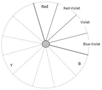 Diagram 2
Analogous colors are three or four colors in adjacent proximity on the color wheel, and in which one color dominates the group.
Positive and Negative Space
The area or space in which objects or images exist is called positive space. Space may also be the distance, void or interval between things akin to moments of silence in music, a pause in speech, or the blank mat area between multiple openings. This is known as negative space. Positive and negative spaces are equally important in the layout, placement and visual unity of a design or grouping.
We are probably most aware of space when arranging wall groupings (photo 4). The negative spaces between the frames, or objects within a frame, should remain constant in order to establish a rhythm and pattern to the grouping. By concentrating on alignment and negative spaces between the frames in a grouping, visual unity is easily achieved. The same is true with an object box showcasing numerous collectibles. The spaces between items are every bit as important as the items themselves.
 Photo 4
Space is not a counted element when shape is features in a wall grouping presentation. Common lines and use of horizontals will hold groupings together while even spaces between maintain individuality.
Space Within Framing
If all things exist in space, we must expect them to move about within it. A picture frame is generally rectangular in shape, its edges can be interpreted as lines, it exists in space, it has a relatively smooth texture, can be seen only in light values (intensity), and its color is variable. Often space appears to be more of an application (a factor) than an actual tool (an element) because it often involves so many of the other basic elements, but it remains every bit as important and independent.
Line directs the eye around the interior of a frame and as we have explored, all types of lines create individual spatial relationships. A ruling pen line as an example of two-dimensional pictorial space and would never be recognized as a space element. A v-groove line, though truly a physically three-dimensional use of actual space also would still count only as a line element.
A surface marble paper strip (line) contrasts with a botanical print differently than a deep bevel wrap using the same marble paper would. The second example adds depth, contrast and potential shadows also introducing a use of intensity. Generally, the only time space will be recognized in framing is during the production of multiple opening mats, shadow boxes, extremes in accented border width, or framed wall groupings. They all utilize space in a more dramatic way to achieve a particular design response or end result.
Space is not a countable element when shape or proportion have been recognized for the same reason. It must be consciously noticed and counted when it is an integral part of the design as in the faux glass etched photo sample, or an oval window in a rectangular mat using no negative space decoration. Anytime the eye is drawn away from the art, then focal point is lost and an element is shouting for attention. Recognize the ones that shout and praise the ones that whisper...as good use of design principles.
END
Copyright © 2001 Chris A Paschke
For more articles on mounting basics look under the mounting section in Articles by Subject.
Additional information on all types of mounting is found in:
The Mounting and Laminating Handbook, Second Edition, 2002,
The Mounting And Laminating Handbook, Third Edition, 2008 and
Creative Mounting, Wrapping, And Laminating, 2000 will teach you everything you need to know about getting the most from your dry mount equipment and materials as an innovative frame designer.
All books are available from Designs Ink Publishing through this website.
Chris A Paschke, CPF GCF
Designs Ink
Designs Ink Publishing
785 Tucker Road, Suite G-183
Tehachapi, CA 93561
P 661-821-2188
chris@designsinkart.com