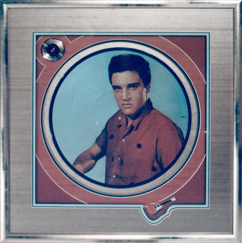
 Photo 1
Following the contour of the small guitar shape in the opening edge of the window mat establishes shape as a dominant element in this design.
Photographs, whether RC, Ilfochrome Classic or antique keepsake are often best showcased when the period styling or nature of the image is reflected in the shape of the window opening or frame it is placed into. For centuries, oval and round frames have held portraits of some of the finest families in history, including our own. What better issue than to discuss shape and its importance as an element of framing design.
What is Shape
Shape is an element integral to design. It creates beauty, refines craftsmanship and reinforces unity. Artists use shapes to develop the illusion and fantasy inherent in their art. Framers use more tangible objects, such as mats and frames, in the form of shapes to complete their presentations (photo 1).
Photo 1
Following the contour of the small guitar shape in the opening edge of the window mat establishes shape as a dominant element in this design.
Shapes are areas which stand out from the space surrounding them because of a defined boundary, or because of a difference of line, color, or texture (photo 2). They are recognized as known objects because of actual geometric or physical form consisting of height and weight. Thus, shape defines a specific area. It then communicates ideas and emotions to the viewer and often is used as a vehicle to stimulate or excite.
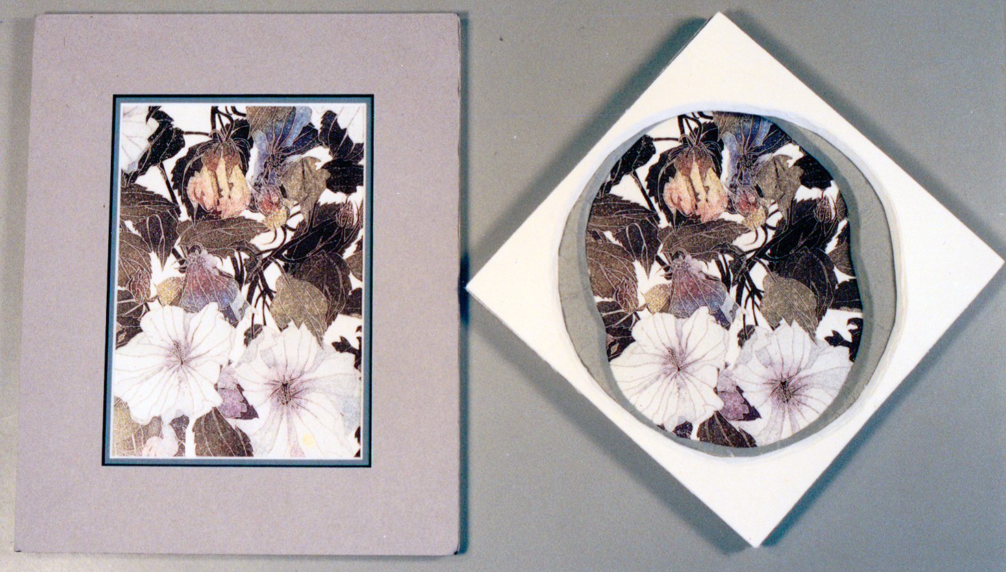 Photo 2
The left sample does not use shape as a design element since all openings and edges are based on the given rectangle.But the square outer shape of the sample right with its inner free form circular shape absolutely does. Color, texture, and shape count as three used elements.
Natural Shape
When considering pure shape, there are four general categories also known as characteristics: natural, geometric, abstract, and non-objective. Natural shapes make up all of our surroundings such as stones, leaves, puddles, and clouds...they are anything found in the natural environment. Plants, animals and humans are all natural noncreated shapes.
Geometric Shapes
Natural shapes (not manmade) may also be characterized as geometric. One of the most common geometric natural shapes is that of the hexagon. It is part circle part square and is naturally found in honeycombs, turtle shells, mineral deposits, snow crystals, and biological tissues.
Geometric shapes are comprised of triangles, squares, circles, etc. and as mentioned above are closely related to Nature, architecture, or in this case picture framing. Rectangular, square, hexagon, round, oval, and multiple opening mats all constitute use of geometric shape as an element in mat design (photo 3). Frames that are multi-sided, oval, rectangular, offset etc. also create geometric shapes, but with mouldings (photo 4).
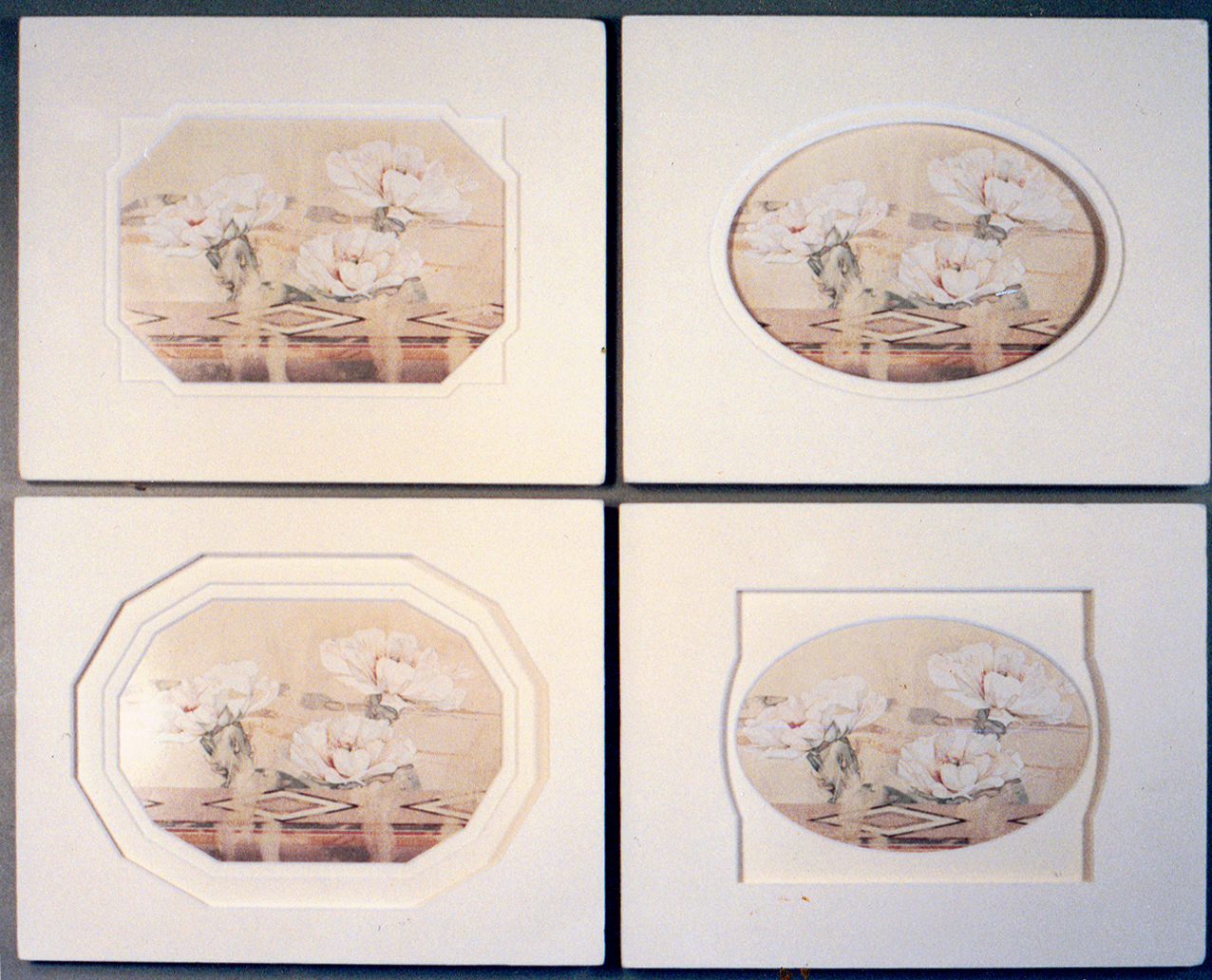 Photo 3
The four samples illustrate how different shape openings visually effect the impact of the inner artwork. These are all in the same sized 8"x10" mats with 1-¾" borders, but the surrounding spaces either open up or confine the image.
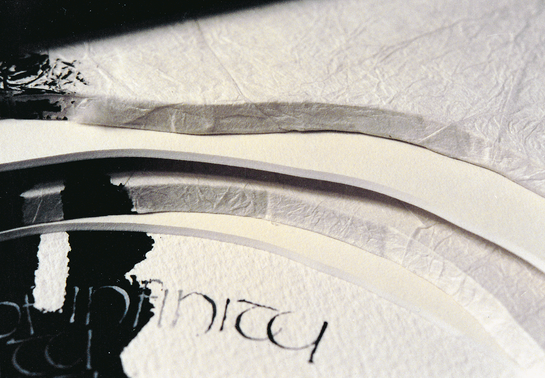 Photo 4
This corner detail of FrameMica moulding cut in the shape of a television was used as a competition piece years ago. A great use of shape as the frame.
Abstract Shapes
Natural shapes reduced down to their essence become stylized or abstracted. American Indians have used religious, earth, and animal forms converted into distinctive abstractions and patterns, which often have very specific symbolic meanings. These shapes are used as designs on pottery, weavings, and jewelry. They emulate natural forms yet evolve into abstracted patterns of their originals.
Nonobjective Shapes
Nonobjective shapes are those that don't originate in any recognizable shape or object. Though they may have been stimulated by an actual natural form such as the human body, the resulting design no longer visually resembles the original, upon which it was based. This is most notable in many contemporary artists such as Kandinsky, and some of the later paper projects by Matisse.
Psychological Meanings of Shapes
Framing uses shape as the perimeter surrounding artwork, creating its border. Horizontal shapes within an artwork, such as a landscape, predominate within a horizontal frame unit. Vertical images grow upward if placed within a vertical frame format. Maintaining or reinforcing the shapes within art creates a harmony between the frame and its contents. It also emphasizes the mood of the original shapes of the artist's images, as the strong near vertical Japanese brush stroke is reinforced by the square frame hung at a diagonal (photo 5). Therefore, design selections of specific matboard openings and moulding perimeter shapes are extremely important. They may either reinforce the original feeling and mood of the art, or throw the entire presentation into an unsettling visual arena.
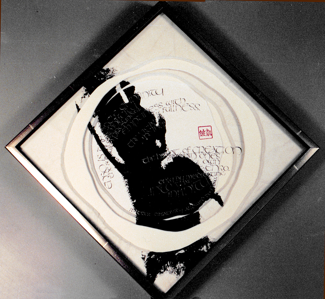 Photo 5
The use of a square frame hung at the diagonal sets off both thefree form inner mat openings, which echo the curved lettering forms, but also reinforces the dark bold curvilinear natural shape of the near vertical Japanese brush stroke.
For centuries, psychologists have been studying the human mind and its reaction to visual shape stimulus. Ink blot responses attempt to standardize human reaction, feeling and emotion in connection with specific lines, colors, and values that create nonobjective shapes. These studies have determined that although it remains somewhat individualized, squares generally equate a feeling of perfection, stability, symmetry and self-reliance. Rectangles stretch those emotions into a more solid base as a result of the stronger horizontal. There is also a tendency to soften the rigidity and perfection a bit, so it feels more relaxed.
Controlled Tension
Compositional balance must be considered when arranging shapes within a confined unit, frame or shadow box. Dark, dense shapes appear heavier and attract greater attention. Shapes of intense color must also be offset to adjust the visual balance within a frame.
A single portrait dressed in dark clothing amidst a multiple opening mat of light colored portraits will be the first photo seen. This dark shape will dominate even if all the images are the same opening dimensions. The desired end product utilizes what is known as controlled tension to direct or balance the images. Visual interest and balance must be achieved or the design is doomed to failure. Good art will already contain this necessary element, but object boxes, multiple openings, and wall groupings must be controlled by the framing designer.
Shape Dominance
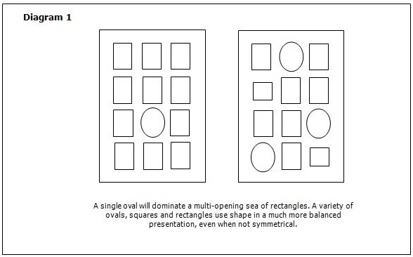
The concept of controlled tension is to arrange shapes is to gently guide the viewer's attention (vision) from one element or object in a frame to another on a directed course. This may be controlled through controlled vision or shape dominance. This in turn stimulates use of other elements such as rhythm and movement. The determination of visual importance or controlled vision of an object, photo or framed unit may easily be manipulated by shape, either by the outer frame perimeter or the inner mat opening. A single oval opening amidst a sea of eleven rectangular openings in a multi-opening mat will attract shape dominance, or greater visual importance. Three oval openings with seven rectangular and two square openings will better balance the visual dominance depending upon the location of the shapes within the frame (diagram 1).
The size, subject and surface decoration involving line, color etc. also add to shape dominance. An oval surrounding a portrait will often dominate an oval surrounding a garden snapshot. An oval opening would also have less visual strength, if there were ruling pen or tiered mat lines, surrounding several rectangles, even if it were the only oval in a twelve opening mat.
Since a shape consists of a border or outline and visual control is the goal in framing, if you elect to showcase shape as an element through pen lines, tiered mats, cathedral mat, or offset corners, the execution must be clean and perfected. The parallel between the diagonal within the image and the v-groove qualifies shape as an element (photo 6). The idea is to make a statement so shape becomes recognized as an elected element within the design and countable in your 'three to five' design principle limitation.
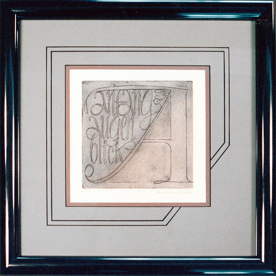 Photo 6
The accented parallel v-groove reflects the double line of the downstroke on the left leg of the letter "A". This creates a repetition of shape while also using color, and line. Limited edition print by Karlgeorg Hoefer, author's private collection.
Shape and Mass
Shape is a two-dimensional design, mass is the 3-dimensional version of the same thing. In life, they are essentially inseparable. The same four categories of shape are found in mass: natural, geometric, abstract, and nonobjective. Mass in its actual three-dimensional entity is one of the most important elements of design, the human figure being the most widely used natural mass.
For geometric mass, a square becomes a cube and still represents stability. A circle becomes a sphere and represents satisfying wholeness and eternity, like the earth. A triangle becomes a pyramid and often symbolizes religious, or spiritual monuments such as the Great Pyramids of Egypt. Two additional shapes evolve with three-dimensional mass. The cube evolves into a cylinder as seen in vases, thimbles, spools etc. The pyramid evolves into a cone as often seen in artistic glass and pottery designs.
Abstract masses are often sculpture or the oddities we are asked to frame but can never quite figure out what they are or why someone wants them framed. While nonobjective masses are generally organic in nature, such as a piece of blown glass. These somewhat bimorphic shapes are ones inspired by nature without truly representing them. They are curvilinear shapes that in art suggest the possibility of life.
Shape in the form of mass is what the framer deals with when framing objects and keepsakes. Using the power of visual control, concentration, shape dominance and emotional control by using placement, interaction, and balance is vital in this type of framing design. As a successful frame designer you must maintain total control over the visual impact of the completed design.
Shape Relationships and Multiple Openings
Understanding shape and mass, as defined in this article, is not nearly as important as realizing their impact on the viewer. The relationship of shapes to their surroundings have a major effect on a successful design. The shape itself is considered a positive area. The shape surrounding it is considered the negative area. These are most commonly known as positive and negative space, yet they are indeed created by the presence or void of shapes.
Negative shapes are equally as important as those creating the positive shapes. If openings are cut too close together in a multi-opening mat the negative shapes will be too weak to properly balance the images. When this happens the controlled tension becomes too intense and uncomfortable (diagram 2). Shapes placed too widely apart may lose relationship to each other also, a surplus of bad negative shape occurs, and a poor design is the result. When this happens the vast shape created by improperly placed openings develops space that must be counted as an element (see article Space).
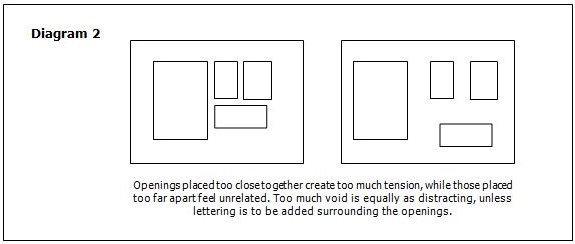
Another situation to watch out for is the placing of curves next to straight lines in a multiple opening composition (diagram 3). This also creates too much negative space through bad shape compositions. A circle, diamond, and circle together leave vast areas of voided space that attracts undue attention away from the art. Wall groupings are another situation where multiple shapes might end up together on a wall (photo 7). The same problem occurs with too much space created by voids of negative shapes put together.
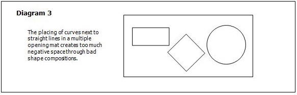
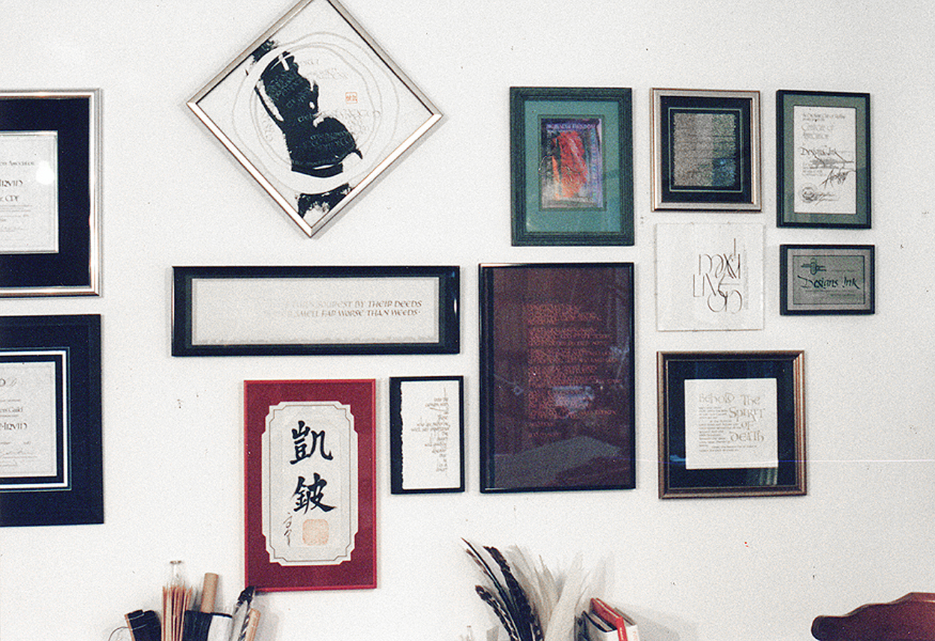 Photo 7
The right hand half of the pieces are hung with negative shapes in mind. The center left square hung at the diagonal leaves a great deal of void around it, so by moving it higher than the top horizontal helps balance it. The two certificates left are placed slightly too far from the grouping leaving a negative shape too wide to be visually comfortable.
Often the proper use of shapes in relation to placement and the creation of positive vs. negative space is instinctive. There are few hard, set rules for how far apart openings must be placed, or how many work well in a given outer perimeter shape. The art will tell you when the spaces are correct, if you listen.
Shape is harder to label than line, color or texture, when counting elements, but it is every bit as important. Understanding that lines produce shapes, that shapes become mass, and that too much negative shape creates negative space that must be dealt with.
END
Copyright © 2000 Chris A Paschke
For more articles on mounting basics look under the mounting section in Articles by Subject.
Additional information on all types of mounting is found in:
The Mounting and Laminating Handbook, Second Edition, 2002,
The Mounting And Laminating Handbook, Third Edition, 2008 and
Creative Mounting, Wrapping, And Laminating, 2000 will teach you everything you need to know about getting the most from your dry mount equipment and materials as an innovative frame designer.
All books are available from Designs Ink Publishing through this website.
Chris A Paschke, CPF GCF
Designs Ink
Designs Ink Publishing
785 Tucker Road, Suite G-183
Tehachapi, CA 93561
P 661-821-2188
chris@designsinkart.com