Paschke Online
Designs Ink Publishing Article Archive and Reference Library
Articles by Chris A. Paschke, CPF GCF
"The Essence of Design: Proportion"
June 2001
Since the onset of the 21st century it seems that the push for profits has shifted into high speed. Then just when we think its safe to sit back and revel in our successes, elections become a joke and the stock market takes a dive. When is it safe to relax. Probably never. The old adage a rolling stone gathers no moss simply translated into good business means we must always move ahead, hit the ground running, don't look back, and think about marketing and profits all the time.
So how might this all apply to design? And why open the article on proportion with a discussion of profits. Interestingly the theories surrounding profits in picture framing can often be reduced to size and placement. Wall groupings create profits by their essence of being more than one framed item for a cluster of images. Stacked mouldings have been marketed and written about in numerous articles, another source of increased profits. And in the last few years the concept of wider mats has finally caught on. It stands to reason the wider a mat the more the framed art will cost.
What is Proportion?
Proportion is what makes our world recognizable. It is the amount of visible sky vs. land or forest vs. desert. A mountainside may be charred by fire but we still recognize the mountain because of its proximity to surrounding landmarks. Thus proportion is the relationship between parts. Once mouldings widened to 3", 4" or more, mats had to proportionately grow just to maintain a balanced presence, to establish a better relationship between frame, mat and inner artwork. In turn additional profits.
History of Border Widths
The concept of weighting the bottom of a mat originated during the period of time when art was hung very high on 12'-15' walls at an angle. Widening the bottom border compensated for the sightline problem and the optical illusion of the same size bottom border appearing narrower when seated.
Contemporary, safe, and somewhat standard guidelines for mat proportions have often made the top mat widest of the mats used. Generally the wider the fillet, whether wood, wrapped bevel contrast or liner mat, the wider that top mat should be. The image size of the art should not necessarily predetermine mat borders by using mathematical standards or formulas. This has been exemplified time and time again by wonderfully exaggerated mat borders to help showcase tiny images (diagram 1/photo 1).
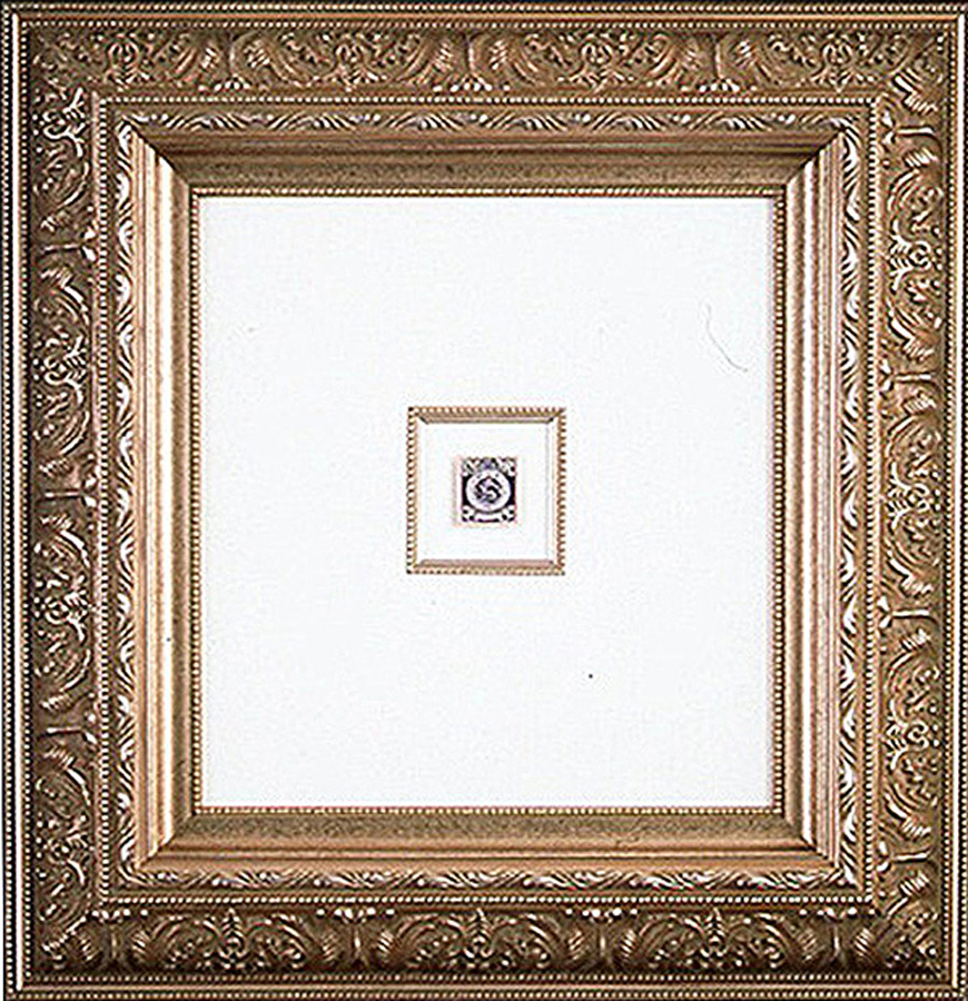 Photo 1
The tiny postage stamp is floated on a base rag board, surrounded by a wood fillet and second larger top mat. Notice the wide moulding is offset by the slightly wider op mat. The accented inner fillet helps draw the eye from the large outer moulding into the tiny stamp. Even though the image appears to be centrally placed, the mat has been slightly bottom weighted to create visual proportion and balance. Courtesy of Larson-Juhl
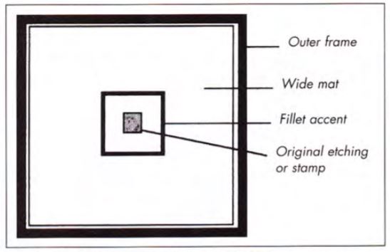 Diagram 1
Pay attention to the widths of frame components and vary them to avoid monotony and boredome in a design.
These contemporary mats have commonly had weighted bottoms of ¼"-½" depending upon the overall size of the frame and the rabbet lip width. Until recently, 20th century designs often showcased 2-½" to 4" double mats with ¼" weighted bottoms and showing a ¼" inner liner. Perhaps this should be considered the given when dealing with proportion as a countable principle.
21st Century Proportional Thinking
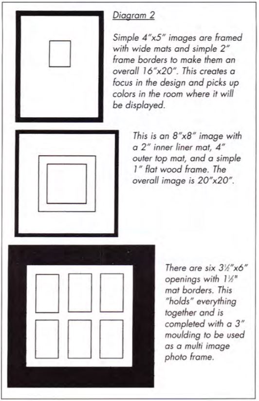
Having just thumbed through a Spring 2001 Pottery Barn catalogue, it is clear wider mat proportions are ousting traditional narrower proportions in the field of interior design. Contemporary looks showcase small 4x5" images within 2" frames for an overall size of 16x20"; 8x8" images within 1" narrow simple frames enlarged to 20x20"; and multiple window photo frames with narrow 1-½" mat borders and 3" frame mouldings (diagram 2). Framing and it's proportions seem to have made it into the 21st century with all the freedoms and poetic license of any design whim.
Proportion and Ratio
Proportion defines as the relationship, dimension or magnitude determining how much space an item occupies and how large or small it is in relation to its surrounding area (diagram 3). It deals with the ratios of one part to another which is why it is most often categorized as a factor rather than a basic element. In framing, this translates into the actual frameable image size plus the outer dimensions of the mat and completed frame.
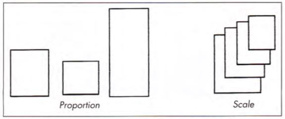 Diagram 3
Proportion is a matter of size relationships within a given project or entity, while scale refers to the actual size of the entity.
Ratio implies a comparison, and in art is often expressed through a comparison of size, number, position and space. An artist must fit all of the pieces together so a design feels comfortable. In turn, all the pieces of a framing design puzzle must fit together comfortably in order for it to be successful.
Successful fitting and use of framing principles requires personal judgment on the part of the artist or framing designer. There are no real RULES for presenting framed art with the correct mat widths or with the correct proportions. Some framers have a natural eye for identifying a design that fits, and this is often why some designs appear much more successful than others.
Mathematical Proportions
When there is a problem determining the proper aesthetic design proportion for a given project there are always more analytical means of achieving the correct dimensions. Proportion may also be explained as a mathematical relationship of parts to the whole as established by the Greeks through the GOLDEN MEAN. This theory provides for continuous halving of distances to ensure proper and comfortable proportions. Everything always relates mathematically to everything else, it's predictable and dependable.
Another familiar relationship of proportion is based upon the DaVinci's drawing of the human body creating a perfect circle through its proportional relationship of arm stretch, stance and body height. How can this then be translated into proportional relationships in framing?
Basic Framing Proportions
As already mentioned the most common use of recognizable proportion is noted in mat border widths and ratios of mat to fillet to moulding. Though there are no hard and fast rules, especially with today's wider trends, but the most important phrase to remember is don't crowd. As in the previous discussion of mathematical proportion, design is often most dependable when proven guidelines are followed. The easiest tool for controlling use of proportion is to remember to vary widths of materials selected. Never design the mat to echo the same width of the moulding or an inner fillet to mirror the liner mat width beneath it.
Whenever panel designing, regardless of the media, be it dry pigments, ruling pen lines, v-grooves or glass etching, always consider variation in widths. Don't repeat the same spacing between decorative elements unless a specific viewer reaction is attempted (photo 2). In the Peggy Lou sample the inner fillet mat and top mat are definitely wider than the 2" moulding, but the surface decoration on the top mat creates the illusion of the top mat actually being the same width as the frame. This makes the design feel somewhat out of proportion.
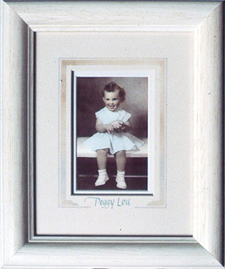 Photo 2
Notice the widths of the moulding vs. the actual and illusionary mat widths. Though not the same width they feel out of proportion.
In photo 3, though the dimensions are all varied nicely the painted surface design is far too close to the center of the mat between the image and frame, making it appear crowded. Proportion is a player in all aspects of the presentation and for a design to ultimately be unified it must work well and not demand attention in one area more than another.
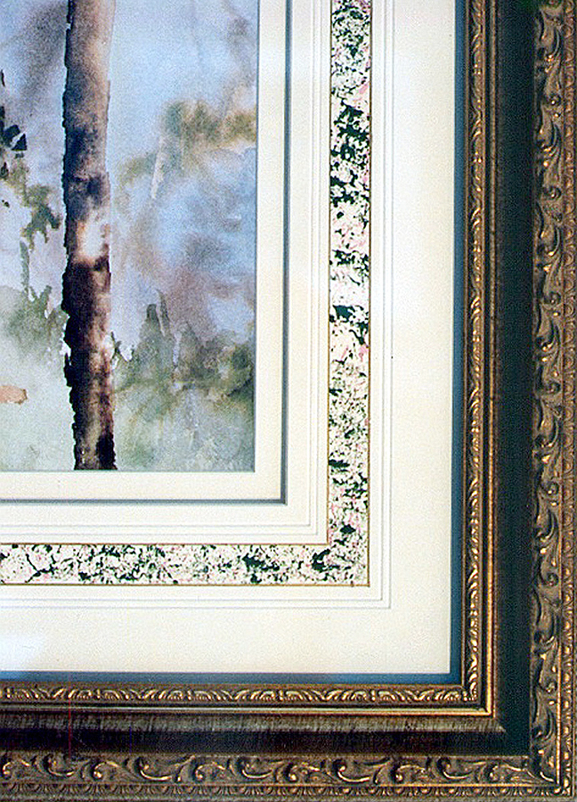 Photo 3
The dimensions of this painted surface design is far too close to the center of the mat between the image and frame, making it appear crowded. Courtesy of Ray Dwyer, CPF.
Proportion and Scale
All principles in design interact and support each other. They are separated only to study and better understand them. Proportion and scale are both related to size, and it is often easy to confuse them. Proportion is a matter of size relationships within a given project or entity, while scale refers to the actual size of the entity (diagram 3).
In framing it is important to understand scale in relation to proportion. Large patterns, even monochromatic moir, may look delicate framing a window as drapery, but might overpower a small fabric wrapped mat. Large floral patterns will appear much larger when contained within a smaller, confined space such as a shadow box. The pattern and scale of the flowers won't change in a confined space, but the proportions of the pattern to the space will appear different.
The detail in photo 4 is from an award winning competition piece from the Rocky Mountain Chapter PPFA. The workmanship is exquisite and the design phenomenal, but the scale of the tapestry print a bit overwhelming for the size of the image. Proportion must be considered when dealing with materials selected as well as the widths of borders, frames and surface designing.
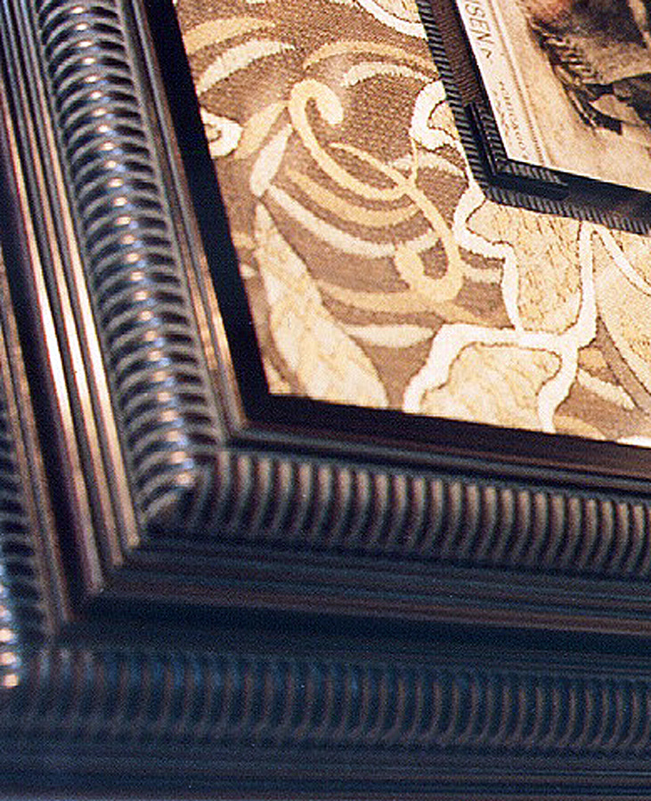 Photo 4
The heavily textured tapestry fabric is well suited to the period of the beautiful stacked moulding box, but the proportions are a bit intense for the featured inner photograph. Careful of textural proportions as well as mathematical ones. Courtesy of PPFA competition archives.
Asian Proportions
The elongated or exaggerated vertical use of varied boarder widths reflects the influence of traditional Asian scrolls as is often referred to as Asian proportions (diagram 4). These proportions when are most often selected in Western framing to reinforce the long thin appearance or more vertical dimensions of a given image. If a long rectangle is framed using mathematical proportions or more traditional slightly weighted bottom dimensions the elongation of the image is diminished. By utilizing Asian proportions of wider top and bottom dimensions and narrower sides, the elongation is better maintained (photo 5).
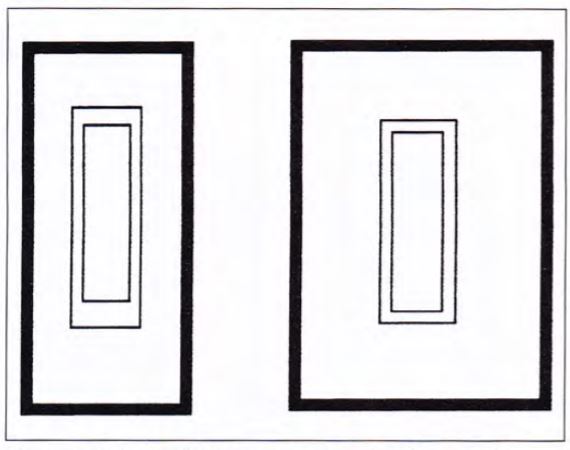 Diagram 4
Elongated Asian proportions emulate the vertical extreme found in Asian scrolls. As balanced Western dimensions and proportions are utilized, the vertical dimension becomes more rectangular.
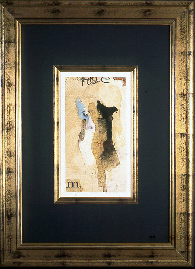 Photo 5
Utilizing Asian proportions when designing will help maintain the illusion of elongated rectangles. Though subtle the sides are just s little narrower than the top and bottom dimensions. Courtesy of Larson-Juhl.
Proportion and Profits
Proportion is often thought of in relation only to mat widths, but it plays an important part in the building of a unified framed piece by balancing, interrelating, and connecting all of the individual parts. Back when corrugated cardboard and masking tape were used as acceptable practice, the mat corner samples used to design a custom frame job were little more than 2". Then the industry widened them to 3" to make them easier to handle, to showcase more color, and to encourage a larger mat be placed upon a piece of matted artwork.
With the promotion of 4" mat corner samples by Bainbridge the bar has been raised yet again. Interestingly for many of the same reasons that 3" corners were initially introduced. Wider mouldings and stacked moulding combinations have demanded that mats become wider to compensate and stand up to the dramatics of their dramatic statements. This in turn naturally creates additional profits.
A 1970s 16x20" print would often have been most often framed using a 2" mat making the overall frame size 20x24" (diagram 5). At today's prices that might run around $150. retail. With the current 2001 mat proportions seen not only in contemporary framing shops but in home interiors catalogues like Pottery Barn this standard size image could be easily become 28x30", or even 32x40" with an average retail value of approximately $260. And with real sales technique and vision, and great store samples consider the retail possibilities of 40x44" as an oversized project.
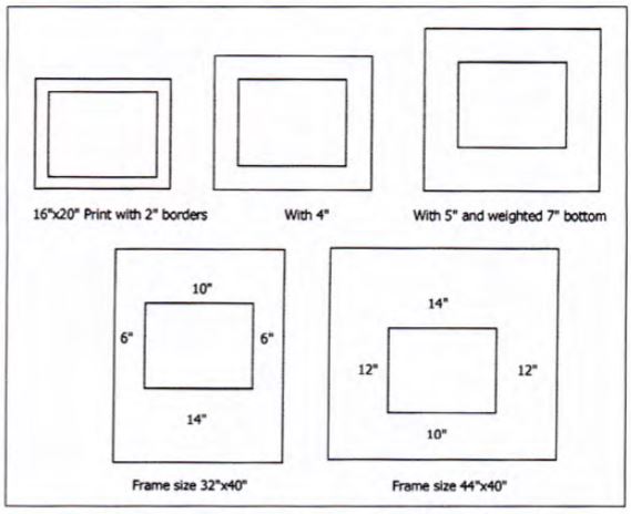 Diagram 5
The same 16" x 20" print with wider mat borders can turn a horizontal image into a vertical frame package, while, at the same time, increasing both drama and profits.
Even with these contemporary 21st century proportional designs, good designing must still be remembered. Vary the widths of the materials involved and don't add unnecessary elements. Still attempt to keep your use of elements from three to five, particularly when making bold statements like a 16x20" image in a 32x40" frame.
Counting the Elements
Wider mouldings as the 3" wide silver Venezia sample from Larson-Juhl in photo 6 craves the stylings of the wider design of the black 5" mat with accent of matching wood fillet to help balance and show off the inner artwork. To count the total principles so far remember that there are givens of a rectangular frame, a mat, a base color, and base texture.
So with the black rectangular mat takes care of the givens, so counting from there are the silver colored inner fillet which represents both a repeated of the outer textural design of the moulding and a change of inner accent color (color and rhythm), and the 5" wide mat (space) equals three design elements happening (photo 6).
 Photo 6
This is a nice example of classy quiet tasteful framing using three principles to pull the design into a unit. Color change by the silver inner fillet, rhythm also by use of the fillet reflective of the outer moulding, and the extra space of the widened mat borders to compensate for the 3" wide frame. Courtesy of Larson-Juhl.
The saying less is more may not be the thinking we are targeting when it comes to the pricing of fine custom picture framing, but it might be when relating to the elements of framing design. Proportion is the strongest factor of design when relating it directly to profits. But it all comes down to the customer and you.
Giving interior design advice by way of illustration through photographs, mail order catalogues, consumer advertising like Larsson-Juhl, having copies of home interior magazines for samples of the way wider proportions are utilized in contemporary home decor, and in store framed art, are all ways of helping show the customer the options open to them. Putting a little effort into simple sales samples and great framed store images will make wider mats and larger proportions easier to sell and as well as helping bring your customers into 21st century design.
END
Copyright © 2001 Chris A Paschke
For more articles on mounting basics look under the mounting section in Articles by Subject.
Additional information on all types of mounting is found in:
The Mounting and Laminating Handbook, Second Edition, 2002,
The Mounting And Laminating Handbook, Third Edition, 2008 and
Creative Mounting, Wrapping, And Laminating, 2000 will teach you everything you need to know about getting the most from your dry mount equipment and materials as an innovative frame designer.
All books are available from Designs Ink Publishing through this website.
Chris A Paschke, CPF GCF
Designs Ink
Designs Ink Publishing
785 Tucker Road, Suite G-183
Tehachapi, CA 93561
P 661-821-2188
chris@designsinkart.com