 Photo 1
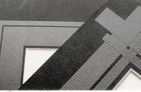
These contempo panels (made with laminates) create a subtle monochromatic stripe that matches the mat color. The matboard textures are accented by wide strips, reflecting the mat.
Line is the most fundamental of the design elements. It begins with a point of concentration and then by an extension from that point it becomes a line. Multiple lines give shape and at the same time space surrounding that shape. It manifests itself from many varied beginnings such as doodles on paper to natural phenomenon such as the horizon. Nature is rich with linear design but the lines are all symbolic of structure and function such as the thin branches of a tree's silhouette, the veins within a leaf or the layering of a shale rock wall. Thus line does not truly exist in nature, only mass and design.
Subjective vs. Objective Line
In the hands of an artist, designer, or framer, line is the most basic of tools. Lines are a graphic device used to function symbolically in literary and artistic expression. Though best described in art, it is the most powerful basis for most of our creative stimulus. Lines may be either subjective (as in the subject of or for communication), or objective (as in the object of physical art.) Subjective lines are those modified for communication to evoke emotional states and responses as in calligraphy and letterform expression or music, the written form. Objective lines describe measurements and surface characteristics or decoration, as in picture framing.
Line enriches a surface without denying the essential "flatness" of the nature of the artwork. Although we see line in all of nature, it is a man made invention, an abstracted definition developed for the simplification of visual facts and symbolizing graphic ideas. This remains true whether discussing lines as subjective for communication or objective for surface decoration.
Photo 1
These contempo panels (made with laminates) create a subtle monochromatic stripe that matches the mat color. The matboard textures are accented by wide strips, reflecting the mat.
The Physical Characteristics of Line
Lines can be powerful or delicate, soothing or jarring, they can set a mood. All lines have physical properties, and the type of line can either unify or divide an image and stimulate an emotional response depending upon their direction, as in a passive horizontal, inspirational vertical or agitated diagonal. Straight lines travel only in one direction (photo 1), may be short or long, and vary in width. If a straight line gradually changes direction it becomes a curved line (photo 2). They may be graceful, flowing, and soothing reflecting passive gentleness or at times appear somewhat unstable. Angular lines (photo 3) have abrupt changes of direction and often stimulate excitement, confusion, or challenge. The width of a line will also impact its meaning. Wide, heavy lines make a bolder statement than narrow, fine lines, and the transition from straight to curved, heavy to light reinforce the entire picture and mood.
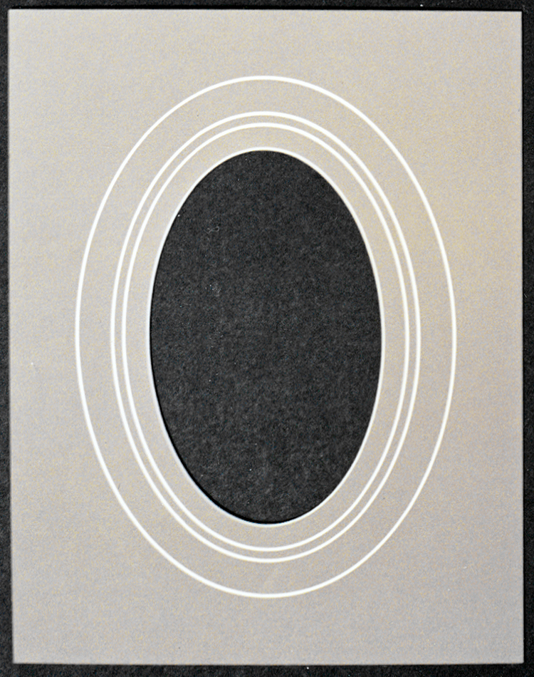 Photo 2
Gentle curved lines become ovals, creating shape. The multiple ovals are still only one element, but the negative area in the corners created by the oval in the rectangle also creates space.
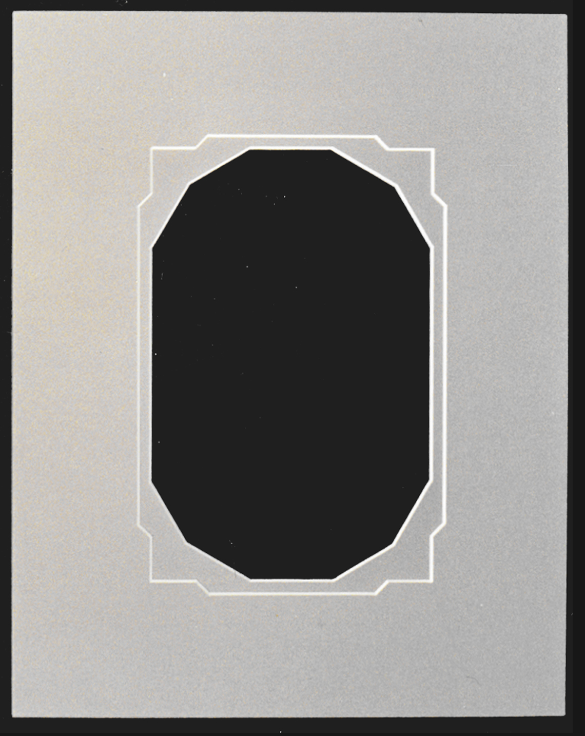 Photo 3
A closed line becaomes a shape as this notched slant top mat over a 12-sided inner mat. The two principles of line and shape are illustrated here.
Translation of Line Into Framing
Since a line is a path of a moving point or mark, made by some type of tool or instrument, drawn across a surface, made visible by contrast...it is fairly easy to translate this into framing design. Thick, thin, dark, light, straight, or curving all lines stimulate some sort of visual response and therefore create movement. This eye manipulation may be deliberately stimulated by a framer through his use of numerous line designs including ruling pen, embossed, painted bevels and panel designs.
In framing, the character of a line is also controlled by these various decorative interpretations. Wide, pastel tinted, dry pigment panels may appear extremely soft, romantic and feminine while a black ruling pen line is capable of taking on a much harder, aggressive, masculine interpretation. Successful line designs may bleed off a page or out of a frame (photo 1, left) yet still draw the viewer back into the frame. They are capable of awakening emotional responses in a viewer through control of focal point and eye movement by the very use of line variety and placement.
Relating to Other Design Principles
When a line creates a 2-dimensional boundary it becomes a shape (photo 2), and by enclosing an area a line's edges create space. Lines almost always imply other elements such as shape, space, form and texture as designated by their application, and they have the power to emphasize or lead the viewer's eye. The intricacy of design will become more evident as additional principles are discussed, and visual emphasis will be covered as a separate principle.
Though design principles are all individually titled and defined, they all intricately weave together into a meshed unit for they often cross over into other categories, this is how the entire concept of a unified design works. Every portion relates and inter-relates to every other part and everything going on within a framing design should be happening for a reason, no accidents no mistakes.
The "Givens", or Counting the Principles
When interpreting the use of line as a principle of picture framing design you must begin with a given set of standards. A designer must be capable of limiting the use of design principles (a total of both the elements and factors) as a basis for the structure of design control. Ultimately what is required is a clearer understanding of what goes into a good design and what needs to be kept out!
The givens in framing include four accepted visual basics:
Anything done in addition to alter the basic visual presentation becomes a specific stimulation of an additional design principle. Again, these work best when the number of principles per presentation is held in the range of 3-5.
By first establishing these givens, those items required to frame a piece of art (frame, mat, color, and texture), then the other principles become customized framing design additions. By understanding the individual design principles (line, color, texture...) one may literally count the number of visual design activities within a framed presentation. In most cases limiting the framing principles from 3-5 items will keep the design strong, tasteful and understated, thus enhancing the art as it should and not overdoing the design!
As a Pure Design Element
As already noted, there are a great number of line possibilities in relation to framing design. The most pure use of line as a design element is a monochromatic double mat (white on white), same color core v-groove or embossed line (photo 4), a design in which no other elements are initiated, using only line as an attention getter or visual accent.
 Photo 4
Embossed lines placed ¼" apart are a perfect example of pure monochromatic line
Controlling the use of line only must excludes the introduction of color (which would then be a second element), but does allow for numerous layers of same colored mats to be used within the design. Each line does not become a new separate countable element, a double, triple, quadruple monochromatic mat unit or simply a double mat with a v-groove all count as a single design element as long as a designer color core board has not deliberately been used as a color accent.
Rag mat and museum same color core boards or white core conservation may be utilized in a pure line one principle design. Too many white on white mats (four or more), though only showcasing line, will create a natural depth that will in a later article be defined as intensity though because of additional shadows. So do not overlook the subtle.
Additional Elements
Once the concept of pure line as a single element is understood a line may then have a color added to expand upon its design potential. Since 3-5 principles is our goal, the addition of color to line is quite acceptable and opens up the ultimate in surface line decoration as mentioned earlier. Now by varying line widths and colors more dramatic accents are possible (photo 5).
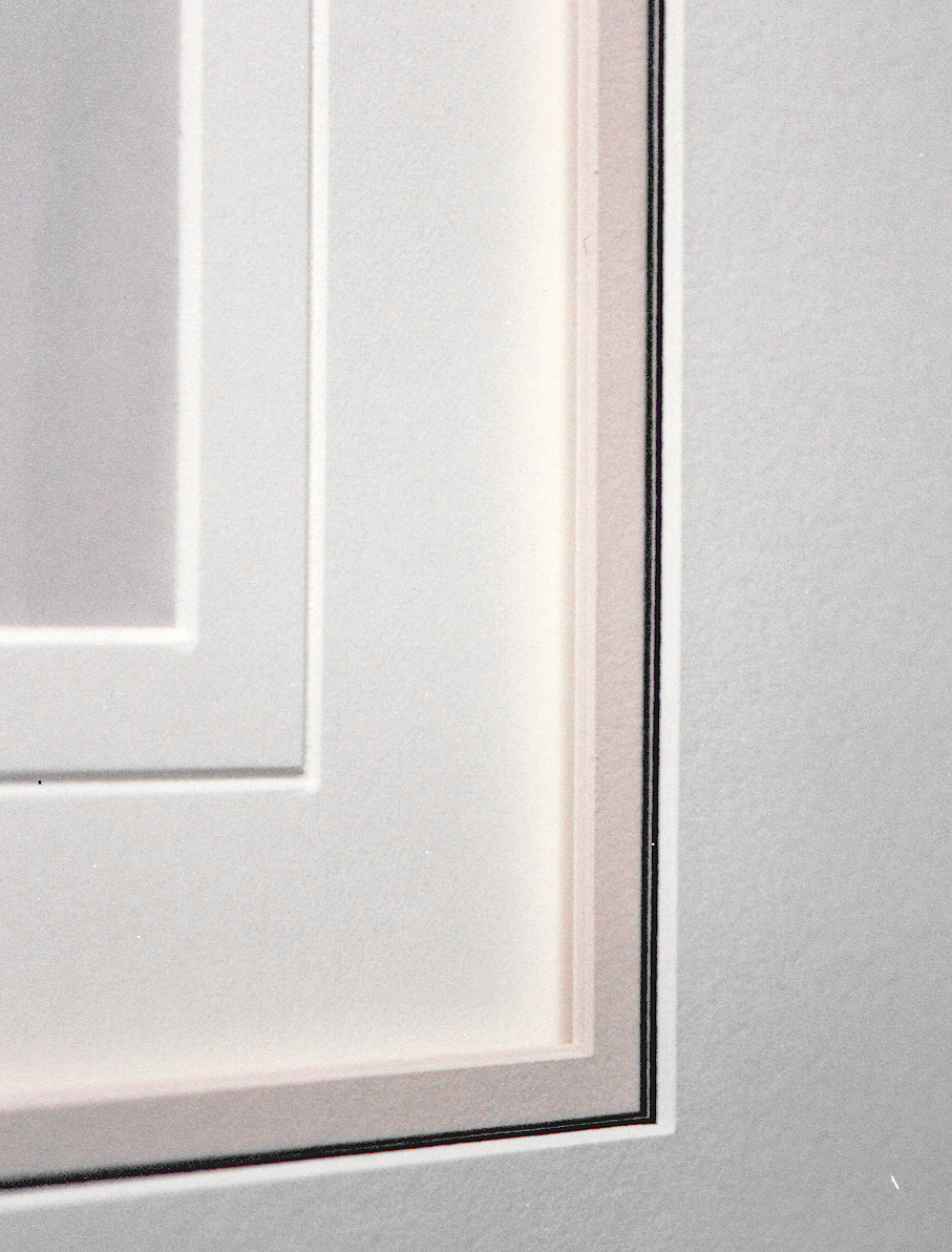 Photo 5
Varied line widths can create dramatic accents. A cut v-groove on the inner mat is contrasted by a pinstriped undertiered top mat. A spacer between mats two and three creates intensity. Line and color are also present here.
Besides color, the character of the line from a framing point of view may be altered by the integration of multiple medias such as sewn silk threads, marbled papers (photo 6) and contempo panels with laminating films (photo 1). As each new item is used to create an illusion of line additional elements are inadvertently integrated and will need to be counted towards the final total of principles counted. Silk threads may represent line and color, laminating films integrate line and texture, but one single strip of surface marble paper counts as line, color and texture.
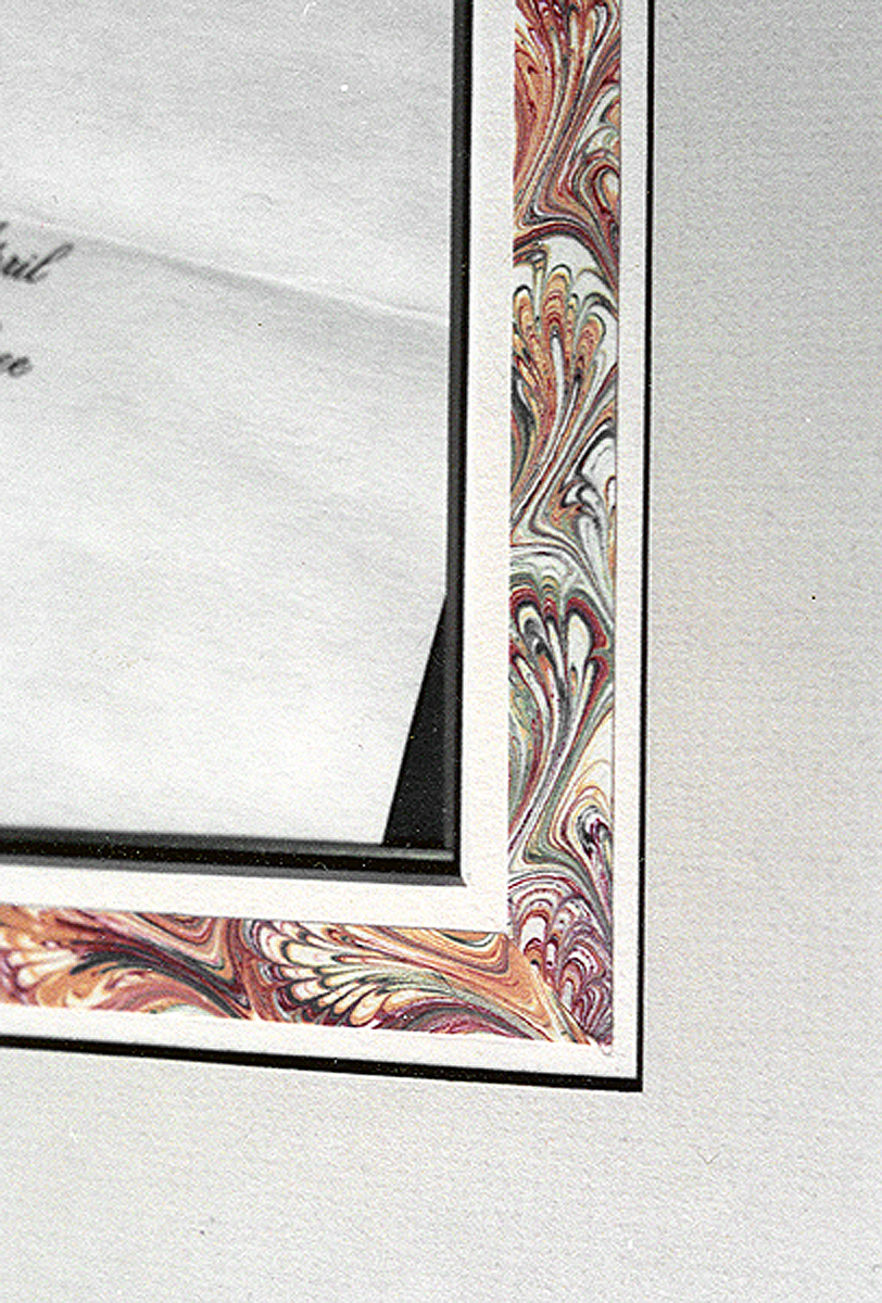 Photo 6
Marble surface strips are wide lines and also add color and texture to the design.
It's not as confusing as it sounds, simply go back to the basics and really see what you are looking at. Pay attention to the fact a surface decorative panel is first a line, though its character may be wide or narrow, pastel dry pigment or marbled paper, it begins as a line prior to it being a color, texture or combination. Designing with pure line is clean, classy and simple, though perhaps not overly profit making, but then again isn't a Brian Wolf hand carved mat simply a series of curved lines creating a shape (photo 7)? OK, so that isn't pure line, it's line and shape...but there's more money in it too.
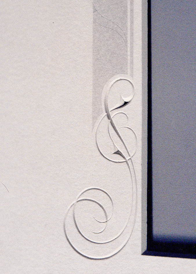 Photo 7
A wide dry pigment French mat panel is accented by a curved incised line shape of varying weights, adding panache to a basic mat design...and lines.
Good vs Bad Line Design
In a good design, the line is energized and will animate the art in relation to the entire design bringing the whole of the image to life. The eye movement is activated from the art image to the line decoration but ultimately returns to the image, truly enhancing the art. A good design is technically well executed, playing off the period and style of the artwork as in a traditional French mat on a antique botanical print.
In a bad design, lines become isolated with no organic relationship or meaning to the whole of the art and the design dies. This can happen through poorly placed v-grooves, too many mat layers, or technically drawing attention away from the art through corner overcuts or nonparallel v-groove lines the result of a poorly calibrated mat cutter.
Line in Review
Try not to underestimate the power of the line. Embossed lines, v-grooves and monochromatic multiple mats may either showcase the art or leave it flat. Think about the appropriateness in your design, everything must be there for a reason, not simply to increase the price of the framing job, and never lose sight of the aesthetics and beauty of the line in its purest state. The bottom line states it's all up to you to determine the correct presentation.
END
Copyright © 2000 Chris A Paschke
For more articles on mounting basics look under the mounting section in Articles by Subject.
Additional information on all types of mounting is found in:
The Mounting and Laminating Handbook, Second Edition, 2002,
The Mounting And Laminating Handbook, Third Edition, 2008 and
Creative Mounting, Wrapping, And Laminating, 2000 will teach you everything you need to know about getting the most from your dry mount equipment and materials as an innovative frame designer.
All books are available from Designs Ink Publishing through this website.
Chris A Paschke, CPF GCF
Designs Ink
Designs Ink Publishing
785 Tucker Road, Suite G-183
Tehachapi, CA 93561
P 661-821-2188
chris@designsinkart.com