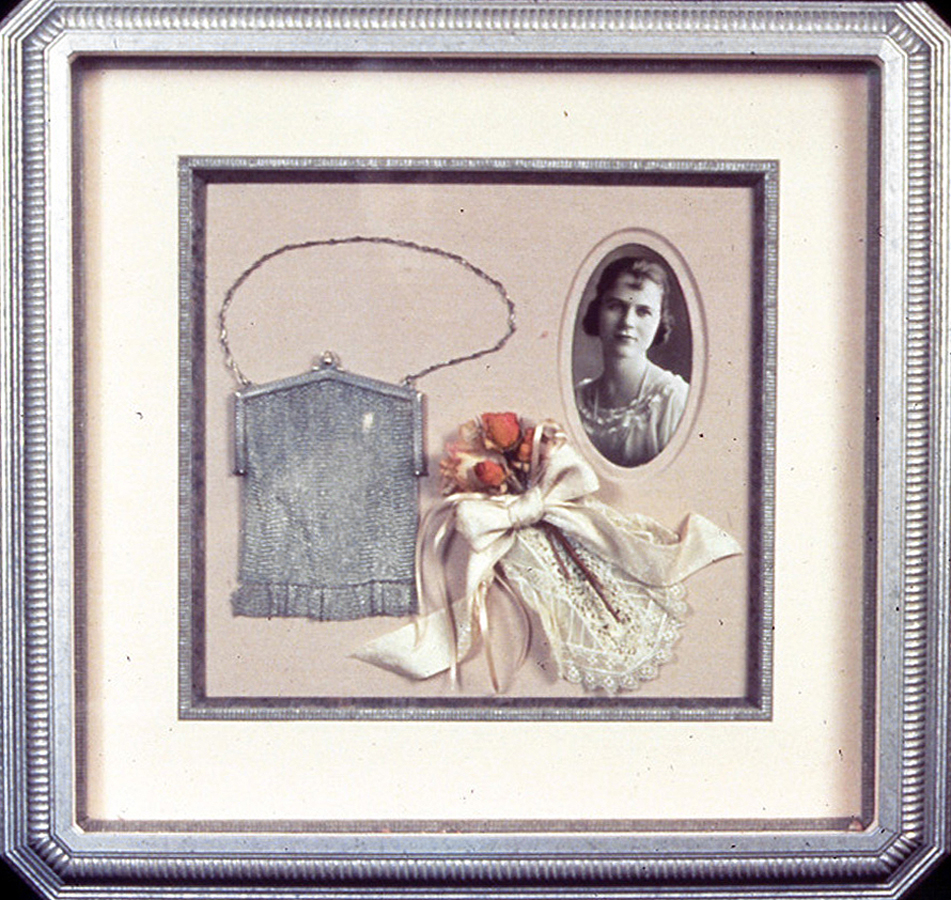
 Photo 1
The eye is manipulated to move both clockwise and counterclockwise in this antique shadowbox, depending upon your visual interests. Photo courtesy of Larson-Juhl.
Emphasis is a concentration or establishment of centrality, otherwise defined as a high point or climax. In every successful composition of music, book or art, something must dominate. Emphasis might be the dominant beat in a musical rhythm, the character which most holds our attention in a book, or the point to which our eye is first drawn within a frame. It is the point to which our eye immediately turns when we walk into a gallery.
Emphasis in design is achieved by use of the many base elements including line, color, texture, shape and proportion. It utilizes physical positioning to control visual concentration within the space of a frame. As framers we are enlisted to create an environment for a piece of artwork, photo or object, to protect it. As designers we work towards visually enhancing and showcasing it in a unified manner while never detracting from or overpowering the art by drawing the eye away from it.
Visualization or Eye Movement
What people think they are looking at and what they actually see are often two different things. Scientific studies have been made tracking eye movement and it has been found that although we may believe we choose what we want to look at, the human eye really follows an unconscious flow taking in color, shape and details about viewed objects and their surroundings.
There is a significant difference between the perception of where people think they look and where they actually do look. They are never even aware that involuntary eye movement is taking place. What we actually see is a rough overview of an image, or framed artwork, with one or two areas in very clear detail. We actively search out interesting visual features that have a meaning for us in a piece of artwork. As our eye fixates on tiny specific areas our peripheral vision is what fills in the rest of the rough image, and what in turn determines where our eye will be drawn next. This is also why individual visual flow within a framed piece will vary from viewer to viewer.
In my design classes one of the exercises I give the students is to pay attention to the flow of their eye when I flash the slide of on the screen (photo 1). Some students would see the portrait upper right first, then move down to the flower cluster then to the purse and ultimately back to the photo by way of the silver chain. Some see the purse first then the portrait, down to the corsage and back to the purse. Some circle round and round the chain to the purse with only an occasional flash to the photo or flowers. It doesn't matter what the initial emphasis within a framed piece is as long as the presentation keeps the eye moving around within the frame and does not throw the viewer out of it. The portrait facing away from center would have done that.
Photo 1
The eye is manipulated to move both clockwise and counterclockwise in this antique shadowbox, depending upon your visual interests. Photo courtesy of Larson-Juhl.
Focal Point
All items should have a center of interest. Without an obvious visual dominant point of focus, the human eye will naturally settle just slightly above left of center to begin to observe an image (diagram 1). This location is generally where the most important or prominent figure, any critical action, or the most vibrant color in a painting will appear. But, any marked contrast will create emphasis. The design factors of proportion, balance, rhythm and emphasis are all extremely interdependent and all play off each other in a well executed design.
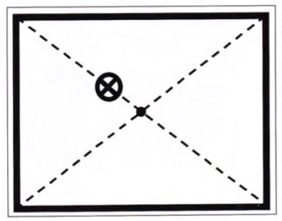 Diagram 1
The natural emphasis or focal point on any image is slightly above left of center.
All designs will showcase some type of emphasis no matter how subdued. Any mark on a solid surface becomes a focal point. When more than one single spot is showcased there becomes a hierarchy of focus. In visual design, there are supporting colors and shapes which dramatize and/or direct the eye. Since no two people are alike, the focal emphasis will vary from viewer to viewer. No singular framing design is the only solution to a framing project, it is merely one solution to any given design problem. This is evidenced every year at the PPFA (Professional Picture Framers Association) National Framing Competitions.
When approaching framing design from a technical layout standpoint never forget the focus must remain on the artwork, and great care should be taken to control the viewer's eye by directing the focus or focal point within the frame. In order to best explain the concept of controlling the eye we must begin at the beginning and consider emotional reactions to visual stimulus.
Emotional Reactions
A viewer's emotions may be stimulated, almost controlled, by the movement or flow of the eye as an image is observed. Reactions such as restfulness, peacefulness, agitation, playfulness, even confusion, may be stimulated by visual arrangements or placement within a frame. Quite simply, some eye movements are emotionally more soothing or disturbing than others (diagram 2).
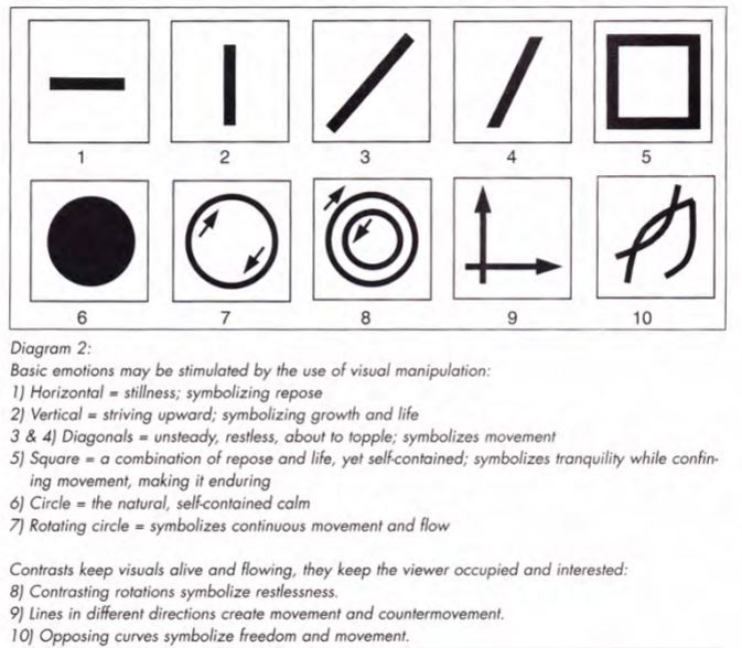
A casual viewing of the horizontal line in box #1, allows for peaceful movement of the viewer's eye from left to right, stimulating a passive and quiet response. So the visual eye movement of a traditional landscape in a no frills traditional, single matted, horizontal framing presentation would also evoke a gentle response. A diagonal moving from upper right to lower left, box #3, is not as comfortably familiar so the emotion evoked is more unsettling and dynamic. It makes a stronger visual statement and may be more difficult to successfully execute. Consider a continuous circular movement of the eye as in box #7. This creates a somewhat natural movement reflecting the positive continuity of growth and comfort and is not at all unsettling. Regardless of moving clockwise or counterclockwise, this is the basic eye movement we experienced in photo 1.
A multiple opening mat using progressive chronological portraits surrounding larger central images would reinforce the clockwise flow of the eye through the rotation of the outer portraits. A child's portrait history mat of annual school photos surrounding the large high school portrait is a perfect example of this. The emphasis would remain the larger dominant central image though all the others will obtain adequate attention also.
A multiple opening mat with assorted window sizes and shapes often stimulates the contrasting movements of #8, with both clockwise and counterclockwise visual stimulus occurring (photo 2). This is far less peaceful than #7, since the eye attempts to circle both right and left to assorted images.
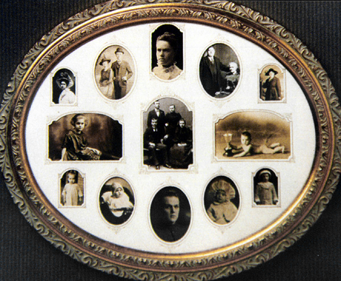 Photo 2
The antique photos vary in size and placement surrounding a central family image. Although not always possible with this many photos the images have been arranged to face towards the center whenever possible.
The placement of images within a frame has a great deal to do with the direction the image itself faces. Portraits on the left, facing left will throw the viewer's eye out of the frame, while by placing the portraits facing center the eye remains within the frame (diagram 3). This can feel aggressive or disheartening. Diagonal lines or obliquely placed objects are very strong and evoke viewer emotion by their angles. When using emphasis diagonals in a shadowbox think the reasons you have chosen a diagonal placement. It will evoke more emotional responses from viewers.
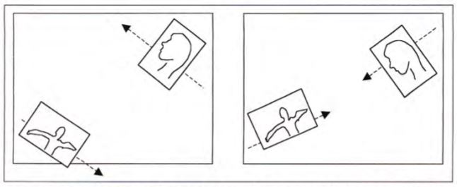 Diagram 3
The placement of images within a frame has a great deal to do with the direction the image itself faces. The portraits on the left will throw the viewer's eye out of the frame, while by placing the portraits facing center the eye remains within the frame. Diagonal lines or obliquely placed objects are very strong and evoke viewer emotion by their angles. When using diagonals in a shadowbox think through the placement and the reason why you have chosen a diagonal placement.
Allowing the eye to search the outer edges of a decorated, painted or specialty mat; uniquely cut frame; or multiple opening design can give a designer the power to evoke excitement and intrigue through visual stimulus. Placement of additional surface accents or designs such as a calligraphic surname or offset mat corner can easily bounce the eye from point to point. This motion can create more unsettling responses depending upon the actual direction the eye moves. Be careful with framing accents. Often, less is more.
Perceived Movement
Look at the four circular examples in diagram 4 (photo 3a,b,c,d) and try to determine the direction the wedge is moving. The first brings the eye into the circle with the ultimate focus at the center point, the second is moving to the right drawing the eye away with it. The third wedge is diving down into the center with rather extreme concentration, while the last is falling from the center allowing the eye to drop from the image altogether.
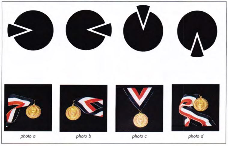 Diagram 4
The wedges create movement in four different directions depending upon their placement. The first appears to be forcing into the circle; the second leaving it; the third is falling into it; and the fourth is dropping out of it.
Photos 3
These photos support the diagram above with assorted placement of the ribbon coming from all four basic directions of the frame. Although the medal remains central, the ribbon dictates movement of the eye.
Thus the two most centralized and positive visual movements will be the first and third, and therefore the most successful designs. The idea is to hold the viewer's eye within the frame of the picture and not to pull it from the image to the outer wall or dash it to the floor. In the corresponding photos, the ribbon of the featured gold medal is laid to signify the wedge moving into or dropping from the frame center. Notice your eye movement as you study the samples.
It is acceptable to create a visual hesitation as the eye moves into the artwork from the matting and framing. By utilizing fillets, v-grooves, French lines, tiered matting or painted bevels, this visual pause may reinforce other selected design elements, as long as they don't overpower the art (diagram 5). Circling the eye or dropping it off of the edge are also acceptable as long as something, such as a shape, color or flowing design ultimately draws the eye back into the frame, at very near the visual exit point, just above or below it. The ribbons can draw the eye away from the central medal to the window edge, where the remaining mat and moulding designs must work harder to maintain visual attention.
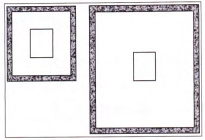 Diagram 5
A small 1" moulding feels balanced and proportional on a small image, but the same moulding on a much larger window mat will dwarf the artwork.
Sleuthing Emphasis
The glass etching in the upper left corner of this shadowbox effectively leads the eye around the inner objects to help tell a story (photo 4). Again, pay attention to your eye movement as you view this framed presentation. Some home in to the magnifying glass then down the ribbon, up the right side of the inner framed book to the glass etching upper left and resting on the oil lamp and pipe lower left center. Others begin with the etching upper left to the framed book, oil lamp and end up concentrating on the magnifying glass.
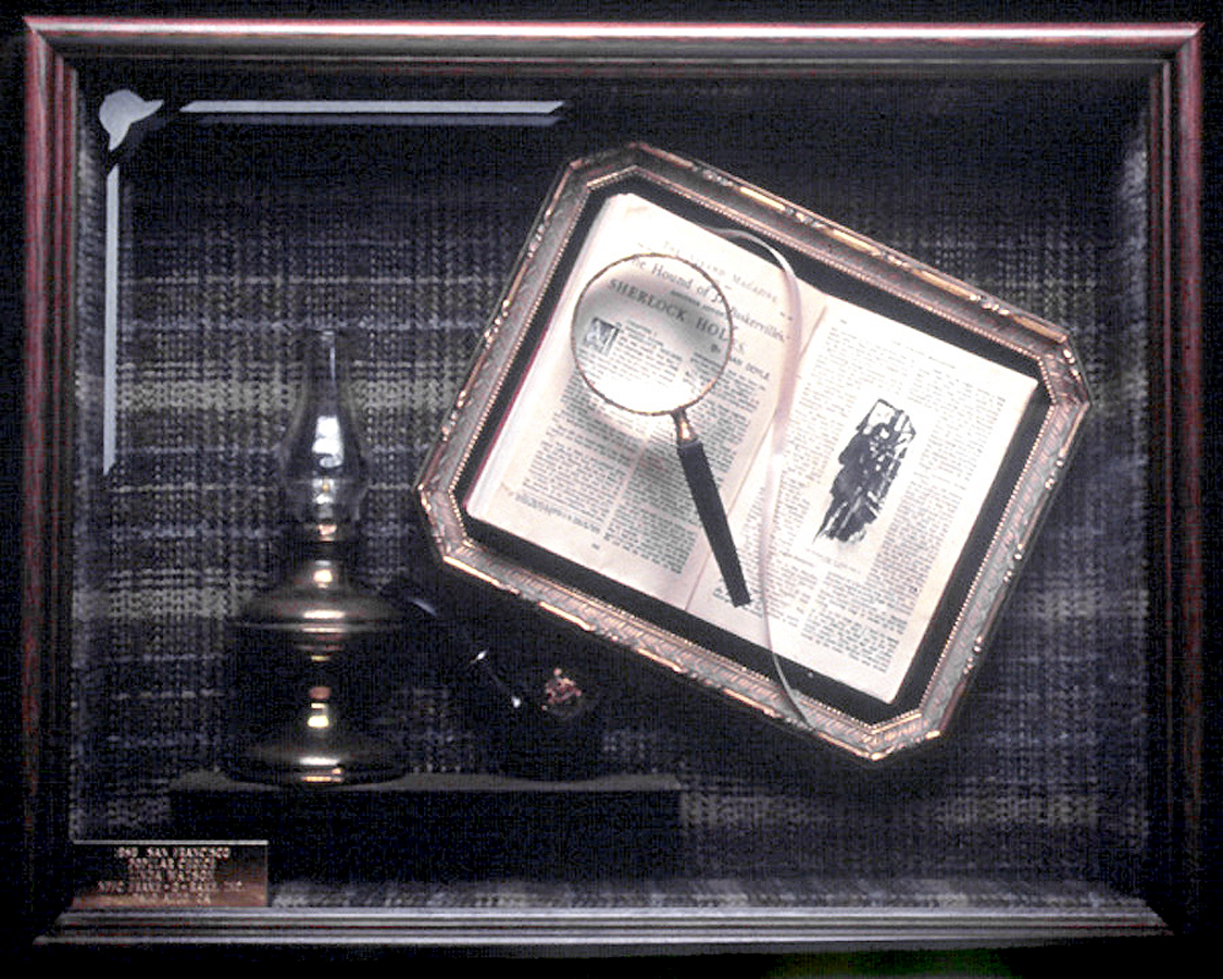 Photo 4
This award winning Open Competition shadow box is an excellent example of placement within the frame to elicit active eye movement while maintaining good emphasis on the book. Photo courtesy of PPFA Hall of Fame.
It's often a matter of personal interests. At not point is the viewer thrown from within the frame, but rather caught up in the warmth of it. The upper left outer edge etching not only helps pull the eye around it also helps fill a potential void or large vacant space that might have been uncomfortable in the upper left corner. Very nice presentation.
Dominance and Proportion
Dynamic use of rhythm and repetition are frequently found in successful framing designs. Each portion of the design (frame, mats, colors...) must hold its proper portion of visual dominance, emphasis or attention. To get the viewers attention a featured portion needs to be in contrast with its surrounding area. When utilizing proportion and larger dimensions to attract attention a different concentration occurs.
The inner art image will always make a statement, whether fragile and delicate or bold and domineering. The matting and frame selected to showcase that image must never overpower it. Proportion plays a large part in visual emphasis. When a narrow moulding has been selected to surround a small image with traditionally balanced 3-4" mats the artwork is allowed to speak (diagram 5).
With the wider design proportions that have emerged in home decorating in the past few years the same narrow moulding selected for the above image will not stand up to wider 6-8" mats, without dwarfing the artwork. The viewer's visual attention and the emphasis will have been directed inadvertently to the outer frame and away from the inner art .
In turn a 3" wide moulding used on 3" mat surrounding a small image throws the balance off and the image is overwhelmed by frame. When a much wider mat and fillet replaces this narrow mat the concentration better remains within the frame on the art. The fillet helps draw the eye into the inner image (diagram 6).
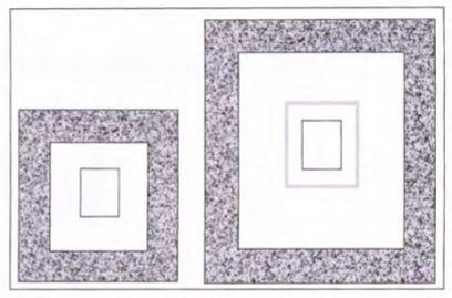 Diagram 6
If a 3" moulding is selected for the same tiny image, the moulding and mat are too close to the same width, making it feel unbalanced. Adding a wider mat and inner fillet will better accent the art, pull the viewer into the image, and keep the design in
Solving the Mystery
Understanding emphasis and focal point is not difficult when attention is paid to where your eye travels when you view any item. As a framing project is laid out if the inner mat color is too hot for the art that color will dominate the eye. Everything must flow to everything else. Flow is the operative word here. Nothing must dominate to the exclusion of all else, though there will be focus.
A multi angled or tabernacle frame is very powerful and eye catching and should only be used with art of equal intensity. It would not be suitable for a soothing Victorian image. Portraits with direct eye contact to the viewer or an emotional image of perhaps Madonna and child would be better choices. The artwork must be allowed to flourish and make its own statements.
Emphasis may remain only a factor that helps mortar together the other framing elements, but is every bit as powerful. It can create or destroy an otherwise strong design as much as incorrect proportions or one that is out of balance. The difference with emphasis is that if you can't attract a viewer in the fist place no one will be around to view the other strong aspects of your design at all.
There is no real mystery to understanding framing design. There are very specific elements and factors that help guide the way to a successfully unified piece. In the final chapter of my column "The Essence of Framing Design" in December we'll recap them all and explore pulling it all together in Unity.
END
Copyright © 2001 Chris A Paschke
For more articles on mounting basics look under the mounting section in Articles by Subject.
Additional information on all types of mounting is found in:
The Mounting and Laminating Handbook, Second Edition, 2002,
The Mounting And Laminating Handbook, Third Edition, 2008 and
Creative Mounting, Wrapping, And Laminating, 2000 will teach you everything you need to know about getting the most from your dry mount equipment and materials as an innovative frame designer.
All books are available from Designs Ink Publishing through this website.
Chris A Paschke, CPF GCF
Designs Ink
Designs Ink Publishing
785 Tucker Road, Suite G-183
Tehachapi, CA 93561
P 661-821-2188
chris@designsinkart.com