Paschke Online
Designs Ink Publishing Article Archive and Reference Library
Articles by Chris A. Paschke, CPF GCF
"The Essence of Design: Balance"
August 2001
In the last article of this series "Proportion" June 2001, I discussed mat widths and visual relationships of the art to the mat, and the mat to the frame. It has been written by Greg Perkins of Larson-Juhl that there are three basic reasons to increase mat border widths on the bottom, or below the art: to bring a look of authenticity to the framing of traditional and classical images; to better suit the space where the art is to be displayed; and to create the sense of perceived balance.
Balance is the subject of this months column, and is probably the strongest unifying principle of all. There is a close relationship between balance and emphasis. Balance is the equality in weight, attention, or attraction to other various visual elements within a pictorial field or frame. Emphasis is the concentration point or main feature that controls eye movement and flow between those visual elements. See "Emphasis", October 2001. Both involve control of the visual flow when viewing art or a framed piece of art, and often they are described simultaneously.
Balance as Equilibrium
Like rhythm, balance is necessary for survival, in fact it is balance that creates much of the rhythm experienced in human life. Inhaling is balanced by exhaling, and activity is balanced by sleep. Balance is sometimes defined as the mathematical relationship of parts to one another within the whole. It becomes a means of accomplishing an organic unity and may be categorized as either structural or visual balance. Structural balance is identified by the actual equilibrium of an object. Equilibrium establishes a coherence, a comfortable feeling. A building without structural equilibrium or balance would be unable to support it own weight.
Visual balance is the perception of or psychological reaction to the illusion of equilibrium. If visual balance is missing, the viewer will feel uneasy. Any composition where all prominent shapes and masses are on one side would appear lopsided unless the opposing side had adequate visual interest to compensate, an imaginary counterweight.
Like the above mentioned building, a framing job lacking in visual balance would also fall apart. Other elements such as space, line or color can be used to counterbalance and tie together a frame design. The proportion of fillet to mat to moulding; the colors and proportions of top, middle and bottom liner mats; or the placement and focal point emphasis may all make, or break, balance within a frame.
Structural Balance
At a basic level, structural balance is based upon the physical nature of items in space arranged with respect to a central point or axis. Structural balance may be either horizontal or vertical. Horizontal structural balance is simple to understand as a central pivot point and cross beam. We've been familiar with horizontal balance as the seesaw since childhood (diagram 1). Balance is from side to side with the pivot or dividing line at vertical center. The classical example of this is also the scale seen in diagram 1.
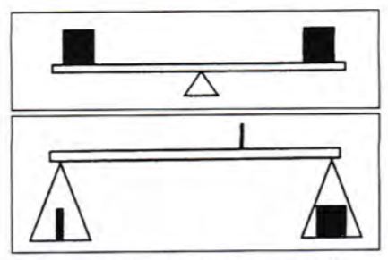 Diagram 1
(top) Perfect, pure, or formal horizontal symmetrical balance occurs when both sides of a central axis are identical, like a seesaw. (bottom) Asymmetrical balance occurs when forms not of the same visual weight are counterbalanced by being placed at unequal distances from the center axis.
Vertical structural balance is also based upon the physical stability of an object or building. Its determining factor hinges upon the relationship of the height of an object to its weight at the bottom (diagram 2). A tall ship mast is balanced by the boat width at the bottom, while a flagpole is set into concrete for adding weight stability. Television antennae are attached to houses and trees are rooted into the ground.
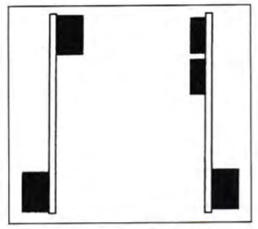 Diagram 2
Vertical balance is determined by the overall height and weight at the bottom. Symmetrical vertical balance is seen on the left; asymmetrical is on the right.
Visual Balance
Visual balance is concerned with the aesthetic quality of balance. It is not a matter of whether it will fall over or not as much as whether it gives the impression of being well proportioned, aesthetically pleasing and able to stand alone. Horizontal and vertical relationships are based on our general understanding of the laws of physics as seen in our day to day lives.
Visual balance is achieved through visual judgments on the part of the artist, frame designer and viewer. The question is not so much whether an object, shadowbox, or framed art will fall over as whether it gives the impression of being well proportioned and aesthetically pleasing. There are three basic types of visual balance: symmetrical, asymmetrical and radial.
Symmetrical Balance
Symmetrical balance is strictly defined as bilateral symmetry in which identical forms equidistant from the center equalize each other. However, you can have visual asymmetry that is in perfect symmetrical balance also. This occurs when forms that appear dissimilar except by visual weight remain the same distance from the center axis (diagram 3). Symmetry is the most basic, and easiest, form of visual balance to understand. There is an imaginary axis or line through the center of an image which divides it either horizontally or vertically into two identical halves. It is for all intents and purposes a mirror image. Identical repetition of this type is also known as pure, formal, passive, or bilateral symmetry. In art it may appear static, lifeless and too monotonous for prolonged audience attention.
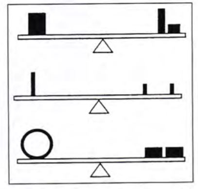 Diagram 3
Horizontal, asymmetrical visual balance is achieved when there is a felt equilibrium. Forms, shaped, colors, and rhythmic repetition must all be shifted to counterbalance the opposite side.
A perfect example of this in life is the human body, which hopefully does not appear static, lifeless and too monotonous for prolonged audience attention. We have all seen the divided photos or mirror reflections of a person where the two halves when identical produce a whole new person. We look to be symmetrical, identical on both halves, but truly are not. Since art is rarely a mirror image either, most art falls under the cloak of approximate symmetry. It relieves the monotony of pure symmetry by slightly varying the two sides of the axis to hold viewer attention. The sides are similar enough to stimulate the feeling of exactness, but remain sufficiently varied to prevent visual monotony (photo 1).
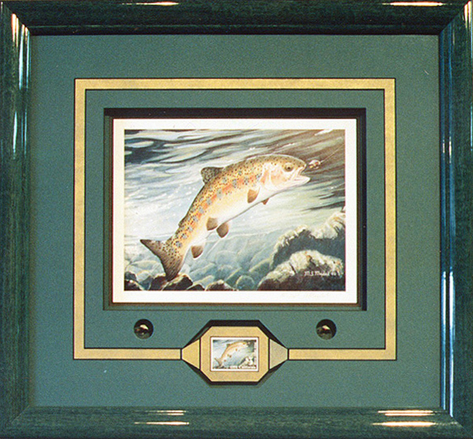 Photo 1
If an imaginary line were to divide this project, the framing is symmetrical on both the right and left sides of the central vertical axis, it is really an example of approximate symmetry because the two halves of the art itself are not literally mirror images. Framing courtesy of Ray Dwyer, CPF, West Wind Studio, Washington Depot, CT.
Because of its technical predictability, symmetrical balance symbolizes stability and security. Symmetrical designs in framing would best be chosen when wishing to produce the feeling of repose, formality, or to stabilize a shadowbox that might otherwise be hyperactive. Then again it is often chosen as a design because it is familiar and easy.
Asymmetrical Balance
Asymmetrical balance is also known as informal, active, or occult balance. It is attained when visual units on either side of a vertical or horizontal axis are not identical, but are placed in positions within the frame so as to create a felt equilibrium. Any time a weight is changed on one side, an adjustment must be made to compensate on the other. A heavier child must sit closer to the pivot of a seesaw to compensate for a lighter child on the opposite end. Forms of the same visual weight are counterbalanced by being placed at unequal distances from the center (bottom, diagram 1).
Though generally more interesting, asymmetrical balance is more difficult to achieve than simple symmetry. Two halves of a design may have equal visual weight but the addition of shapes, colors and textures must be considered. Visual weight is not always seen as mass, for it may appear as a balance of contradictory forces. Small strong colors may be easily countered by a large empty or negative space.
All of the elements may be used to achieve asymmetrical balance in a framing design. Texture may balance shape, color may balance size, and proportion may balance color and line. Understanding the elements or building blocks of design definitely helps construct a balanced wall or frame design.
The psychological impact of asymmetrical balance is far different than that of symmetrical stability. It stimulates, activates, and arouses us more vigorously, often creating a curiosity that holds the viewer's attention. It suggests movement, spontaneity, and dynamics of design.
When applying asymmetry to a framing design, position is critical in successful use of balance. Two shapes of equal stature placed too near an outer border may create too much tension and the overall design may appear heavy or out of balance (photo 2). Elements used for focal point must be placed to contribute to the total balance of all involved picture parts. Too much stress sets everything out of balance.
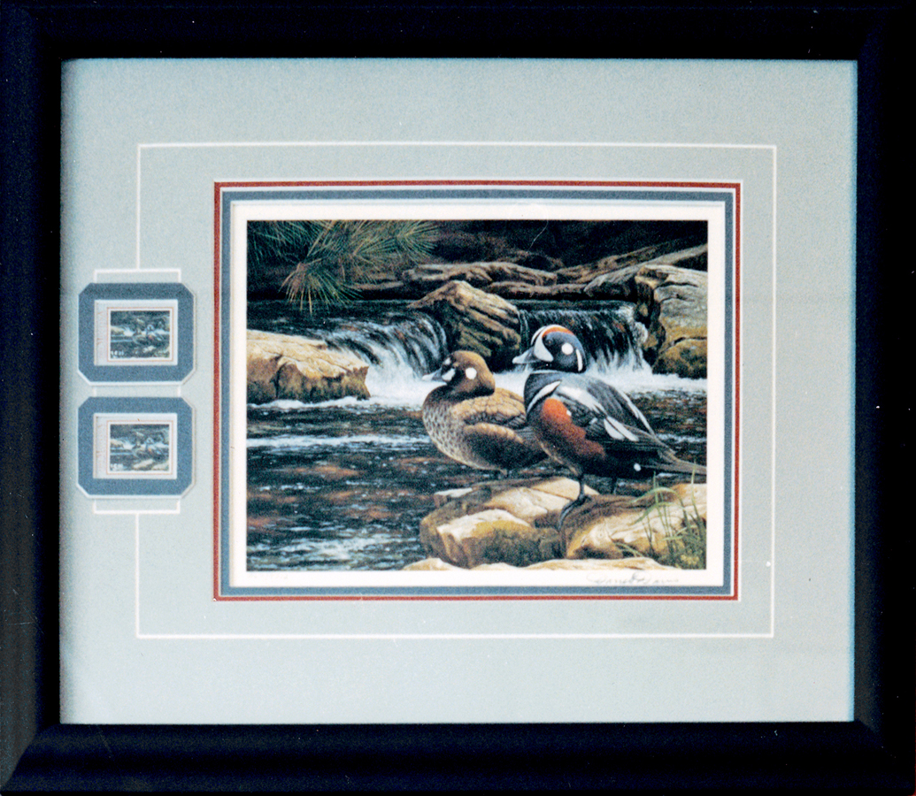 Photo 2
The placement of the duck stamps so closely to the left frame border creates a visual stress and extreme visual focus. This throws the asymmetrical design somewhat out of balance. Perhaps by adding another ¼" to ½" to the outer mat border that stress would have been relieved, proportions improved, emphasis placed back toward the center, and the overall design would be brought back into balance. Courtesy of Ray Dwyer, CPF.
Radial Balance
Radial balance, also known as radial symmetry, occurs when the weight is distributed around a central point, as two or more forces identical in strength and character circulate around it (diagram 4). Simple everyday examples would be the spokes of a wheel, a dandelion, or daisy. Thus the center becomes the focal point or emphasis and often there is a feel of circular movement.
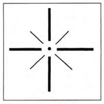 Diagram 4
Radial balance is when equal forces move in all directions, often creating a circular motion.
Formal symmetrical radial balance might be found in round Gothic stained glass windows, a cathedral dome, or the design of a dinner plate. An asymmetrical example would be expanding spirals and off-center mobiles. Radial balance can add another dimension to an otherwise somewhat static symmetrical design. Photo 3 illustrates somewhat of a radial design in framing. Though the invitation may be visually symmetrical, the framing has created more of a radial movement emanating from the center of the invitation toward the outer points.
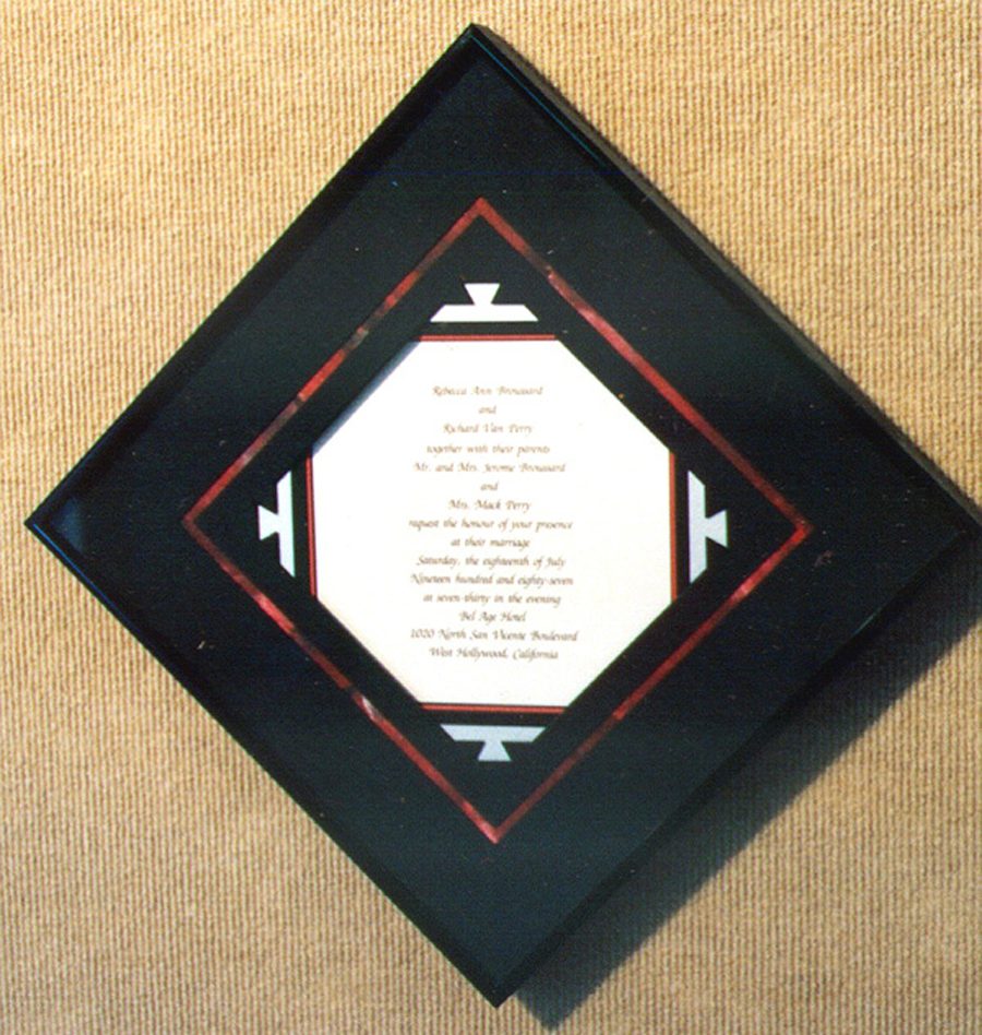 Photo 3
This example of radial balance (radial symmetry) uses the framing to provide the stabilizing factor emanating from the imaginary central point within the approximately symmetrical invitation. Placing it on the diagonal increases the radial balance stimulating eye movement in all directions and making it more interesting. Framing courtesy of Ray Dwyer, CPF.
Symmetry in Opposition
Balance depends upon a central axis or focal point, horizontal or vertical, around which weight or tension must be equally distributed. In framing and picture making, balance refers to the felt or implied equilibrium between all parts. Artists and frame designers are forced to balance their designs horizontally, vertically, radially, diagonally...in all directions and positions simultaneously in order to achieve harmony or unity (diagram 5).
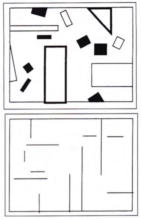 Diagram 5
When balance is achieved in all directions (horizontal, vertical, radial, diagonal), a design is in perfect harmony.
Its rare an artist or framer consciously applies design principles as he/she works. Rather they emerge as the design work progresses. During stages four and five of the design process (production and clarification) we should be evaluating both consciously and subconsciously our use of the design principles. Very often we instinctively use the elements correctly with our own interpretive flare.
Applying Balance in Design
Since balance is a factor of the design principles it is like the mortar that holds the rest of the design together. Balance is closely aligned to emphasis, a perfect segway into the upcoming October article. Emphasis is control of what the viewer looks at, when, and for how long. As with balance there is a fine line of mixing the mortar too thin so that it doesn't hold together well, or so thick that it cracks and falls apart. The idea is to balance the images and objects within the frame so that by their balanced placement they assist in the creation of a viewing pattern that is fluid and comfortable.
Recapping Balance
There are two kinds of balance: structural and visual. Structural balance is concerned with physical equilibrium of three dimensional projects, while visual balance is concerned with the perception of balance within a design. Balance occurs upon a central axis in which all weight and tension must be equally distributed, and therefore may be either horizontal or vertical. Visual balance includes symmetrical balance where there are two identical halves; asymmetrical balance where visual elements may counter each other creating interest and variety; and radial balance in which a design is circular and appears to emanate from, or revolve around, a central point.
Understanding the types of balance, their applications, and impact on the viewer will help you become a better frame designer. The best matched color mats in the world with the perfect textures, accent object, and surface mat design will never hold together if the proportions are placed out of balance by placing an accent too close to the frame edge and the emphasis throws the viewer out of the frame. Balance is every bit as vital a part of good design as a well cut window mat or perfectly mitered frame corners.
END
Copyright © 2001 Chris A Paschke
For more articles on mounting basics look under the mounting section in Articles by Subject.
Additional information on all types of mounting is found in:
The Mounting and Laminating Handbook, Second Edition, 2002,
The Mounting And Laminating Handbook, Third Edition, 2008 and
Creative Mounting, Wrapping, And Laminating, 2000 will teach you everything you need to know about getting the most from your dry mount equipment and materials as an innovative frame designer.
All books are available from Designs Ink Publishing through this website.
Chris A Paschke, CPF GCF
Designs Ink
Designs Ink Publishing
785 Tucker Road, Suite G-183
Tehachapi, CA 93561
P 661-821-2188
chris@designsinkart.com