 Photo 1
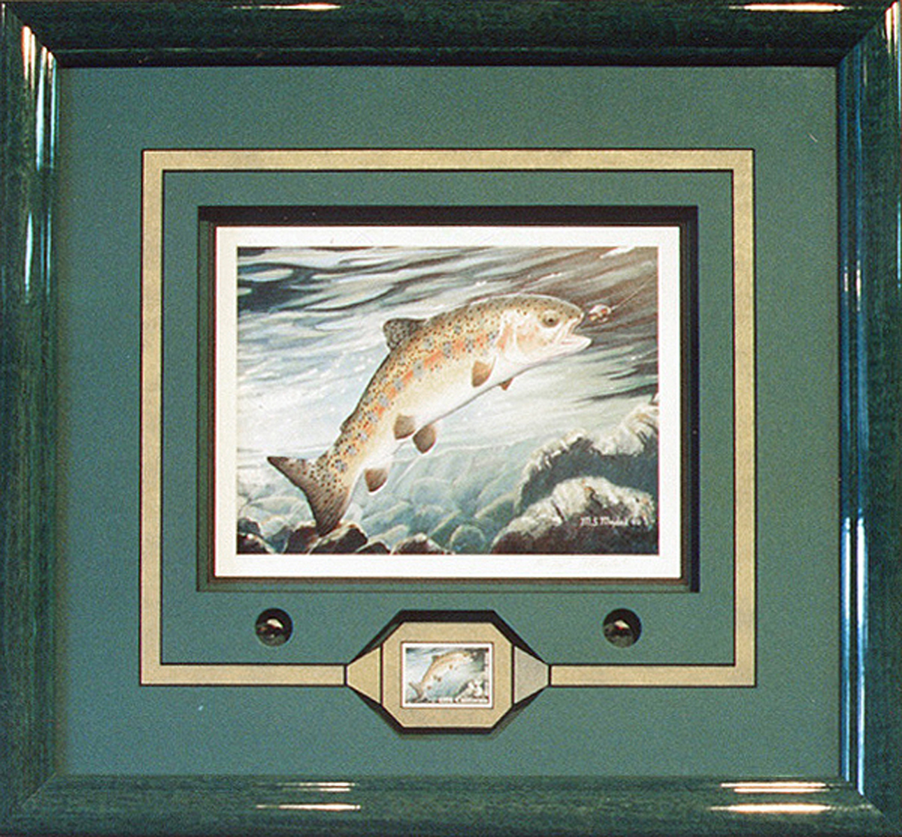
This chosen design by Ray Dwyer, Whitefish, MT won 3rd place at the PPFA National Championship Open Competition, Chicago, 1993.
As spring is just around the corner, so are thoughts of getting outdoors. After all the snow melts and ice fishing concludes, what better way to experience the cold, crisp melted snow streams than by fly fishing. This month's print is your non-typical fish story with a stamp, and flies.
Defining the Project
This chosen design hooked 2nd place in northwest Regional PPFA competition, then 3rd place at the PPFA National Championship Open Competition, Chicago, 1993. This chosen design hooked 2nd place in northwest Regional PPFA competition, then 3rd place at the PPFA National Championship Open Competition, Chicago, 1993. It is the brainchild of Ray Dwyer, Whitefish, Montana and features a signed, numbered limited edition fish stamp print "Wild Trout" by Michael D. Maydak. The California stamp set is dated 1991 (photo 1).
Photo 1
This chosen design by Ray Dwyer, Whitefish, MT won 3rd place at the PPFA National Championship Open Competition, Chicago, 1993.
The print was selected by Dwyer specifically as a competition piece, so complete design freedom was allowed with no financial or time limitations. Two identical Royal Coachman flies were custom tied by Lakestream Fly Fishing Shop, also of Whitefish, to perfectly duplicate the fly in the print. Now the print, the stamp and two custom tied flies became part of the entire project.
Creating a Solution
Moulding was chosen the same blue-green color of the mats in order to draw no specific attention to the outer frame. The high gloss finish was meant to emulate the wet appearance of water. Mat colors were chosen to enhance the cool blue-greens in the print itself while accenting the fish by the contrasting metallic gold inlay of the top mat.
The stamp was showcased in a rather non-traditional way by accent framing it with the contrasting gold mat growing from the inlay, then floating it in the modified octagonal opening which had been cut in the top green mat. A hairline of orange Crescent colored art paper was under tiered (mounted to the back) of the middle mat to quietly highlight the orange in the fish's gills.
Analyzing the Materials/Limitations
Technical requirements were primarily the need for Mylar encapsulation for the stamp and to accommodate for the depth of the flies. The art could be framed strictly for itself, colors, textures and shapes all could be chosen for the benefit of image enhancement and technical challenge.
Frame dimensions are 16-⅞" x 15-⅛", using a Nurre Caxton #7138 1-¼" wide x 1-½" deep high gloss moss green washed lacquer moulding. Mat boards include Crescent blackcore Real Teal Green #63323 for the top and middle, #63338 NightWatch bottom mat with #63713 Nero Gold Precious Metal for the inlay and stamp mat.
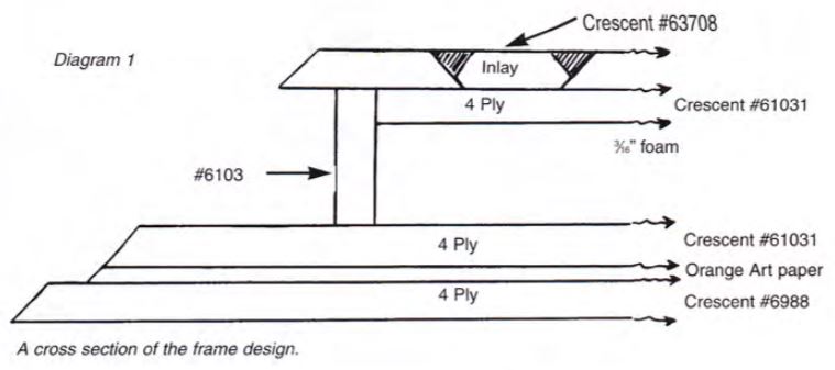
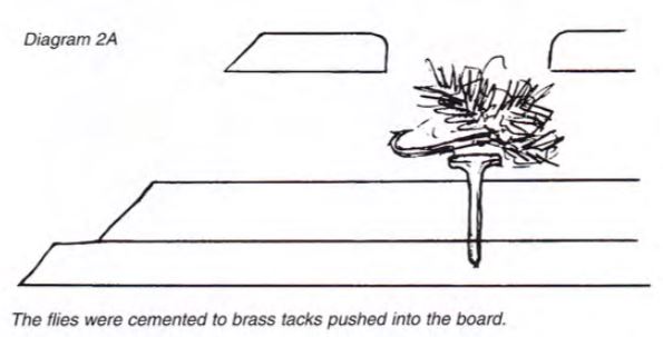
The flies are recessed into two small ¾" circles in the top mat on either side of the stamp, and mounted on brass nails into the bottom mats. (Diagram 2A) The spacer is nearly ½" thick, vertically trimmed with matching mat board to create a shadow box effect which creates adequate depth for the independently framed stamp and flies.
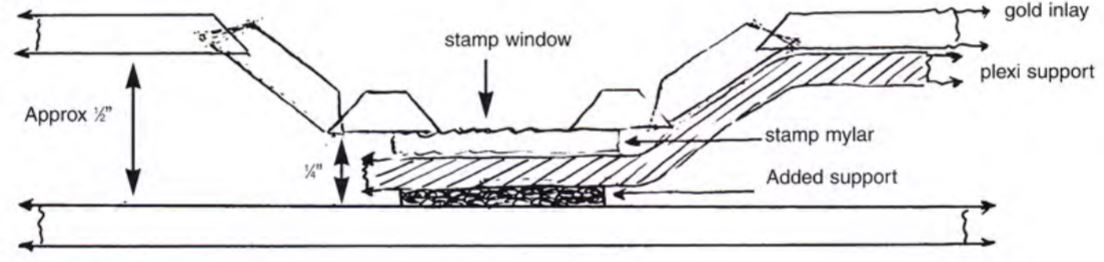
A heat shaped plexi support ramps down into the octagonal opening from the inlay to support the stamp frame ¼" above the middle mat. Since blackcore board was selected, a sheet of barrier paper was dry mounted to the back of the bottom mat prior to cutting. The entire piece was then glazed with Denglas upon assembly completion.
Who, What, When, Where, Why
Begin the critique, by visually overviewing the project by following the viewer's eye (who). The eye is drawn to the center jumping fish (what), then rather rapidly (when) drops down to the smaller stamp below (where).
The angled and tapered gold stamp mat gently leads the eye both left and right into the 7/16" panel inlay of accent color. As the eye travels horizontally in an attempt to follow the line up the sides and around the top, it is halted by the small flies either side and slightly higher. The placement of these leads the eye right back into the original fish painting (why). Then the whole circular process begins again (diagram 3).
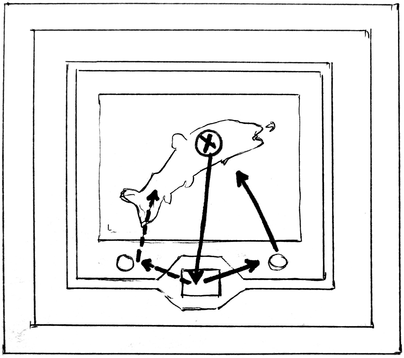 Diagram 3
Emphasis leads the eye from the fish to the stamp, then flies, then back to the fish in a cyclical manner.
`Why' is determined by the specific selection of colors, textures, contrasts and dimensions to help evoke viewer emotion and interest in the art itself. How all this is achieved comes next as we analyze the elements.
Analyze the Elements
The bold gold panel creates a strong use of both line (1) and color (2), reinforced by the darker green innermost bottom mat. The metallic inlay introduces another visual texture (3) also establishing it as a countable element.
Since a single rectangular mat is the given, then the double opening octagon shaped, reverse bevel window enhancement for the stamp counts as shape (4). Shape is also used in the small round punched cutouts for the fishing flies. Any time a spacer is used there is are highlights and shadows that appear within the framed project. In this case, the print is set back through the use of a spacer as are the flies and the dropped stamp. All of these recessed items creating shadows and reflections of depth within the frame, as a countable use of intensity (5).
The placement of all items in the frame are working together in a way so as not to draw unnecessary attention to any particular use of positive or negative space. Therefore the remaining element of space wouldn't require acknowledgment of it's use in this project.
Factoring it Together
Elements remain the easiest countable building blocks, now how are the factors used to hold them together. Though the width of the weighted bottom would overpower the print if it were the only item in the frame, the additional stamp and flies have enough visual diversity to handle the larger format. So proportions appear relatively comfortable as the eye moves within the frame without getting lost.
There is good placement of the stamp leaving adequate room for the flies and still feeling a part of the whole. Even the octagonal stamp window has added width below it creating a slightly weighted bottom, well proportioned.
Emphasis is the focus or focal point of a project, and as discussed earlier in this article, the eye is comfortably focused within the outer frame, if not within the confines of the inner yellow accent line, and does not lose the viewer's attention. There is an active interplay of vertical as well as diagonal visual movement.
The vertical is between the leaping fish print and the lower stamp duplicate. The diagonals are between the flies and print; the stamp and flies; and even the slant corners of the inner yellow stamp frame. Diagonals even create a physical parallel between the diagonal arch of the jumping fish and the slant corners, again echoed in the stamp. Diagonal movement is very strong and aggressive when it comes to psychological eye movement and works well with this active fish image.
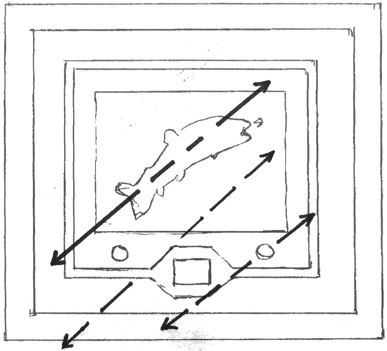 Diagram 4
Strong diagonals create and reinforce movement both in print and frame design.
The next factor for consideration is balance (6). True symmetrical balance can only occur with a mirror image where both sides are identical. Since the fish has a tail on the left, head on the right it will never be perfectly symmetrical. But, the placement of the centralized print and stamp, and the mirrored fishing flies on either side creates enough of an even balance to call this a symmetrically framed design.
If a plumb line were drawn down the perfect center of the presentation it would indeed feel visually symmetrically balanced. When balance is used in this recognizable a way, it probably ought to be recognized as a strong application, thus becoming a countable fundamental.
Though rhythm is notable in the repetition of the print and the stamp it is a part of the art and not a part of the controlled frame design. Therefore, rhythm would not be counted in this project.
Use of 3-5 elements and factors is suggested when designing, this project used a total of 6 fundamentals including line, color, texture, shape, intensity...and perhaps balance. Since the texture element is rather subtle and the use of symmetry might not require counting it doesn't appear to be a problem. The question remains if it feels unified.
In order to determine unity, the art must dominate the framing. The art in this project is the print, stamp AND flies, so all of them must share the spotlight. If all of the elements are well executed and the factors have all been utilized appropriately by proper proportion, emphasis, and balance...and the piece is well represented in the appropriate style and period it indeed will feel unified. This design appears to have harmony and a well planned understanding of the fundamentals, it indeed has award winning unity.
Design Philosophy
According to Dwyer, the print was selected for competition because it is more difficult to win in open competition with a print than with assorted items. The frame designer is forced to stay within the range of enhancing and protecting the image while creating a technically challenging design that appears to showcase normal, traditional framing technique.
In this case, the print was placed higher in the frame with a greater weighted bottom both for the additional items and to elevate the jumping fish. Color was selected as a non-distraction for both mats and moulding and the high gloss moulding was to relate to water.
Something well illustrated in this project is thinking outside the box. The print and stamp made a fine project alone, but the addition of the fishing flies added interest, as well as more design potential. Interestingly, the competition print concept, has the impact of a shadow box by the ½" depth of the recessed lower mats and the addition of the custom tied flies after all. Good job Ray, but don't we have a few objects in this box?
END
Copyright © 1997 Chris A Paschke
For more articles on mounting basics look under the mounting section in Articles by Subject.
Additional information on all types of mounting is found in:
The Mounting and Laminating Handbook, Second Edition, 2002,
The Mounting And Laminating Handbook, Third Edition, 2008 and
Creative Mounting, Wrapping, And Laminating, 2000 will teach you everything you need to know about getting the most from your dry mount equipment and materials as an innovative frame designer.
All books are available from Designs Ink Publishing through this website.
Chris A Paschke, CPF GCF
Designs Ink
Designs Ink Publishing
785 Tucker Road, Suite G-183
Tehachapi, CA 93561
P 661-821-2188
chris@designsinkart.com